contiguous

Contiguous /kənˈtiɡyo͞oəs/ – to be close in distance, side by side; to touch borders.

Ex. New jersey and Pennsylvania are considered contiguous states because their borders touch.

In my illustrator class, my teacher used this term when explaining selection methods. The word has a weird sound and could have meant anything so i decided to search it up and add it to our class glossary.
lenient

Lenient /ˈlēnēənt/ – to be forgiving or permissive.

Ex. “Sam became lenient after I apologized for breaking her book. She smiled and gave me a hug.”

I’ve come across this term countless times throughout my time being. I’ve had a sense of the word but didnt really know what it actually meant. Turns out to be the oppisite of what I thought it was.

Color Harmony: Phase 3

Cover side-01
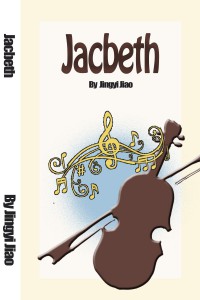
Humument Book Cover(side)
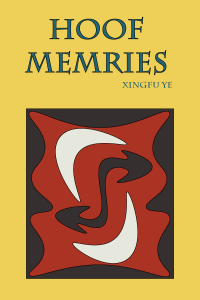
Humument Book Cover (Front)
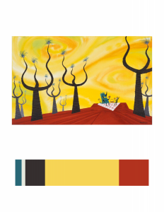
Color Inventory
Color Inventory


I choose this image (CONCEPT ART, SULLIVAN AND BOO, MONSTERS, INC., 2001) because the feeling this image gives to me is really close to my Humument book’s theme. The theme of the original book is about a resilience in the face of family tragedy, and the new theme is about imagery of fantasy. This image is fantasy because the scenery in the image seem does not exist in real world. Here is link to Cooper Hewitt Research: Here

Total time spend: 2 hour and 50 minutes

Color Harmony: Phase 3

book cover chriswarecolorinventory.ai

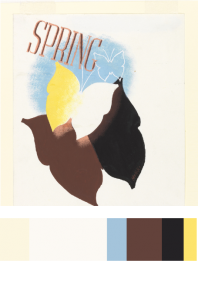
I chose this piece ( Spring in the Country, 1935) posted by Edward McKnight Kauffer, acquired it in 1963. I chose this piece to reference in my Humument book cover because most color contains in this piece are warm colors, like yellow, chromatic red (brown), and muted yellow. The theme I chose for my humument is relax, warm color can better to represent my theme, it gives a feeling of warmness and relaxable.

source link 

Color Harmony: Phase 3

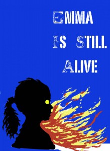
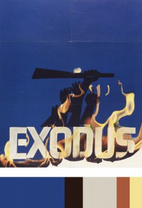
After our trip to Cooper Hewitt, I decided to choose a piece of art by Saul Bass called Exodus. This piece was created in 1961, and was poster designed for Otter Preminger’s film Exodus. I chose this particular piece because i thought it would be an excellent color scheme for my humument, and it also featured fire, which is already a pretty important part of my piece. I then created its color pallet, and used it as a base for my own cover art.

colorpallete


color harmony phase 3

observation_phase3bookspine bookcover


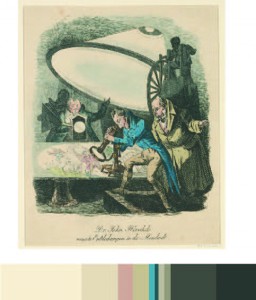
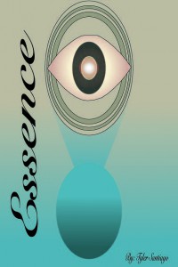
For this project i chose as piece called “THE GREAT MOON HOAX OF 1835” Posted on October 25, 2015. I chose this piece of work because it represents what my theme of my book is, the theme of my book is observation and the title “Essence” comes from the original title of the book which was “silences” by Tillie Olsen. I also liked the colors that were used in the work that i used and i think it goes great with the aspect i was trying to convey. 

Reference Link


Color Harmony: Phase 3

Color Inventory
Color Inventory
1561
Humument Book Cover

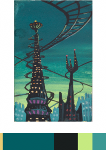
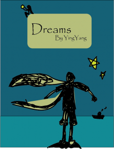
The reason I chose this image(CONCEPT ART, MONSTER CITY, MONSTERS, INC., 2001) from Cooper Hewitt is that I feel like it really match the themes of my humument work. The themes of my humument work are dreams and loneliness. The picture is basically bule and black. That gives me a stronge feelling of derams and loneliness.

Source Link