Color Harmony: Phase 3

I chose this image (DATA VISUALIZATION, FLIGHT PATTERNS, 2005–08) to reference in my Humument book cover because it is a juxtaposition of my books them. The original theme is about a boy becoming of age, and the new theme is mysterious. This image is mysterious because of all the negative space with the colorful spirals in the center.
Source Link

Time Spent – about 2 hours.

Color Harmony: Phase 3

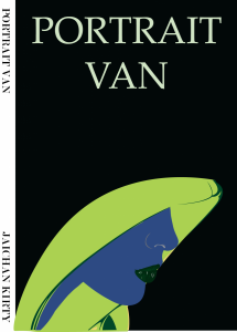
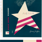
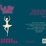
I picked this from the design gallery at the Cooper Hewitt, Smithsonian Design Museum; Book cover, Amerika, 1947 design by Alvin Lustig. The explanation of why Lustig made this cover is said from the the didactic from the web site that states, “…employ abstracted iconography and simple typography and lettering to create emotionally compelling representations of a book’s themes.” I picked this cover, because it was simple. As in, it had simple colors compared to others. Others tend to have multiple colors that it didn’t identify it, for my connection in the theme. Since my dominant color is dark blue, the use of shade in the ballerina drop shadow was difficult. However, if you see it closely it is actually a more dark shade of blue. I also used tint in the title of my book and also a shade for my name at the bottom. For over all phase 3, I spend about two hours. I didn’t use any tin or shade at the back cover, since I wanted the reader to actually see the text. I used Photoshop to complete this phase. Link to Cooper Hewitt Research: Here

Exhibit Catalogue (Revised, Final)

This exhibit is presented by Ayano Morishima, who was born and raised in Tokyo, Japan, then moved to New York, where she now lives and studies. She was inspired by Tom Phillips’s work, Humument of transforming a used book into an art and poetry project. Morishima then created, La Fay-Vaile a new name she picked out from the original book she used for her project. She also changed the theme of a book to dark wonderland to show the difference from the original theme, Wish. She was also inspired by the original creator of Alice in Wonderland by Charles Lutwidge Dodgson under the pseudonym, Lewis Carroll in 1865. The three design Morishima created, Gates to Wonder, Book to Wonder, and Dreams to Wonder are from the book that represents to the theme the most and an message about how anyone can rewritten a destiny of the book. Though Morishima’s knowledge and techniques from her studies in COMD 1100 and ENG 1101, college courses that is part of Learning Community: Ways of Seeing, it helped her to be able to create this project. To create her designs, she used her technique in using ink brush pen, x-acto knife, old book and folding to show the viewers, the new kind of story that unfolds.

For the first design, Morishima title the design, Gates to Wonder. Because of multiple doors of the design, indicating a way to the wonderland. A starting point that everyone must encounter. She used the ink brush pen to make many repetition of connected diamonds to indicate a chandelier also, blocking out most of the text in the book to show how visible text are connected to the picture that is shown as a ground. Each words representing the meaning behind the design, such as went, door, worse, cry, wondered, etc. In addition, used figure and ground technique to show the viewers where exactly to see; in this case, the shapes of the ground shows more vividly since the black ink, the figure blocks out other negative space.

Down into the rabbit hole; the second design, Book to Wonder leads the viewers to go though the door to read a little book that came from the concept of the original, Alice in Wonderland. She used x-acto knife to cut open a block of text at the bottom of the page and glued only in the middle. By doing this, she wants the viewers to see that there is a book in a book. Same as the first design, she used the technique of figure and ground, showing the ground to block other negative space. In addition, by folding the corner to the right top, it shows the next design that shows the technique of a chromatic gray; grays that exhibit a subtle, but visible hue; created by adding larger amounts the complement and white.

Dreams to Wonder is a design that was created to show “the after math of Wonderland”. Story goes as the darkness in wonderland was finally came to the end. Many would think that the ballerina could be Alice, however being the character in the original story, Morishima completely disconnected the characters from her project. The ballerina indicates a spirit that it stabilizes the wonders in the wonderland. She also used ink brush pen to create curtains on the right and left sides to show that she is on a stage, and the visible words that fits with the story of the page, such as dancer, moment, felt, perfect, and choice.

Ayano Morishima, made this project from her understanding in COMD 1100 and ENG 1101, college course she is taking in New York, where she lives. She made this mainly to attract people who are interested in creating their own story. It conveys though out each pieces of art work and detailed design, where it tells the message in the theme. Single page contains a message where Morishima’s story that she made though out the art she loves, she wants the viewers to understand that stories can be can be rewritten to make new ones. Even characters, make them have their own destiny with out following the original story.

Color harmony: Phase 3

Proportional Color invetory
Proportional Color inventory

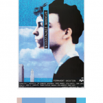
For this phase of the project, we visit the Cooper Hewitt museum as a class trip. Here we explored many fields of art from graphics, sculptures, textiles, motion graphics, architecture, and so on. We were to use an inspiring piece of art found in the museum that also fit our selected theme for our humument books. My book in specific talks about a journey and I am juxtaposing that with the theme of memories. There is a relation but big difference between a journey and a memory. While on journey, a person’s experience is physical  and fruitful. A memory on the other hand is a mental experience which we feel emotionally not physically. I also chose to articulate various memories of people from different walks of life to emphasize the differential between people. My book on the other hand shows how people can sometimes be all connected. I chose this as reference for my color inventory because when I first looked at it my mind suddenly became clear and peaceful. The peacefulness perceived from the blue allowed my mind to relax and reminisce. I’ve learned different shades, tints of blue can emit different emotions and this blue specifically gives a tranquil, relaxed state of mind. Although it’s peaceful the feeling of assurance is also provided. This part took me about 2 hours 20 mins.


Color harmony: Phase 2

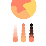
 bottom (left to right); Tint, Two color gradient, shade
Analogous color palette
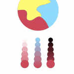
 bottom (left to right); Tint, Two color gradient, shade
Split complementary palette

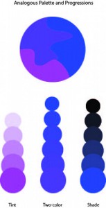
The Analagous color pallete on top displays Analagous colors. These are colors that lie adjent to one another on the color wheel. For example you want the color green. You’ll then chose one color after and before green which are green blue and yellow green. That leaves you with Green, green blue, and yellow green. Together those colors will work harmoniously and that is a strategy in choosing colors. For My analagous pallete I decided to stick with muted warm colors. To be more specific I have a muted red-orange, orange and yellow-orange mashup in my composition. Under my composition I show an example of tint on the left, a two color gradient in the middle and  shade on the right.

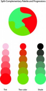
For split complementray colors you take one color and use the two colors adjacent to its compliment. An example is Violet, then find it’s compliment (yellow). The colors that come before and after yellow are orange and green. That means violet, orange, and green work harmoniously as a split complimentary color pallete. This composition contains muted colors aswell. Colors are muted with white leaving tinted red violet, blue and yellow. Below my composition, you see three examples, the left showing shade,  the right showing tint and the middle showing a two color gradient.  I did both compositions using Adobe Color CC Program. In total I spent around 2 hours.

Exhibit Catalogue (final)

The artist Brian Mifsud was born on March 29, 1997 in Queens New York. He now currently lives in Manhattan and studies in Brooklyn. The artist drew inspiration from Tom Phillips “A Humument” to create his own versions of this style of composition which combines both language and art to convey anything the artist desires. Tom Phillip was an English artist who purchased a cheap book to use as the basis of an art project known as A Humument. Behind his artwork,  he paints, collages or draws over the pages, leaving some of the text peeking through in serpentine bubble shapes, creating a found text with its own story, different from the original. In this case Brian made three compositions with a theme that juxtaposes with the theme of the original Book. In this exhibit Brian chose the book Hunger Games Catching Fire which has more of a darker and serious theme to it so Brian juxtaposes this theme by making it a bit lighter and more into a comedy. To help convey this Brian also change the title of this composition to Off the Hinge.

Brian created the compositions using a variation of sizes of Micron pens mainly using 0.25, 0.35 and 0.45 mm. Also he used a Faber-Castell Brush pen. For his first design, your idea he creates a composition the perfectly conveys the title of the composition that being your idea using the universal symbol of an idea being a cloud which can be seen in different forms of media, from comic books to cartoons you can see the thought bubble used to convey an idea. The artist also uses different techniques like repetition of the clouds and variation of the cloud sizes to help create emphasis on the main large cloud surrounding the phrase your idea. This composition helps to also convey the theme Brian is trying to get across because the imagery of clouds gives the feeling of dreaming and happiness to help create that lighter theme.

For his second design, Unity, he first had to envision what color combined would make a nice color that is not too harsh so he came up with two colors blue and red which when mixed created a nice purple. So with that Brian colored in one half of the page with red and the other half of the page with blue so when they met in the middle they created a nice shade of purple to show the unity between the colors. The purple line in the middle also has this rhythmic vibe too it that also gives it a nice sense of design.

For his third design Brian wanted to have another design that was in black and white but also did not use the words on the page for his design either. In this design Brian tries again to convey a lighter tone compared to the darker tone of the book. In this composition we see a nice soothing line that goes in a type of wave formation that with dark lines that fill up around the line but not touching the main line with a gap between it. This to the artist gives the composition a lighter tone.

With his composition Off the Hinge, Brian wanted to convey certain ideas that can change the darker tones of the book too the lighter tones of Brian’s new creation. The work of alternated texts along with visual images creates a new story from a preexisting one. It creates more room for stories that have yet to be told as the original source is left as inspirations behind those stories.

Project #3 (With Work Cited List)

Beauty, the quality of being physically attractive is something that the user will encounter after they downloads this app. My co-workers and I, Ayano Morishima are making an route simulator known as “Road to Beauty” that takes the user to a journey that can lead them to a beautiful constructed location. Many people uses other apps to locate their shortest and fastest route, so that they could get to their location much faster. Taking a different walk from your usual course of route would open your view on beauty after downloading this app, which it contains features of short, fast and beautiful route.

Many apps from the apple store contains route simulator that pinpoints to the users location and calculate time to show them different option in best or shortest route to get there quickly as possible. However, is it time that the users want to save up to get to their destination? Sure, people want to get there quickly and do whatever they needed to do. But what if there is an app that can change the users surrounding views? Think about it, looking at the same route over and over is boring. The user might already know whats built there, even if they are blind! Our app focuses on people’s daily route and time, however what is different is users can use this app to encounter a beautiful constructed location just by taking a different route. Simple right? By changing just a little routine of using the same route to their destination; even if it takes just an extra few minutes, sure the surroundings of the users view will changes. Peter Terzian states that “The Heights wears its rich history on its sleeve, with the area a showcase of stately architectural styles, august churches and schools and literary landmarks.” Basically, the author is saying that there is a lot to see at the Brooklyn Heights. Such as churches, beautiful architecture, school, etc. Its beauty captivates people hearts and its amazing location with in Brooklyn heights conveys the inner beauty in Brooklyn.

One of the ongoing project route starts from the Voorhees building. This building is a center for engineering technology for students who does to NYC College of Technology. Once you left the building to make a right, you will see a big road. If you turn right again, you would encounter an entrance of Brooklyn Bridge. Brooklyn Bridges connects the two boroughs, Manhattan and Brooklyn crossing over the East River. As you go further straight, you will see a huge park called, Cadman Plaza Park. A huge park where you can play any sports. Walk to right and left again, where you will encounter location called, Brooklyn Heights Promenade. As you go in though this location, and keep walking straight, you will see a Brooklyn Bridge Park Pier 2. Place where it features in basketball, handball, etc. Each locations shows the beauty of each aspect in how it was constructed for. For example, since the Voorhees building was built unique, which it intrigues people who are interested in architecture or simply how different they are. Also, Brooklyn Bridge Park Pier 2’s building is constructed beautiful, because of the surrounded body of Hudson river and the view of the sky scrapers of Manhattan. Ronda Kaysen states that “As it is, many preservationists worry that Midtown could soon reach a tipping point in which the architectural mix of old and new is lost to a wash of sparkly glass.” Basically, the author is saying that not only in Manhattan, but other boroughs such as Brooklyn architecture are in need to keep an eye out. Soon or later it would be demolished without knowing.

These exampled location is a place where the users will encounter in the app. Such as the caption below will pop up to explain a little information that the user could do, when they arrive at certain locations. Many volunteers contributed to this route making, so that it shows the best time to go to the location, where it also shows the “best time” to go to the location at the top right corner. An example for the location above is, “the best time to go to the location” is between 2:30pm to 5:30pm. One of the volunteer commented, “It is a great place to go, especially since it is quite. You can see how each location are constructed differently comparing it to other locations. Going with friends or family would be a great way to explore a new route!” Thanks to our volunteers, this app does contain other features, such as little game that satisfies the users traveling, voice active system where you use it like Siri, time countdown where it countdowns time to get to the location. The article of The Adventure of a New Perspective: A Literary Walk in Brooklyn Heights states that, “Brooklyn Heights still retains a sense of dignity and quiet, the legacy of a residential neighborhood that was famous in the nineteenth century for its churches and for its elegant homes built by merchants and sea captains in the shipping trades.” Basically, the article is saying that Brooklyn Heights is the best place to go and explore about the legacy of a residential neighborhood and the beautiful scenery that smooths people heart.

Seeing different surroundings would motivate users to look though into new route to their destination, where they haven’t discovered yet. By using this app Road to Beauty, not only they gives the best option in shortest route, but to think about the user’s preference in showing beauty of how the location was constructed. Many people looks for quick way to get to the destination that they are seeking. However what if there is a route that is short and beautiful enough to make you use this app again? Why won’t you not give it a try?

Work Cited List:

Terzian, Peter. must-see Brooklyn Heights March 03, 2014. Web. November 16, 2015.

Kaysen, Ronda. “Midtown’s Vanishing Historic Architecture” New York Times. June 5, 2015. Web. November 16, 2015.

No name. “The Advantages of a New Perspective: A Literary Walk in Brooklyn Heights” Blog: Walking Of The Big Apple. October 12, 2010. Web. November 16, 2015.

Rosen, Jody. “Write about resources” OpenLab. Web. November 6, 2015.
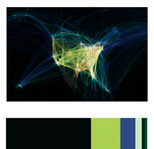
Exhibit Catalogue (final)

Jiao, inspired by Tom Phillips’ A Humument, exhibits her works and at the same time, tells a short-story plot about Macbeth, she also adds a new feeling to it other than the tragedy; a positive feeling of relaxation and warmness for readers. Tom Phillips created Humument by using a collage, placement, color value, and other skills as reference to that. Jiao created her own humument art known as The Stage of Value, Box of dimension and Music Party DO-RE-MI. Jiao conveys a lot messages in her humument arts, and also gives an effect of Macbeth itself. She chose Macbeth by William Shakespeare to be the paper layer for her humument, by using the same skills as Tom Phillips, she chose to use the three skills which are the collage-making, placement, and overlapping. Each skill used in a different piece of work.


The Stage of Value is her best piece of work. It may look easy and simple but, the meaning behind, is significant. For The Stage of Value the artist chose to articulate value, which is the lightness and darkness of a color, she used materials of inking brush pens (black, dark gray, and light gray). Using inking brush pens to block out specific words, Jiao chose the word “stage” to incorporate the fact that Macbeth is a famous play itself. Using the skill of placement, the page shows value from the darkest blacks to no color at all. The black and grays color choices refers to the evilness, hopeless, and the o a lot of negative messages conveyed from Macbeth. More than half of the areas were low-key, with only a small part left as white, because there remain little positive messages left in Macbeth, which are former king’s kindness and soldiers’ loyalty.


Her second work is The Box of Dimension, in this piece, Jiao shows technique of overlap. Using inking brush pens to color boxes into different values, the transparent gray colors merged up and becomes overlapped. By overlapping the boxes with different ranges of value together, it tricks the audience’s eyes and gives a 3D-feeling. The design makes it look like a time tunnel, the boxes represent tunnel entrances that connect with different time dimensions. They can transfer you to the another world, the era that had Macbeth’s existence is included in one box of dimensions; viewers could take a guess of which box is the entrance to the world of Macbeth. This page can be a little game for you, after you chose a box, flip to the next page to see if there is a word that says “Macbeth” behind the box you chose, if there is, it means you were right.


The last one is Music Party DO-RE-MI, it shows Jiao’s learning of rhythmic pattern that she connects with her interest in music. This composition shows the two different rhythms of staccato and legato. Staccato represents sharp patterns while legato represents round patterns, Jiao combines them up and turned music into art. Macbeth is also a famous stage opera show, the actors sing out their lines while following the background music. In her last humument art, Jiao gives the message that Macbeth is not just a book, it is also an opera. By covering the patterns over the lines, she conveys these lines that could be sung out as a beautiful song. So when people read Macbeth, at the same time they can get a feeling of listening to music, feel relaxed, get a different feeling such as Macbeth’s tragedy. Same concept for Box of Dimension, interesting 3D-feeling that brings you out of a sad tragedy and makes you feel joyful.

End-of-semester checklist

A few reminders and follow-ups as we approach the end of the semester:

  • The glossary write-up is due. Today. Refresh your memory of the instructions here. As soon as I have them all, I can compile a complete glossary from the semester.
  • As you prepare for the final exam, remember to review the notes from our discussion about preparing for and writing this essay exam. Remember also that you can ask questions/answer questions/make comments in the comments section.
  • I posted instructions for the Project #4 cover letter. Please write this post so I can take your ideas into account as I re-read your work.
  • Many of the Project #3 posts did not have Works Cited lists–without them I can only assume that you either didn’t do any research, or that you used sources without giving them proper credit. If you add your Works Cited lists, I can take that into account as I finalize the grades for Project #3.
  • If we had discussed your plans to revise one or more of your projects this semester, would you remind me by sending me the link to the revised version? I have several, but before I return them on Monday, I would like to have everyone’s accounted for and graded.
  • I’m really excited to see your finished altered-book projects. Remember that we’ll take lots of pictures of them and of you with them on Monday in COMD 1100.
  • If you would like additional feedback on any of your work, we can schedule a meeting.
  • Good luck with all of your work! You can do it!