Color Interaction Parings: Phase 3

colorinteractionfreestudy_

This project I found to be really fun and interesting. Not only was everyone able to work with a partner but we had the chance to get to know our partners in this activity. So with my partner Tyler, we had to pick a color for each other that best represents the other person’s personality. Then we had to pick a color that matches both of our personality traits. Next we had to come up with logos that represented each other but in a way that they are similar. With all of these elements we had to make sure our work showed simultaneous contrast. I chose yellow-green for Tyler because he’s mainly funny and outgoing(that represents the yellow) but at the same time he’s relaxed(that represents the green). Tyler chose to do a pink-blue color for me because although I’m cheerful and giggly(that represents the pink) I’m also intellectual, trustworthy and relaxed(that represents the blue). Our shared color is a blue-green to represent our relaxed traits. Tyler chose a cat logo for me since I’m cuddly but clever like a cat. I chose a dog for Tyler because dogs are outgoing and he really loves dogs. This part took about 4 hours and 30 minutes to complete.


Sensationalist

noun

  • the use of shocking details to cause a lot of excitement or interest

Source:http://www.merriam-webster.com/dictionary/sensationalist

I came across this word in today’s class when we were making a summary for the reading excerpt, “The Boston Photographs”. This word can be found in the sentence “Although some argue whether it was sensationalist and unethical to do so, purely in newspapers’ own interests, Ephron sides with their value as good photojournalism”. From learning what sensationalist meant, some people believed that the newspaper used the shocking photos to just gain attention for their newspaper.

Superfluous

adjective

  • 1a :  exceeding what is sufficient or necessary :  extra

1b :  not needed :  unnecessary

  • 2 obsolete:  marked by wastefulness :extravagant

Source: http://www.merriam-webster.com/dictionary/superfluous

I came across this word in today’s English class. It can be found in the Project #4 peer review post, “what’s superfluous?”. In this case superfluous would be meant for extra or unnecessary. In other words “what’s superfluous?”, means in the post what extra information is unnecessary so that it can be eliminated from the essay.


Exhibit Catalogue

The artist Brandy Ortiz was born on 1997 in New York, NY. She currently lives and studies in the city she was born in. She was inspired by the works of Tom Phillips in his A Humument book to create compositions that combined linguistic language and art into three pages of her vision. Tom Phillip was an English artist who purchased a cheap book to use as the basis of an art project known as A Humument. Behind his artwork,  he paints, collages or draws over the pages, leaving some of the text peeking through in serpentine bubble shapes, creating a found text with its own story, different from the original. Ortiz made compositions with themes that juxtapose from the original theme from the novel Brimestone by Douglas Preston and Lincoln Child. While Brimestone theme was thriller, the artist decided that her artwork would have a softer tone. Within her creation of Glass Child contains Ocean Breeze, Picture Perfect Family, and Love Exists, each having their own messages that relate to a gentle tone.

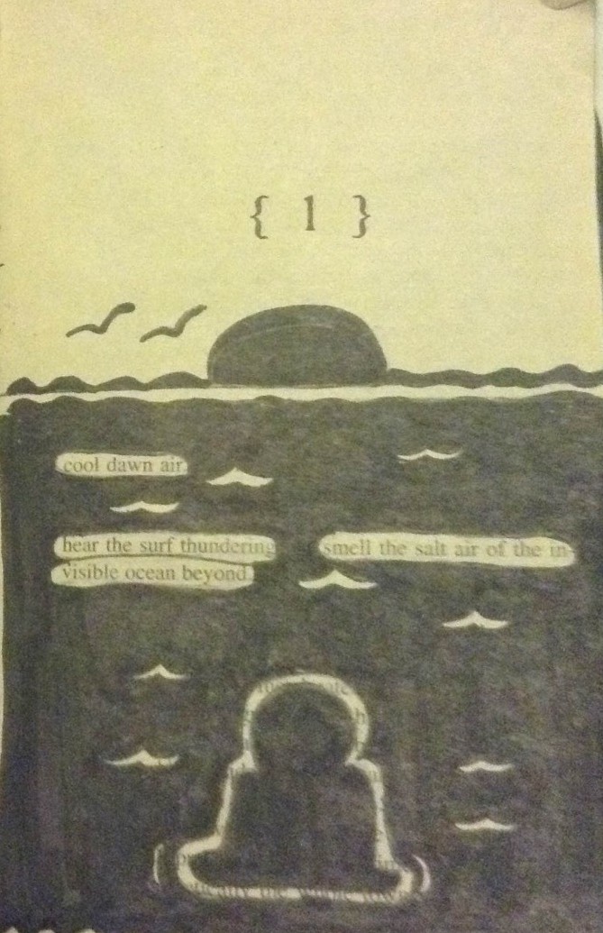
Ortiz used Pigma Micron Pens(0.2, 0.5 and Brush), Faber-Castell Brush Pen, pencils(HB-6B) and a pair of scissors as her materials for her artwork. For her first design, Ocean Breeze, she shows a silhouette of a boy relaxing in a beach setting with the sun rising. She first made outlines of the boy and the waves by using the micron pens. Afterwards she used the Faber-Castell Brush Pen to ink the ocean and the sun. While having the top half of the page not inked and most of the image within the bottom area leave a visual sense of figure and ground. Figure and ground is the relationship between positive and negative space. The revealed message that the artist created says “Cool dawn air. Hear the surf thundering. Smell the salt air of the invisible ocean beyond”. The boy in the image is taking in the soothing sensation of the environment that the text creates.

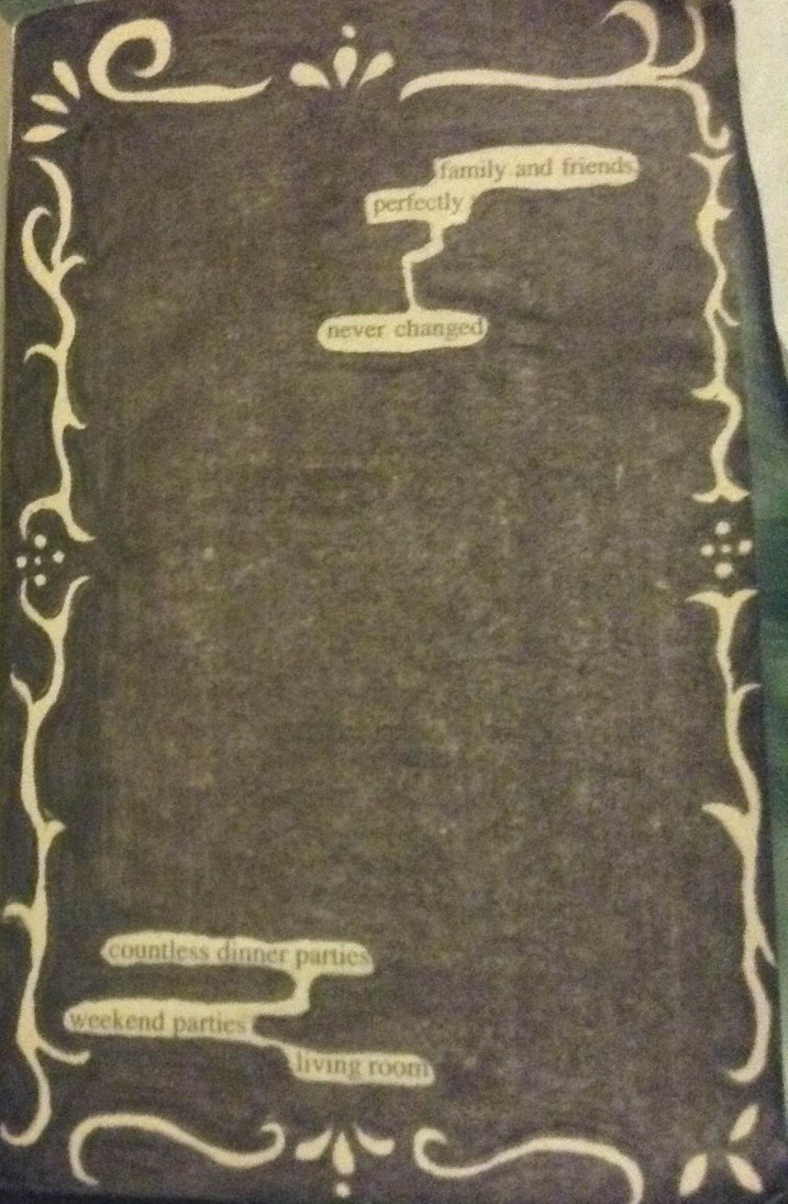
For her second design, Picture Perfect Family, she first creates an outline of a frame within the margin area of the page with the micron pens. Next she uses the Faber-Castell Brush Pen to black out the rest of the page leaving out the frame and the revealed text. The revealed message that the artist created says “Family and friends perfectly never changed. Countless dinner parties, weekend parties, living room”. The message conveys a family that enjoys getting together for parties in their living room. A frame is a boundary made from either a rectangle, square or circle that is placed on the edges of the paper or the margins drawn within. The concept behind the frame was to transform the text to make it look like a family portrait since the idea behind the message was family gathering.

For her third design, Love exists, she used scissors to cut out pieces of the page to reveal words from other pages. Instead of blacking out the page to show her message, Ortiz creates a message from cutting out certain words from various pages to show all on one page. The revealed message that the artist created says “Love was fantastic to obtain in the vast world”.  The artist made a heart in the lower left corner of the page while everything was shaded by pencil to show low key. Low Key is when the values of an image are predominantly dark. The idea behind the message was that love is a great feeling to have in the world we live in. The heart shows that love will always be there even when surrounded by darkness. With her vision of the humument, Ortiz wanted to show her ideas of different messages of through the language and the art she depicted. Even though each page had its own concept the overall tone was pleasant.

Color Interaction Parings: Phase 2

Achromatic gray studies

Group 1: For this study, I learned how to use different shades of grays to change the color of the middle square. The squares in the middle are the same color but the surrounding color makes it appear as though it’s a different color. It took 20 minutes to complete.

Shifting value with color

Group 2: For this study, I learned how to keep the color of the larger squares but change the value. The squares in the middle are the same color but with the change in value within the surrounding color it changes the appearance of the square in the middle. It took 20 minutes to complete.

Shifting hue, but not value

Group 3: For this study, I learned how to make different colors have the same value. The squares in the middle are the same color but the surrounding color make the little squares appear as if they have the same hue as the surrounding color. It took 35 minutes to complete.

Shifting hue and value

Group 4: For this study, I learned how to change the appearance of the middle squares with different hues and different values. It took 35 minutes to complete.


Simultaneous Contrast

Simultaneous Contrast 1 Simultaneous Contrast 2

(Click here for link to the first image. Click here for link to the second image.)

From what I’ve observed, these two images show interesting simultaneous contrast. In the first image, the lines are the same color but with the surrounding gray and yellow makes the lines appear as the colors are switched. The lines in the yellow box are gray while the lines in the gray box are yellow. In the second image, the surrounding colors are like in the first image( in a that they are different colors from one another). But the red hand in the black box appears to be lighter while the red hand in the blue box looks darker.


Didactic Panels


Panel 1

IMG_1503

Brandy Ortiz

Born 1997 in Bronx,NY
Lives and studies in New York

Picture Perfect Family 2015
Pigma Micron Pens(0.2, 0.5 and Brush) and Faber-Castell Brush Pen

Ortiz transformed Brimstone and its thriller theme into one with a theme of family gathering. Behind this composition through the revealed text, the artist depicts a family that enjoys getting together. By outlining the frame with micron pens followed by blacking out the rest of the page, the frame within the margin area transforms the text to make it look like a family portrait.

Panel 2

IMG_1504

Brandy Ortiz

Born 1997 in Bronx,NY
Lives and studies in New York

Love exist 2015
Scissors and Pencils(HB-6B)

The artist transforms Brimstone theme of thriller into a theme of love. The concept behind this composition is that through the revealed text, Ortiz depicts that love is a great feeling to have in the world we live in. Most of the page is shaded by pencil and represents low key. The heart shows that love will always be there even when surrounded by darkness.

Panel 3

IMG_1502

Brandy Ortiz

Born 1997 in Bronx,NY
Lives and studies in New York

Picture Perfect Family 2015
Pigma Micron Pens(0.2, 0.5 and Brush) and Faber-Castell Brush Pen

Drawing inspiration from Phillips’s Humument project, Ortiz transformed Brimstone and its thriller theme into one with a theme of relaxing. The artists uses inking pens to create a figure and ground image of a boy relaxing on a beach. The revealed text brings a setting of a cool sensation from being surrounded by an ocean breeze.  


Saturation Studies: Phase 4

For this project, in the beginning I learned about the different triads of colors which are CYM (Cyan, Yellow, Magenta), RGB (Red, Green, Blue) and RYB (Red, Yellow, Blue). Also I learned about the different levels of saturation for color which are chromatic, muted and prismatic. Mainly the tasks were to make broad and narrow range collages using each level of saturation. At first getting the colors down was pretty difficult because you had to be careful with how much of the complement color you add in to change the saturation. I was very scared of the paint running out in this project. Another fear was making the exact shade of color when I ran out of it. I thought using paint in this project would be a bit easier because in the previous project we used paint. As a matter of fact it was harder because of mixing all the different colors. I find for this project I really need to improve my craftsmanship because the paint didn’t come out as smooth as I wanted it to. The next task was to make a swiss style poster which I found to be pretty simple because at that point I got a better grasp behind the concepts of the saturation levels. The next project I don’t really know what to expect which is pretty exciting because I’ll be learning something new. Hopefully I can use what I learned from this project and previous projects for the next one.


Saturation Studies: Phase 3

spicy pop

For this phase I was out in TK and Ashley’s group, we had to make a poster that follows 3 cards that was assigned to our group. We had to make a title that was a cross-sensory metaphor. In other words using, words that involves the senses of the body such as touch, taste smell, etc. For our title we used the sense of taste and sound which is “spicy” and Pop Our main primary color had to be a warm color, so we went with red. We went with a bad religion style for our composition. This poster took 3 hours to complete.

Didactic panel for poster

Brandy Ortiz

Born 1997 in Bronx,NY
Lives and studies in New York

Picture Perfect Family 2015
Pigma Micron Pens(0.2, 0.5 and Brush) and Faber-Castell Brush Pen

Drawing inspiration from Phillips’s Humument project, Ortiz transformed Brimstone and its thriller theme into one with a theme of family gathering. The concept behind this composition is that through the selected text,  the artist depicts a family that enjoys getting together.By outlining the frame with micron pens followed by inking the rest of the page with the brush pen, the frame within the margin area transforms the text to make it look like a family portrait.