
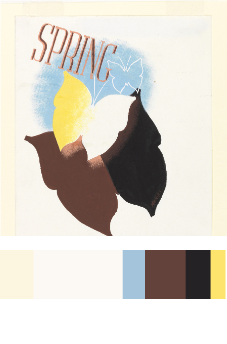
I chose this piece ( Spring in the Country, 1935) posted by Edward McKnight Kauffer, acquired it in 1963. I chose this piece to reference in my Humument book cover because most color contains in this piece are warm colors, like yellow, chromatic red (brown), and muted yellow. The theme I chose for my humument is relax, warm color can better to represent my theme, it gives a feeling of warmness and relaxable.


I really like how you gathered those color reference and add made it to your own book cover! I also like how the title of the book matches your tone of the colors. Nice work, I am assuming that you used Photoshop as well. Add what program you used and how many hours you put it to finish.
I like how you adapted Kauffer’s use of blue into your own cover design by using a similar position for it, and since that color goes directly between the instrument and the music notes, it seems to emphasize the contrast between them.