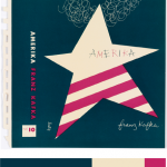

I picked this from the design gallery at the Cooper Hewitt, Smithsonian Design Museum; Book cover, Amerika, 1947 design by Alvin Lustig. The explanation of why Lustig made this cover is said from the the didactic from the web site that states, “…employ abstracted iconography and simple typography and lettering to create emotionally compelling representations of a book’s themes.” I picked this cover, because it was simple. As in, it had simple colors compared to others. Others tend to have multiple colors that it didn’t identify it, for my connection in the theme. Since my dominant color is dark blue, the use of shade in the ballerina drop shadow was difficult. However, if you see it closely it is actually a more dark shade of blue. I also used tint in the title of my book and also a shade for my name at the bottom. For over all phase 3, I spend about two hours. I didn’t use any tin or shade at the back cover, since I wanted the reader to actually see the text. I used Photoshop to complete this phase. Link to Cooper Hewitt Research: Here


I like the concept that you are going with. However to me, your book cover looks more like a CD cover. Is that the entire cover as in the front of the book alone? Or is the other half the back of the book? If that’s the case, then its perfect.
No, the right side is the back of the book. You will see them on Monday, and why I done that.