Homeopathy

Noun

a system for treating illnesses that uses very small amounts of substances that would in larger amounts produce symptoms of the illnesses in healthy people

I encounter this word in the reading “Extreme bias at Wikipedia on homeopathic medicine” by Dana Ullman. The word is found in this sentence, “After reading the below body of scientific evidence on the subject of homeopathic medicine, I hope that we can engage in a dialogue that will help reduce the amount of misinformation that pervades certain subjects, such as homeopathy.” Without knowing the definition of this word, I couldn’t understand what this article is about. Now I understand it is a system for treating illnesses.

Simultaneous

adjective

occurring, operating, or done at the same time.

This word was encounter while I was reading the article Lecture Me. Really, where it says “the mind’s energetic and simultaneous action upon and towards and among those new ideas.” Now I understand that this word mean something is done at the same time. A example of Simultaneous, If the two things are different, they are either simultaneous or in succession.

Hitherto

adverb

until now or until the point in time under discussion.

Source: Google Definition

This word was encounter while I was reading Lecture Me. Really. where it says “the mind of a number of ideas hitherto unknown to it,” Now I understand that this word is use to say until to some point in time. A example of Hitherto is someone had hitherto been silent.

Color Interaction Parings: Phase 4

Project 5 lightning and sun png

From doing project 5, I learned a color could look different compare to the original color when it is surround by another color. When the color is surrounded by low value color, the color will appears more brighter, when its surrounded by high value color, it will appears more darker. I also learn some techniques of illustrator. I think what I can done better in the project is I want to make the color illusion look more effective. I wish I could use what I have learned about illustrator for the last project. Total time took 4 hours to finish .

Color Harmony: Phase 2

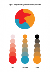
split-complementarypalette-01
Split Complementary Palette
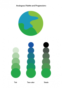
analogouspalette-01
Analogous Palette


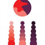
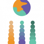
For Analogous Palette, I need to choose three colors from the color wheel that are adjacent to each other. And create color dominance by varying the value of one or more of your chosen hues by adding complement, white, or black. For split complementary palette, I need to pick first color and  two other colors that are are next to the opposite side of the first color on color wheel. Then follow the same step as split complementary palette.

This phase took 30 minutes to complete.

Color Interaction Parings: Phase 4

colorinteractionfreestudy

In this project, I did a research of the meanings of different color. Then I picked a color that I think it represents my partner’s personality the most. The color I chose is cream yellow. Because I feel like she is a friendly and quiet person. Next we chose a shared color that contrasts both of our color choices. I also learned how to use less-saturated hue or variation in value to create good contrast. Finally, we picked a icon for each other. By making the icon, I learned  some Illustrator techniques. I learned how to use pen tool to create a simple silhouette. I filled it with the shared color and place it within the background. Overall, I really enjoyed this project.

Color Harmony: Phase 1


Photo Link: 1st|2nd|3rd

I found these photos from google images and provided a link where it actually from. The first image is a sky with two colored progression. In which two colors are mixed in the middle and both sides takes two different colors that to show how it progressed to make the middle color. It also contains a little bit of chromatic gray shades in the middle since there are clouds. Secondly, I this image was posted in some kind of corner form, called Big Blue interactive which it said, “In honor of Flowers…” one of the post by Pete from Woodstock on 5/5/2015 11:21 am. There is different types of color that pansies produces as they flower. I picked this one instead of others since others had a relationship in using tint. I can see the progression of shades going on from outer petals toward the inside where it gets darker. Lastly, I picked a flower that had a tint of progression in pink. I was surprised that this is from someone who is using OpenLab and he/she went to a botanical garden and gathered this photos. It clearly shows the tint where the color progressed from the middle of the flower to the outer petals. Since we really different have time to go anywhere as a class, and since I gathered this information from the internet. It took me about five to ten minutes to gathered this images and inks, however it took me about twenty to twenty-five to write this post. About thirty-five minutes to finish this phase.

Color Harmony: Phase 2

From our lesson, I learned the color harmony. There is different kinds of harmony such as use of gray scale, shades, tint, tone, compliments, and gradient. There is color relationships that I learned also, Analogous, Near-Compliments, and Split-Compliments. For our phase 2 of the project #6, I downloaded a template that my professor provided for us to understand and take practice in using tone, two-color, and shades. By picking three colors from the color wheel and using the Analogous and Split-Compliments. This part of the project was pretty easy and understandable, since we learned so much about color, and the way that how each relationships of the color works from our learning today. It took me the whole class to complete phase 2, so about three hours.

Exhibit Catalogue (Final)

This exhibit is presented by YingYang Zhang. Born and raised in KaiPing, China, then moved to New York where he now lives and studies. Tom Phillips, a British artist who began creating altered books called Humument at 1966. He altered every pages of a second-hand book by painting, collage and cut-up techniques. Phillips already published five versions of Humument. Yang combinded the concepts of Phillips’ Humument and what he learned from Graphic design principle 1100 and English 1101 to create his own Humument. The book Yang used is Of Mice and Men. The book is about George and Lennie’s ambition of owning their own ranch, and the obstacles that stand in the way of that ambition, reveal the nature of dreams, loneliness, and sacrifice. Yang really like those themes that revealed from that book, because he understands that if you want to make your dream comes ture, you must experience lonliness and sacrifice. Outside the book, Yang also came up with another theme that relate to dream—-freedom. Yang has lived in China for 16 years. He has seen many people’s dream being limited since they were children. In China, getting a good grade is more important than almost everything. Some parents would force their kids to study very hard. They don’t even have the freedom to do what they want, not to speak of their dream. Yang feels regret for those children, so he decided to create these themes in three different pages for his Humument. To create the pages, Yang used X-Acto knife, black bristol, glue, No. 6H pencil and black big brush. For the first page, Yang named it Route of Dreams. It represents Of Mice and Men’s themes of dreams and loneliness, Yang used an X-Acto knife to cut out shapes of a dark cloud, lightning, and a bird from black bristol, then glued them on the page to create the obvious composition. The dark cloud and the lightning stand for the obstacles of our dreams, and the bird is used to represent loneliness. On the way to achieve our dreams, we would encounter situations that no body could help, we have to go through it by ourself. We might feel lonely, but we have to get used it. The second page is called Broken. It represents Of Mice and Men’s theme of sacrifice, Yang used a No. 6H pencil and a black big brush to create the concept of pattern. Yang used the No.6H pencil to draw the shape of the pattern, then filled it with the black big brush.  The irregular lines staggered together makes it look like a broken mirror, represent the idea of sacrifice. In order to achieve our dreams, sometimes we might need to do some sacrifices. We might need to sacrifice our time, money, hobby, or mate. Yang believes all the sacrifices would be worth at the end. For the third page, Yang called it Freedom. He used a No. 6H pencil and a black big brush to create the concept of overlap. Yang first used the No.6H pencil to draw the outline, then filled it with the black big brush. In this page, you only see part of the heart. And the heart is separating in birds shape. Presenting the idea of freedom. Yang wants to appeal some parents not to limit their kids, let them be what they want to be.