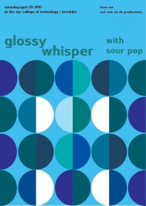
My partner was Klever Cobena, we worked on phase three where we followed the three cars that was already provided for us. The color (Cool), composition (cross-sensory) and style (Iggy Pop). We chose the colors between blue and green, however I added one violet color which I add in more blue to make it cool color. Some may notice that there is a white part of my phase three. It was intentionally, because I used the example from Van Gough-Cafe, where we talked about in class.
The OpenLab at City Tech:A place to learn, work, and share
Support
Help | Contact Us | Privacy Policy | Terms of Use | CreditsAccessibility
Our goal is to make the OpenLab accessible for all users.
top


I like the two basic colors your group chose to use, green and blue are both good examples of cool colors. The only suggestion I have for this poster is the color contrast of the figure-ground and the band name color. They are both like chromatic to me, plus the values are kind of same as well. I believe it will having a better contrast after you changed the value. fighting.
I can tell right of the bat that you had to use cool colors. I think you executed the different levels of saturation pretty well. The white really makes your poster pop even though there’s a small amount of it. I also just love a lot of blue :).
Wow! This is really cool. I like this poster. I see you had to use cool colors and goos job with choosing them, they make the composition really colorful with the different values and saturations. I can tell you put in a lot of time into this.
It must have been fairly challenging to get those circular shapes right in the beginning of your process, but it seems to have paid off quite well. I think the addition of violet was also a nice touch, and it wasn’t used excessively to the point where it detracted from anything else in the poster.