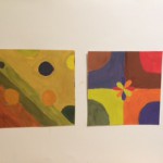
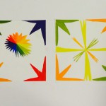
For the chromatic studies, I learned that we have to add a large amount of the complimentary colors which is a opposite color that shows in the color wheel (ex. yellow and violet). Muted Studies, I learned that you must add a little complimentary colors and add in white. However, putting so much color would lead into pastel which we do not wanted. Finally, I learned that in prismatic studies, you do not need add anything to change.
It was pretty hard making chromatic colors and muted broad and high key. I had to redo them which I will take picture and update after I get the project back. I redone the muted high key and for prismatic high key. What I also learned was I thought that I must add white to make high key, however we do not need to use white. It took me about three to four hours for each studies. Over all, I learned many things, such as chromatic, muted, prismatic, saturation, value, etc. In addition, I think I was able to learn a new skills in painting where I never would have, if I did not take this course.


Unique designs, interesting treble compositions of bubbles, lines, and flowers. In your prismatic phase, I notice you add a little bit white in your right composition, but there shouldn’t be any white in it. Other than this mistake, well done others. I like your work.
Yeah, I know that I even said that in the description that I am going to update the picture for the prismatic.
I like how you changed your designs throughout each study. Also I like how you took the time to fix one of your pieces. The chromatic needs to be darker though but I do love the colors you created.
Most of your concepts are executed fairly well within the parameters of each study, though I agree with Brandy that your Chromatic colors should have more complements mixed in so that they appear darker. Aside from the white on the Prismatic, I think that they’re both interesting concepts, so it would be interesting to see what you might add to it if you updated it.