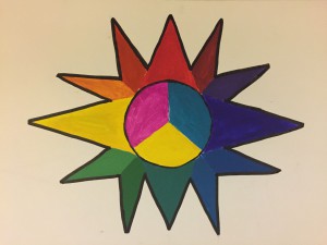
My concept for my color wheel was a sun, because since the sun gives light, color, and not to mention UV rays, I thought it would be a good idea to give it a good concept on about light and color. Drawing the sun in the center was a struggle due to the fact that it was difficult to tell if was placed in the center correctly and getting the size of each triangle evenly correct. The colors were a little bit of struggle, what was hard was getting each color to be exact or somewhat exact at least, but they turned out pretty well. It took me about 2 hours and a half all together.
The OpenLab at City Tech:A place to learn, work, and share
Support
Help | Contact Us | Privacy Policy | Terms of Use | CreditsAccessibility
Our goal is to make the OpenLab accessible for all users.
top


I think it was pretty clever to use the colors to make a sun in your work. What you could’ve done before adding color was draw an outline of the design then fill it in to make it look more polished and even. Other than that I like how you added a black outline because it gives the colors a more bolder look. Keep up the good work!
Nice work, I like how you had a concept on this art work. It would be more awesome if the points was more around the circle. It looks like each points are going up, down, and two sides. Including in between those would be cool also. Above all, nice work!
I like this color wheel, to me it looks like the sun with different colors on each rays. Very cretive, good job.