Sound Visualization: Phase #1

For this project, I listened to two types of music; Legato and Staccato to help me create patterns that go with it. Legato is music that is smooth and it flows. Staccato is music that has a fast beat and have breaks between the notes. The song that I chose for the Legato was “The A Team” by Ed Sheeran. This song was slow and had a smooth flow to it. For the song, the pattern that I drew for this were wavy lines. For Staccato, the song that I chose for it was “Very Good” by Block B. This song has a heavy beat to it and has some breaks between the notes. The pattern that I decided to draw for this was zig-zags. The drawings took about 20 to 25 minutes to do.

Legato: The A Team by Ed Sheeran

Staccato: Very Good by Block B

IMG_2511
      Legato
IMG_2510
Staccato


Sound Visualizations Project #2: Phase 1

The song I chose for this phase is Stay Ready, by Jhene Aiko. The reason I chose this particular song (other than it being one of my favorite of all time) is because it has many kinds of instrumentals that can be considered both staccato and legato. Its composed of two parts, first part being a very smooth and melodic tone, second being more acoustic and stable so to speak. Its starting tones have such a mellow and calm feel to it, sort of like a flow. These are some words that come to mind when i think “legato”. Upon the songs ending, it becomes more of a sharp beat and instrument. It has more of a pulse as well. Qualities i think of when it comes to “Staccato” The song does have kind of a monotony though, which is only broken when the songs second part comes in. Its bass beat is repetitive, though the sudden changes in the instrumentals keep it interesting regardless. Not a lot of songs use a “two part” format, but this song executes it well, especially since it actually breaks monotony with the sudden change in tone, beat, and overall emotion of the song.

Project #2: Draft

Have you ever been to any of the other borough other than Manhattan? Many of us are afraid to take a step forward to the unknown place that they have never set their foot before. What if there is an opportunity opened up before your eyes? Would you take a chance to discover something you haven’t encountered? There is an opportunity to discover more parts of the New York City, thanks to the City Technology College it made the student more motivated to discover something they haven’t yet in their life. One of the class, ENG1101 was assigned to work on this project that includes on walking from the college to any place around the neighborhood. Brooklyn is a great example of borough that shows the difference in social system and the overlapping such juxtapositions that includes old and new.

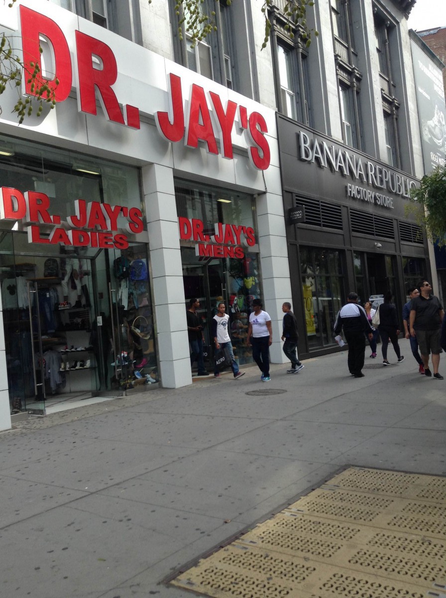
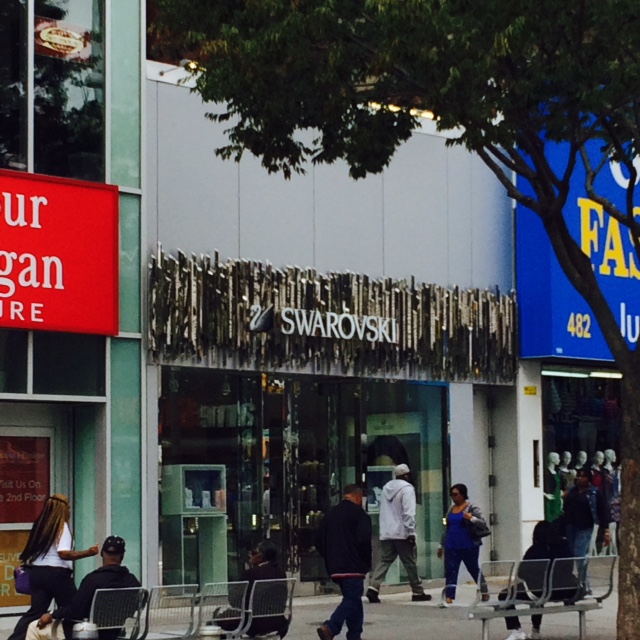
Brooklyn, the home of City Tech are combines with many mixed society that expresses equality toward the people and their culture. Brooklyn is nothing like what we see in Manhattan, Queens, or Bronx. Brooklyn is a place where all the borough are collided together. Making a whole new mixed city that does not identify difference in people nor their social class and culture. Some of the stores are old and new, the element of juxtaposition of the time where stores contrasts each other. One of the example is, there is a Off Price Fashion Outlet next to an expensive Swarovski jewelry store. This weird combination of stores next to each other makes this borough unique. Many stores on Fulton Street has something similar like this as an example. Another example of juxtaposition where time overlaps is; there was an T-mobile store in Fulton Street, however within few days the store was already empty and the sign were gone. This kind of phenomenon happens where your memory thinks that “It was just there few days ago” this is something that we don’t see it everyday, other than Brooklyn.

On the other hand, Manhattan is an interesting place where the place represents the tittle of New York City. Times Square, it is an very famous place where everyone knows about it, if you are currently living in New York City or if you hear its city name. The place is intrigues people by its lights of the Broadway show, TKTS, Sephora, Starbucks, the ball drop on New Years and it is called the place where beginning of fashion started. An example of juxtaposition where time overlaps is how the ruby-red stair case, TKTS was not there before 2006 where it began building. The moment where someone says “was this here before?” after nine years of living in the same city for so long, is not a big surprise. Other than the ruby-red stair case that everyone knows about, there was once a tower that was built as twins but as one. The name itself makes everyone become silent, because of what happened in two-thousand one, September, Eleven. This juxtaposition of irreplaceable memories and the historic event makes everyone become as one. It is something that unforgettable and unresistant to look away from the fact that it happened.

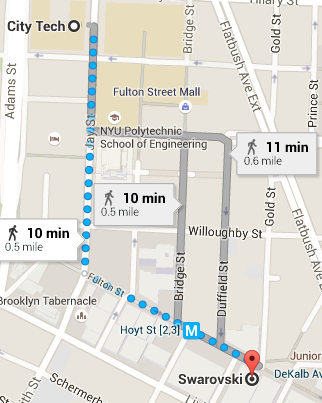
Comparing the borough between Brooklyn and Manhattan, it is shown that Brooklyn borough are more mixed in society. There is no difference in social class with the store management where everything have to be the same. Each store are different but in the same location. Because of these stores are arranged, it makes people “The buyers” feel more comfortable walking the place they are familiar. Many people are from different cultural background were seen in the borough, it is different than Manhattan where cars and performers are too noisy for county or upstate people. Brooklyn makes the people feel welcome and to show that there is no difference in their background stories. An example is Swarovski, an expensive jewelry store that is usually found in mid-town Manhattan. However, was found in Brooklyn where the store was next to an Off Price Fashion Outlet store. This historic symbol of an swan and its name itself represents their example of elegance and beauty, it also makes the store to stands out what is around it. This example shows the different juxtaposition of overlapping time and its historic figure of how Brooklyn is a borough that is special than other places.

To conclude, Brooklyn is a great example of borough that shows the difference in social system and the overlapping such juxtapositions that includes old and new. When there is a opportunity opened up, take the chance where they show the different part of city that you have not seen before. Thanks to the City Technology College it made the student more motivated to discover something they haven’t yet in their life. One of the class, ENG1101 was able to work on this project that includes on walking from the college to any place around the neighborhood. Manhattan can be a place that is intriguing, because of the Broadway show, TKTS, Sephora, Starbucks, the ball drop on New Years and it is called the place where beginning of fashion started. However, Brooklyn represent something more and unique that shows other people from the borough like us to understand their difference that are congenial to them. Places like Brooklyn, it makes you think that you just teleported to a different part of New York City, by only taking a few steps.

Project #2 (Draft)

New York City is often considered to be one of the largest and most diverse cities on the planet. Its reputation consists of a luxurious and beautiful city, with opportunities at every corner, as it’s been portrayed through all types of media throughout the world for many many years. However, an actual New Yorker would know that New York is more than that. For every single individual who lives in this grand city, New York is different. Its unique to the eyes of every person who views it. Though some bask in the luxury and a higher standard of living, there are also those who work and struggle, and take refuge in the lesser known parts of New York. Any two individuals who are in separate parts of the social ladder would have a different view of the city they live in, and would most definitely see New York different than anyone who does not reside here.  Interestingly enough, there are many neighborhoods and areas where an individual can actually physically see the overlapping of social classes, where there is a distinct juxtaposition of a more lower class and a higher class. Once instance of this can be seen in a particular location by Jay Street, at the corner of Prince Street and Myrtle Avenue.

In this particular location, there are many large buildings surrounding it. These buildings are mostly corporate and business, and are made up of mostly glass and steel. The street and area surrounding these buildings are very clean and well kept. You would hardly be able to find a piece of litter or garbage. Very important people walk up and down these streets, wearing fancy business suits and carrying briefcases and such. There is also lots of construction going on in this area, as there are many projects for even bigger buildings. This gives the area a distinct smell of sawdust and burning materials. It also makes the area very loud, of course. With all kinds of heavy machinery and equipment being utilized, it would be expected. One would notice it instantly upon walking here. However, upon walking across a single street, you would be stepping into a completely different environment. Located in the same area, there is a large community of housing complexes. or Projects as many New Yorkers refer to it as. This area contrasts drastically with its neighboring place. These tenements are run down with age and are not nearly as well kept. There is lots of garbage and residue littering the street up and down, and there are also large dumpsters behind each complex, giving the area an unpleasant smell of waste. This is the “New York” that many never view, and is more a part of a lower class residents vision of the City.

What’s interesting about this particular location is the juxtaposition it holds. Its a very contrasting one, and its very clear to distinguish as well. Literally, one can see both of these areas side by side, by standing at the corner of these two streets. Its an even intersection. Its a perfect example of how New York City is different for everyone. There are individuals who live here who don’t even know that such places even exist, for they have their own view of the city, as they have seen it their entire life sometimes. Then there are those who parts of New York like this one are their entire reality, and is their vision of it. One person might be accustomed to having their morning coffee at a place like Starbucks, while another would go to the bodega at the corner. One might have memories of growing up playing in Central Park during the summer, while others remember playing in the fire hydrant with the other neighborhood kids. These types of contrasts are mostly founded on the grounds of social class. People who reside in the higher class will always have a different vision and reality than those in the lower class, especially when residing in a place like New York City. Same way those who do not live in the New York have a distinct vision of it as well, as they have only seen it through Television or other kinds of media. Though social classes is only one of the endless number of factors that contribute to a persons “personal New York” This is what makes New York City so unique to every single individual. If you were to ask anyone what New York was to them, every answer would be different. And for an infinite number of factors. One could even consider this the true definition of being a New Yorker.

Eng. Project #2 Draft

New York is an ever changing place with many places throughout the city tending to overlap with two different New York’s.  So I went around the surrounding area of City Tech to find one of these Overlapping New York’s, I finally did at Brooklyn Heights. First off I exited the Namm building and turning left down on Jay Street towards Tillary Street. From there I made a left on Tillary until I got to Clinton Street  you know that you’re going the right way because on your left is a small park dedicated to all the Korean war veterans.  I continued to follow Clinton Street until I hit Pierrepont Street. When i arrived at Pierrepont Street I followed it noticing all of the nice buildings and how many of them differ from each other and how much they differ from the buildings I’m used to in Times Square, until I finally arrived at Brooklyn Heights.

The overlapping New York in that area is that you can see the huge differences between the small building in Brooklyn Heights and the huge towering buildings of Manhattan. You can see the difference between them in that all the residential buildings in Brooklyn Heights are made of brick while the huge buildings of Manhattan are made of steel. Also from the side of Brooklyn Heights some people may have different views of both Manhattan and Brooklyn. For example some people from the side of Brooklyn Heights may see Manhattan as the place where they work while others like myself see Manhattan as home. On the other hand people on the side of Manhattan looking at Brooklyn will either see Brooklyn as home or either as a foreign place to those who may have never been too Brooklyn. While I was there I also saw a photograph of the old New York skyline with the twin towers tied to the fence. I thought that it offered a bit of insight into someone else’s New York. For example someone who might have lived in Brooklyn heights before 9/11will remember the skyline before the twin towers fell and therefore make that a part of their own New York while those that came after 9/11 only know what the skyline might look like without the twin towers or with the Freedom tower in the skyline. Regardless those are three different New York’s that may belong to anyone that lives in Brooklyn Heights.

Also in view at Brooklyn heights is the Brooklyn Bridge to everyone it represents a connection between both Manhattan and Brooklyn. This bridge is used to bridge two different people, even though they are the people in both Brooklyn and Manhattan are still all New Yorkers they are all entirely different people. So in that sense it is not only a bridge between Manhattan and Brooklyn but it is also a bridge between different New York’s

In the photo I took captures the juxtaposition between the small quaint buildings in Brooklyn heights compared to the huge towering buildings in Manhattan. You can easily see the differences between the buildings size and design. It also captures the differences between the different skylines of the different New York’s and how some people may have grown up with one thing while others grew up with another.

Project #2: Including senses

As I was making my way towards my location, I walked through a busy street filled with different kinds of people, different kinds of smells from food carts, construction and honking cars. The lively area of Fulton Mall is filled with a variety of different stores all in one place. While walking I came across a Dr.Jays right next to Banana Republic. After seeing that I felt a bizarre feeling because Dr.Jays is usually a store you would find in the Bronx while Banana Republic is a store you would find in Manhattan. The juxtaposition here is that Manhattan is more of a welcoming, metropolis area that tourists like to flock to . On the other hand the Bronx is more of a hood area that most people would be afraid to be in. The overlap of these two stores is just odd since the locations that they primarily found in are completely different in terms of environment and social status.

IMG_1095

Eng. Project #2 Draft #1

Project #2 Overlapping New Yorks

New York is always changing thus leaving different sensory in our neighborhood. I went around the City Tech neighborhood in look to find any overlapping New Yorks, and I did. In order to find the overlapping New York I found, you first need to exit City Tech from the Namm building. Once you are outside, turn right on Jay Street and start walking. As you walk for about 5 minutes, you will pass a parking-lot, a Halal Cart, a resting area where a lot of people will be sitting and socializing with their family or friends. Then the Jay Street Metro Tech subway. As soon as you pass the subway about half way through the block, look across the street and you will see the overlapping New York. You will see a tall beautiful building called the Brooklyn Fire Headquarters and right next to it you will see a small store name Metro Café.

The Overlapping New York here is a big beautiful building (Brooklyn Fire Headquarters) and a small store name Metro Star Café. The Big building is newly renovated, whereas the Café looks old as if it was there for a very long time. It has an old time look to it, but the fire house looks very nice and it fits the time period it is in. The fire house has a pointy roof top, you can see the patterns in the design on the roof, whereas the Café has a flat roof and you cannot even see it from the street view. The Fire house is a huge building about 6 stories high, and it even has a balcony. The café is just two stories high. The fire house has many windows about 20, where the café only has about 3. The fire house is made of brick where the café is not. On the café you can clearly see the name on it right at the top, but you cannot see the name of the fire house on the building anywhere. My guess is they have not put it up as of yet. The fire house has a arch door entrance and a regular door entrance which really makes the design of the building beautiful. As for the café, it has a very basic door entrance.

The Fire Headquarters represents New York’s safety. New York is very quick when it comes to responding to danger. The Café represents New Yorkers and food. New Yorkers love food. New Yorkers live on Coffee, we have to get up early and coffee is the way to get that morning boost.

The photo I took shows the frame of both buildings. On the right is the small café, and on the left is the huge fire house. It captures the juxtaposition nicely. You can clearly see how different these two buildings really are. The main focus here is the fire house because of the size, whereas the café is so small, you barley look at it. These two buildings are completely different, the Fire house is big, tall, and very clean like the other buildings around there, when the café is a small short building smack in the middle of the tall big buildings. Both buildings however are highly maintained.


Project #2: Including senses

My location I picked is great, because I never been to this place. When I first arrived near the location, it was beyond what I had in mind. The different views and the smell of the mixed cultured food overwhelmed my nose as I entered the corner of the Fulton Street when you make a right turn. It was nothing like what we see in Manhattan, Queens, or Bronx. After the walk, it made me comprehend that Brooklyn is a place where all the borough are collided together. Making a whole new mixed city that does not identify people nor their difference in social class and culture. What I noticed was some of the stores are old and new, the element of juxtaposition of the time makes us realize that old stores contrasts the new stores in was that we don’t see everyday. My photograph frames the location, because it explains the definition of juxtapose. My location and the store next to it was totally different to each other in value that it contrasts. Many stores on Fulton Street in Brooklyn, has variety of differences in each location. Everything depends on where you stand and arrive at a different place even though you only took a few steps. As if you are teleported to a different part of New York City.

Swarovski
Swarovski
Swarovskijpg
Swarovski

Sound Visualizations: Phase 1.

The song I chose is Locked Away by  R. City  ft. Adam Levine.

The song starts off smooth, then it went to a sharp beat, then a steady repeating beat. Then sharp again and back to smooth. I saw a curve line in the beginning and then it starts going zigzag and then it went back to a nice curved line. I also can see a strait line and then a spike in the middle when I hear the piano beat. I see small spikes and large spikes, depending in the beat. This song has rough, sharp and smooth flowing beats.

(Time spent on this phase – 20 Minutes)

Sound Visualizations: Phase 1

For my design for project #2, I found many repetition and patterns of squares and triangles. I was doing it intentionally, because I couldn’t think of anything else that represents staccato. Staccato is something that has the beat of fast and sharply detached or separated from others. Because of the sharply detached sounds from the song, it became more geometric than the legato deign. On other hand, legato is a smooth, calming note that has no breaks in between. Because of the long lasting flow to the music, it made the design more organic shaped. Another thing that I want to add is that some of the songs are not as easy to identify the beat of the music. Some of us had struggle when identifying the beat, which some changes during the course of music.

Music that I listened to: Here

I listened to this music while designing, because I liked the beat where it shows many examples for staccato. There is some parts of the song that are legato where it inspired me.

*Note, I might change 1 or 2 design due to my feelings for it. (Will update when I finish the new one)

Took me about hour each for legato and staccato

Staccato
Staccato
Legato
Legato