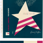
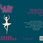
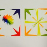
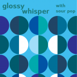
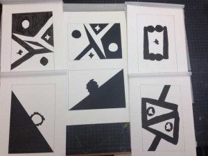
For this project, I picked dominant, sub-dominant, and accent colors from the design museum we went as a group. It was called, Cooper Hewitt. As I saw varieties of different designs, this book cover made me catch my eyes since it had all I need for this project. I picked it since it was simple to work with, and the choice of the color matched my theme itself. I used the eye dropper from the color inventory and used Photoshop over all to make the new book cover (at the right). I picked ballerina for my cover since I used a ballerina in one of my design it self. I used my theme for my style in the font also. I gotten the quote for the back and I done everything else at the back with the bar code and the numbers and the lines are all changed to the color I picked from my inventory. Over all for this project, other than the time we went to the museum, it took me about two hours to work on it. I also liked this project, since I was able to express freely about the theme of my book and how I was able to use technology to work on it.
Tag: Phase 4: Deliver
Project #3
People are different in many ways some like to take long walks while other just want to get from point A to point B in the fastest time. When people go for a walk there are different things people would like to see or do on that walk. Everyone is different some people like to see different things on their walks like things that they may deem beautiful to them. Others might not want or care to see anything beautiful on their walks; some might just want to get from one place to the next in the fastest time while others want to go somewhere peaceful and beautiful. For me I love to take nice long walks, I don’t even need to be going anywhere in particular as long as I am not busy. But for me the ideal place to walk through, that is by the water.
On the walk I choose to take I walked from Citytech over the Brooklyn Bridge too City Hall. I choose this mainly because I love to be by the water so when I went over the Brooklyn Bridge it was refreshing to see the river instead of the usual tall buildings of the city. “No mere river crossing, this span is an elegant reminder of New York’s history of architectural innovation. When it opened in 1883, the Brooklyn Bridge was a feat of engineering: It was the first structure to cross the East River.” It was also really nice to feel the wind blowing in my face and being able to see Brooklyn and Manhattan from a different view. In a way it helps give us a different perspective on the way we see Manhattan and Brooklyn. For this walk I started from City tech and walked to Tillary st. where the entrance of the Brooklyn Bridge is. As I was walking I watched as the buildings stopped and I began to see the river. Even though it may have been noisy due to the passing cars on the bridge it still was very peaceful for me because seeing the river and both skylines of Manhattan and Brooklyn are pretty breathtaking. I continued on my way until I made it to City Hall Now if you would like to enhance your walk I would say that crossing the Brooklyn Bridge at night is your best bet, the view of the city is enhanced due to the light emitted from the city. Even other people agree that the Brooklyn Bridge is the best spot to get the most beautiful views. On different websites you can see that people have a lot to say about how beautiful the view can be from the bridge. “Everyone should walk the Brooklyn Bridge, I have been to New York quite a few times and have never walked the Brooklyn Bridge. It is such an amazing view and worth it to do this especially as the sun is setting, its perfect!” another person said “it has a Magnificent view, excellent experience, refreshing from the building infested city, either for a romantic walk, or for a friendly catch up with a view or a family trip.”
Another walk you could take that also delivers on the breathtaking view of the Manhattan skyline is the Brooklyn Heights Promenade. This location is another one that I enjoyed walking through mainly due to the fact that it is also by the water. The Brooklyn Heights Promenade is one third of a mile long, here it gives you a beautiful view of the Brooklyn Bridge connecting two people, people from Manhattan and people from Brooklyn.
“The Brooklyn Heights Promenade will take your breath away. Made famous by cameo appearances in movies like Annie Hall and Moonstruck, it is one of the most romantic spots in New York City, and has been the destination for thousands of first dates, wedding proposals and anniversary celebrations.”
I would also like to reiterate what I said before in that this locations view is enhanced when it is night time. For this walk I also went up Tillary st. but instead of going onto the Brooklyn Bridge I continued straight noticing the nice architecture of the post office as I went along until I got to Cadman plaza W. from there I made a left until I got to Pierrepont st. noticing the Columbus park as I passed. From there I followed Pierrepont st. until the end. On that street you can see some very beautiful architecture from the nice houses there so take your time when walking.
All in all I want to impart these locations so that others can experience the same beautiful sights I have because in its own way you have to be there yourself to truly experience the sights. No picture can truly give you the same emotion as being there for yourself.
Works cited page
Terzian, Peter. “must-see Brooklyn Heights March” 03, 2014. Web. November 16, 2015.
“Brooklyn Heights Promenade” New York Harbor Parks. November 16, 2015.
Freudenheim, Ellen. “How to Walk the Brooklyn Bridge—Manhattan to Brooklyn, Brooklyn to Manhattan” November 16, 2015.
ENG 1101 Project #4 Cover letter and process post
Please write a private post to share your thoughts as you ordinarily would in class on paper for the cover letter, and on the site for the process post.
To make your post private when you write it, click on Edit next to Visibility in the right sidebar, and choose Private instead of Public or Password protected.
In combining both letter and process post, please write about the following:
- What are you most proud of in Project #4?
- What challenged you the most in Project #4?
- How did you figure out your approach to the topic, both in terms of page choices and in terms of the theme?
- How did you approach writing critically about your own work your project?
- How did you approach writing didactic panels that were exactly 60 words?
- Did you meet the requirements of the assignment?
- When you found out you had more time, what did you change?
- How much time did you spend on each phase of the project?
- What did you take away from reading your classmates’ work, from their comments, from my comments, and from class discussions?
- If you could have changed the assignment, how would you have changed it? What would you insist on not changing?
- Is there anything else I should know about your work or about you as a writer or as a student?
Please categorize your post as ENG 1101 Project #4, and find and use the tag Phase 4: Deliver, plus any additional tags you find useful.
Color Interaction Parings: Phase 4

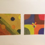
For this project, I had to use my knowledge of color interaction, where the color are the same but the background color tricks our eyes to see differently. Also, because of how one is more d saturated, and other are much more muted color. Making the logo stand pop out or sinks it in. The hardest thing to do for this project was where we have to come up with a logo. We had trouble at first, however we decided on using abstract piece. (Explained in Phase 3) Took me about four hours and forty minutes in total, with sketching and everything.
ENG 1101 Project #3 cover letter and process post
Please write a private post to share your thoughts as you ordinarily would in class on paper for the cover letter, and on the site for the process post.
To make your post private when you write it, click on Edit next to Visibility in the right sidebar, and choose Private instead of Public or Password protected.
In combining both letter and process post, please write about the following:
- What are you most proud of in Project #3?
- What challenged you the most in Project #3?
- How did you figure out your approach to the topic, both in terms of location and in terms of the theme?
- How did you approach incorporating the outside resources into your project?
- To what extent is your project making a persuasive argument about taking the longer route?
- Did you meet the requirements of the assignment?
- If you had more time, what would you change?
- How much time did you spend on each phase of the project?
- What did you take away from reading your classmates’ work, from their comments, from my comments, and from class discussions?
- If you could have changed the assignment, how would you have changed it? What would you insist on not changing?
- Is there anything else I should know about your work or about you as a writer or as a student?
Please categorize your post as ENG 1101 Project #3, and use the tag Phase 4: Deliver, plus any additional tags you find useful.
Saturation Studies: Phase 4
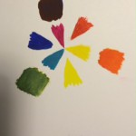
This project was pretty interesting, because I did not use paint ever since elementary school. I remember when I was mixing color back than, however comparing it to now it is very different. I had to learn new vocabulary such as saturation, value, temperature, lamination, etc to help me do the project 4. At first, I had trouble with the paintings, however from our critique I learned many things that I should have done instead to make it a very successful piece of art. I really liked phase 3 instead of phase 1 or 2 since we used Illustrator to help us create our band poster. It seems that I am very fit in using technologized material instead of working with paints.
The Pitch (Final)
You only live once thus you need to break off from your everyday routine and do new things every day, try new things, see new things. Enjoy life for what life is. And with this app it does just that. This app (The Beauty Finder) takes you away from your everyday boring walk to school and leads you in a new walk that will excite you and appreciate the way our planet really is. Although walking along Jay Street is the fastest way to get from the A/C/F/R station to City Tech, a route that passes Bridge Street, Hoyt Street, and Jay Street would be a better way to start the day because it offers The Beauty Finder users relaxation and beautiful inspiration.
When you’re walking in a city, your experience could change completely just by a wrong turn in a single block. One minute you’re walking along a crowded artery, the next you’re on a quiet residential street. In New York, there are so many different views and places all in one spot due to the diversity of this great city. Some people probably develop favorite routes, from either getting to and from their home to their work, school, and even the local grocery store. However when it reaches the time to go somewhere unfamiliar, like in a new neighborhood or city. Now what do you do? Which path do you take? You can look on a map or you can just type in your new destination it on your smartphone. But what you don’t realize is that will show you the most direct way from where you are to where you are going. Now some people may say that’s a great thing, they want to get to their destination as fast as possible, but what they also don’t realize is they are missing out on all the beautiful things they could see if only they spend an extra 20-30 minutes on their route to their destination. Does that faster route and smaller roads mean beautiful gardens or garbage and rats? It’s impossible to tell. Until now with The Beauty Finder.
They are so many beautiful routes you can take around New York City that will worth your wild, but the main focus today is a beautiful route from Hoyt – Schermerhorn, Brooklyn, NY, United States, to New York City College of Technology. By using The Beauty Finder, I will show you why you should invest your time in an extra 15 minutes of your daily routine from the train station to City Tech. Once you step out of the train station and begin your walk, you see these beautiful buildings surround you. Their glossy windows shining when the sun hits them, while the trees reflexing on them gives you a beautiful sight to look at.
Instead of getting off the train at Jay Street MetroTech Station and walk for about 3 minutes to reach city tech, let’s take a new route and see the beauty around the City Tech Community. This new route will only take you about 16 minutes, 13 minutes more than your usual walk to school. While on this new route you will see so many beautiful things you have never seen or even know about. This walk will worth your wild. You can walk this route both in the day and in the night. In the day you see everything every little details; the beautiful buildings, streets, trees, art on the walls and much more. In the night, you see the beauty of the lights as it sparkles in your eyes. In addition to this route’s beauty, aren’t you hungry in the morning or even in the afternoon after a long day at City Tech, and need to relax for a while? Well this route offers you a range of restaurants and fast food chains where you can grab a quick bite to eat or even sit in for a while, while you unwind and relax. Walking through Fulton Street, you can sit down and eat a delicious pancake or whatever your taste buds are craving that day at IHOP. Or if pancakes aren’t your thing, maybe a quick bite of Burgers and Fries suits you better or even Chipotle right in the middle of Jay Street and Bridge Street, called Metro Tech.
This part of the City Tech neighborhood is very busy, which is part of the reason why there are such a high number of restaurants so close together. When you first walk through the center, you are greeted by the beautiful pleasant scent of the Chipotle Mexican grill restaurant. Also when you’re eating don’t you want to look at something beautiful instead of burying your face in your smart phone? That is why this section has put a lot of expenses in constructing this business site so that it creates the beautiful view for people to appreciate as they eat. Right now they are new installments allover Metro Tech, they are the quotes you will see while walking around the Metro Tech Area. These quotes are beautiful and makes you want to think about what they are saying.
Also in this section of this beautiful route you can see the fall season take effect as the trees are stripped from their leafs, as they turned brownish-yellow. You can see them fall from the trees and blown by the wind as the children tried to catch them. You can hear the laughter and yelling of the young children socializing with one another in the park area rather than seeing them on a smart phone like every other place you go. You can also take a breath of fresh air and relax on a park bench and observe the beautiful art pieces that are placed all around the park area. This walk will clear your mind and will make you take a minute to appreciate the beauty of this city. And in addition to this new route and seeing beautiful things you will be exercising by walking an extra 13 minutes which is great for your health!
To summarize why you should take this route instead of your old boring two-minute walk from the Jay Street MetroTech train station to City Tech, this new walk you will show you the beauty of the City that will make you appreciate waking up in the morning and coming to class. This walk will give you a chance to unwind and loosen up while you gather some thoughts. This that is very helpful, especially for someone who had a long day and need to take some time to garth themselves back together. According Holmes,
“Beauty is not just a nice add-on — it has a function and purpose, and it plays a real role in the quality of your life and mental state. Studies show patients heal faster when they have a view of the outside from bed, and we are naturally drawn to spaces that please our senses.”
Therefore, Walking and socializing is a great way to relieves stress because you are putting the stressful things aside for a moment and enjoy the time and the things that are around you during that moment. By the time you reach the end of this route and entered the A train, your mind will be at ease because you took some time to slow things down and relax for once. And the best part is, it will only take a short 15 minutes out of your way which is worth the while. For this reason, I would highly recommend that you consider this route for the app The Beauty Finder.
Work Cited:
Holmes, Lindsay. “Stress Tip: Look At Something Beautiful.” The Huffington Post. TheHuffingtonPost.com. Web. 22 Nov. 2015.
Project #3: (Annotated Bibliography)
“The Advantages of a New Perspective: A Literary Walk in Brooklyn Heights” Blog: Walking Of The Big Apple (No name, Published October 12, 2010. Web. November 16, 2015.)
The buildings were famous from the churches in the nineteenth century and its elegant homes created by the merchants and sea captains in the shipping trade. The picture itself connects to the theme of beauty and quietness, and the photograph looks as the same when you visit this location. Also, it mentions about an author who wrote about the beauty of a yellow brick house. Since, we are in the generation of using technology, many social media is connected also so that people can comment on the site and share their experience at that location.
This website connects to the project, because it talks about the background of the location. It includes such pictures and detailed promotion toward the area that I picked for my location. Even with my knowledge of the Brooklyn Heights, it talks more about different things that I believe that it motivates the reader to go to the place.
Keywords: Beauty, Quiet, History -AM
Kaysen, Ronda. “Midtown’s Vanishing Historic Architecture” New York Times. June 5, 2015. Web. November 16, 2015.
Historic District Council deemed worthy of preserving 12 location and 36 were recently demolished. She mentioned in her article that, “None of these sites were designated New York landmarks, but for many people, they were nevertheless among the treasures that define the city’s neighborhoods — the mix of terra cotta and stone amid the glass and steel that makes the city unique.” Midtown’s Vanishing Historic Architecture, an article published in the New York Times by Ronda Kaysen explains the reader about the how some buildings in NYC should not be demolished. Ronda explains the reader how many buildings should be kept in preserved, because of the significant architectural built of each premises. It is in the matter time that the Midtown will reach the tipping point of losing these old and new mixture of architectural buildings.
This articles relates to the project in a way that can help the Brooklyn heights to preserve its worth. Such explained in the Midtown vanishing architecture, buildings are demolished each day’s. People should know this reality that these old memorable places should be kept. We should keep our eyes open for any changes though the Brooklyn Neighborhood. Such occurrence happening in Manhattan, there is still possibility that it is not safe in Brooklyn or any other boroughs.
Keywords: Beauty, Demolished, News -AM
“Walking New York” New York Times By: Different blogger, dates are all different also
This website is very high-tech in displaying each location with the picture in the background and scrolling once by reading the next page. Each location are explained in details that are not like a long boring text to read like in one of the article. However, it is a whole collection of people explaining each of their experience with the location that have visited. There is a map that it shows the location of the place they mentioned in the text. The images that is behind can be moved by your mouse or hand. Showing the bird’s eye view, like the google globe that goes endless with right and left.
Even though, the location and the website does not make any connection in which is about Brooklyn Heights. However I believe that it some how shows different aspect in where the background map moves when you drag it, which is cool that people who made this kind of technology should do it for different borough, such as Brooklyn. Sure, Brooklyn Heights is fun. However, there is so much more in different locations. By reading articles from different people, I am sure that however reading it would lead them to the location that they want to see.
Keywords: Creative, Beauty -AM
McGrath, Ben. “New York City Walk” January 03, 2005. Web. November 16, 2015.
An amazing person, Caleb Smith who walked all the streets and island of Manhattan in NYC. He explains in his own website that he took two years to complete this project. He explained in his website, what exactly he done in his walk and in his days in the summer he woke up five in the morning and began started his daily walk. He have a map that is marked with black marker which it shows all the line so of the street covered. He also have many thumbnails to show people what he had accomplished, and this is something that any of us could do.
This article relates to our project because it is something that we could do as a Brooklyn community. We can do what Caleb Smith have done, where he walked all the street in Manhattan. We can walk Brooklyn Heights and see the different views and architectures. We can learn from his unique walk and it does relates to our project, because he have done something similar to our walk in Brooklyn.
Keywords: Beauty, Creative -AM
Terzian, Peter. must-see Brooklyn Heights March 03, 2014. Web. November 16, 2015.
Small summary about the Brooklyn Heights which it explains the architecture and the history behind the location. It contains more picture than the text itself, because showing beauty with words is different than showing the actual place if that person been to. In addition, comparing it to different source, each pictures is taken differently in perspective angles. It also has a link to some of the words that the author included, so that readers can understand what he means on the website.
This article also relates to our project, because it shows the different perspective of pictures. It have taken from different angles and some are taken at night to show the difference in day and night. I think that this little description is good enough to say to the people who wants to visit Brooklyn Heights, because giving off too much could lead the reader to know everything, which I am sure that they want to figure out things themselves.
Keywords: Beauty, -AM
Value-Added Portrait: Phase 4
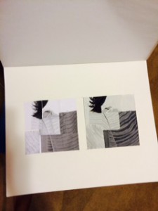
Project#3 was very interesting where I got to use paint and Photoshop in order to create my finial work.I learned many things from this project that will benefit me to the next project. Hardest part of this project was the painting, since the last time I painted was when I was in elementary school in Japan. I also screwed up on measuring my collages, so that the final project looks off for the Photoshop. I do not know what happened when I printed out my image version in JPEG. I specifically out it into 6″x 6″ however, I do not know how library printer works so the image came out smaller. Also, since my collage’s measurement was off by 2 to 5 millimeters, I had to add in more to the side. When I looked the final project, I noticed many errors that I can work on further more. Above all, I did pretty much “Ok” with the above all project #3. However, I could do them better next time.
Urban Artifact: Phase 4
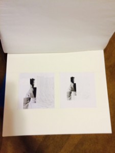
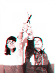
From this project, I have learned two different figure, stable and ambiguous figure-grand. My favorite part of this project is using the exacto knife to cut off the shape I want, although my desk was scratched, but its still a very nice experience. From the beginning to the end of the project, I have changed many details on my creations from phase to phase, I thought I could make them better. Indeed, I did make them better but I lost the concept of the words. I thought if I make the image simple enough and clear, it will be a stable figure, but stable figure have an imbalance of figure and ground (70/30), wherein the ground “supports” or surrounds the figure. This is what I have done wrong. And I hope in the next project I can clearly understand and memorize this little details.
