Congeniality(n.) – to be pleasing, welcoming. Warm hearted.
Congeniality is similar to “geniality” which means friendliness
Ex. “The hospital was very congenial, the staff treated me like family”
Congeniality(n.) – to be pleasing, welcoming. Warm hearted.
Congeniality is similar to “geniality” which means friendliness
Ex. “The hospital was very congenial, the staff treated me like family”
Vindictive (adj.) – To posses the need for revenge.
Ex. “The man stole the monkey’s banana’s and suddenly the monkey became vindictive to ruin his life.”
Cogent (adj.) – to be very clear and believable; convincing.
Ex. “I like your art project Kayla, your concept is very cogent. I can specifically see the message you wanted to send. ”
Pronounced: (k-oh-jent)

Time Spent – About an hour and a half.
My name is Jingyi (Jingyi Jiao). I was born in China, and came to the US when I was 13 years old. Before I came to live in here, I only know the easiest sentences for greeting, just like “hello” or “how are you”. So it was difficult and took me a long time to try to communicate with others. My English is still improving. Hopefully, I will become voluble and more fluent in English after I graduate college. I graduated from Midwood High School. During the time to make a final decision about which college to apply to, I was falling in deeply thinking about what I prefer to do in the future. I did some research on the college websites before to apply, and I noticed City Tech has a better art or design program, the distance is also not too far away from my home since I live in Brooklyn, so I chose to apply to the City Tech( New York City College of Technology). I love to draw manga, to read manga, and to watch anime began in childhood. Even many years later, the passion for it has never changed. I determined my future career must to be related to anime and design, such as animator, manga artist, or graphic designer, or the voice actress for anime. However, these were my occupation insights before this summer. I am now also interested in creating film as well. I developed this interest during this summer when I was volunteering at the creative department of a TV station names NTD ( New Tang Dynasty). As a staff volunteer, I went with an advertisement crew to make an advertising film. The director was stylish, voluble, and with a strong capability of directing. I was fascinated with that ability, and felt to be a director is a right occupation for her to express my creative and leadership ability. So now I add in a new future career in my consideration list which is the director. Apparently, this is the reason why I chose to enroll at City Tech, because they teach a lot about the computer program usage, including graphic design, film editing and animation courses.
My aesthetic is showing in my avatar completely. My avatar is a full shot of a Calico cat, tightly stuck his face on the camera lens. His features are big eyes, small mouse, and a huge puffy face. These features indicate one kind of genre as Japanese anime style. In my knowledge, in Japan they have two genres are called anime and manga. Manga can be multicolor or black and white, but without special circumstances or cover page they use to have black and white as figure only. Anime is opposite, it always has to be done by multicolor, the figure has to be colorful, sometimes with multiple movement such as animation of anime. They do have genres in America as well, but they call them as cartoon and comic, different calling and art style. Cartoon and comic are unfamiliar to me, I prefer Japanese genres more. Basically, my avatar’s genre is anime, its not varicolored manga because of manga with multicolor will never be this simple, manga are always coloring in complex ways.
My avatar can be considerate in a few different ways. Some people might misunderstand it as my avatar is just showing how comical, weird, and slothful the Calico cat is, but actually there are more tiny contents in this avatar you haven’t noticed. This avatar is reflecting my inner. Calico cat stuck on the camera lens is not part of his playful, it can be defined as he pursues to get closer to the others, wants to make friends, and wants to encounter with more people. He desired to talk with more people, so he will not be alone. And this avatar is from a Japanese anime, so people watch cartoons might harder to understand the art style. Same as me, I don’t really get the cartoon style, different culture contains different genres of art, and try to explore these different genres are our designer’s job.
My complete profile will convey who I am. What am I good at and bad at, what I don’t like and do like, what my career goal is, and what my hobby is. I am trying my best to let my classmates and people to know more about myself. My overall life will never live without anime and manga. I will be glad if I got a chance to go to Japan, so I could visit the place where Japanese anime produced and met with those amazing manga artists. I wish I could visit there in the near future.
In this project, I have changed it for many times to make it easier for readers to read and better understanding. I realized what I wanted to include was after I saw the theme word juxtaposition, “the act or an instance of placing two or more things side by side; also : the state of being so placed” , so I decided to start with choosing my two places that Im going to juxtapose. I determined what to eliminate is after my classmates leave me a comment. I figure out the project’s organization after having met with professor, she inspired me a lot. My classmate’s feedback helped me to consider what to include and eliminate, example like grammar, sometimes I put “the” in the place don’t need to, and my classmates help me out with that. I spend 20 mins on brainstorming, 1 hr on outlining, 2 hrs on drafting, 1 hr on revising, and 10 mins on polishing.

The first image is low key and second image is low key. The difference between these two image is that the low key image has dark color the most and the high key image has light color the most.
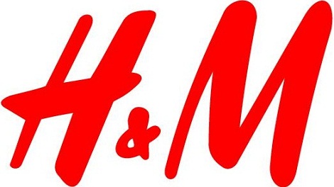
There are many juxtapositions near City Tech (The New York City College of Technology). The two locations I choose to juxtapose are Macy and H&M, both are located in Brooklyn, on Fulton Street, near City Tech. Although Macy’s and H&M are both stores that sell clothes, very similar decorations of the interior, but you still could find out the difference by juxtaposing them.
Fulton Street is a long street in northern Brooklyn. There are many chain stores build on it, include Macy’s and H&M. Clienteles prefer to have a clothes shopping in either of these two stores, the stores’ popularity and unique fashion style has attacked majority clienteles who interests on clothes shopping. Otherwise, these two clothing stores are controlling New Yorkers’ fashion storm the most. The six main elements to juxtapose are logo, size, item selling, building appearance, interior appearance, and demographics. The first five elements identify the rate of demographics, and the clientele type they have. The clientele has no age limit, can be teenagers and seniors as well.
Logo is the symbol of brand, represents a company, contains the management conceptions of a company. Macy’s logo design is horizontally and contains a red star on the left side of the letter “macy’s”. Instead of using apostrophe between y and s, they add a small black star replace on it for better visualization. H&M has a sloppy logo. It seems to be more like a handwritten letter, the letters are tilted to the right, and if you look at it clearly you will notice this logo can be written down by using marker, the endpoint of each composition has a little waving trace that can be done with a marker only. Macy’s and H&M are using different fonts for their logo, Macy’s logo is very similar to Avant Garde Gothic Extra Light, H&M’s logo is similar to Dom Diagonal. The logo shapes reflect their style. Macy’s tendency trends plain, cozy, generality, and stable. H&M trends stylish, and diversity. But they also have a common in color using which is red. “Interesting things happen when the creative impulse is cultivated with curiosity, freedom and intensity.”, by Rob Marsh. Red is color with strong intensity, “the color red is the color of energy, passion and action”, bright warmness color red can easily catch up clienteles’ attention to their logo, this is why many other companies are also putting red in their logo such as Youtube, Coca-Cola, etc.
The size of building implies how many classifications they do have. The larger the store is, the bigger the chance of clientele to get a view inside the store, unless a small store is famous. Macy’s size is larger and higher than H&M, plus underground floor it contains 7 floors, 5floors more than H&M, so it is possible for Macy to sell more different kind of items in their store, and after my observation, I find out they really do sell other stuffs. Other than clothes, they sell furnitures, fragrances, watches, and daily necessities on the underground floor and the floors over the 3rd floor. People go to stores for shopping items they demand for. Since Macy has more categories of item selling, the rate of the clientele are defiantly greater than H&M, because H&M sells clothes only. Another thing helps clienteles’ rate raises is the location. Macy and H&M are both located on Fulton Street, where many chain stores build on. Macy is getting a favorable place than others. A bus stop of B25, B26, B38, B52 is on front of Macy’s store, there are always many people sitting and standing at the bus stop waiting for the buses. The more buses stop at the bus stop, the more people will be there for waiting. The more people are there, the better chance for them to walk in the Macy’s store even they don’t demand for anything, maybe after they visit inside the store they will find out what they need to purchase. H&M has an inferior location stand, but in my own opinion, I like their building appearance more than Macy’s. Macy’s building appearance is laconically plain, appear light brown color. They have two large glass doors on the ground floor, and a few showcases beside entrances. Macy’s building has no windows, this appearance gives me a feel of less oxygen, depression, and gloomy. H&M build a glassy wall, support with Iron shelf, that means people can clearly see inside through the glasses, for better understanding what type of fashion they have sell, this way is much more efficient than looking at the showcase. In addition, this building appearance appears bright, clean, and fresh, unique building design attracts clienteles’ attention a lot. “Architecture is a visual art, and the buildings speak for themselves.” by Julia Morgan.
I have been to Macy’s and H&M twice for observing. The results of my investigation shows Macy’s clienteles more inclined to adult, clienteles for H&M are inclined to teenagers and who born after 90’s. I prefer H&M as a teenager, their logo looks contemporary creative, fashion styles are classified properly, not like Macy’s mix fashion, example when I looked for preppy style clothes I couldn’t find them as a group presents in a precise area, but in H&M I could. This is just my own opinion, not meaning as general. Everyone interests in different type of fashion styles, and this preference lead to the juxtaposition of Macy’s and H&M. “Fashion is about dressing according to what’s fashionable. Style is more about being yourself.” by Oscar de la Renta.
World changes with the passage of time. No one knows when things around would be change to unfamiliar, maybe a year, a month, or probably tomorrow. Many changes have led to most of the people become careless to the things around. But if you just paid a little attention to it, you will realize there are many small phenomenon you could realize in much detail ways. Since you juxtaposition, realize the advantages and disadvantages, you will always compare what you see to the others, and most time the equivalence will not be the same. Such as the Macy and H&M locate on Fulton Street. “Cities are about juxtaposition.”, by Richard Rogers.
![]()


high key
low key
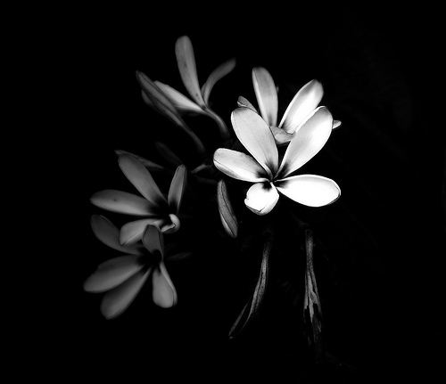
The first image is high key and the second one is low key. You can see the differences between the light. High key has a brighter figure and low key has a darker figure.
The OpenLab is an open-source, digital platform designed to support teaching and learning at City Tech (New York City College of Technology), and to promote student and faculty engagement in the intellectual and social life of the college community.

