Exhibit Catalogue (Final)

This exhibit is presented by Ka Yee Tsang. Tk is the abbreviation of her name Tsang, Ka Yee. She was born and raised in Hong Kong, then moved to New York where she now lives and studies. She inspired from Tom Phillips, in his A Humument book to create composition that draws and painting into the book pages, that combined the language and art of the vision. The concept of the Humument artwork, is creating the shapes, founding a text of the pages that have the different meaning of the original.

After understanding of the concept, Tk try to create the first humument design, she combined the skill of learning from the COMD 1100’s project. She used the line, repetition, variety, pattern and texture of her first design, which called “Flower” of the Enrique’s Journey book. In this work, TK wanted to create a simple idea that represents the Flower pattern. Set up the pattern like the painting book called ”Secret Garden”. This beautiful and interactive coloring book features delicate and highly detailed pen-and-ink illustrations. When she got the idea from the secret garden, she was using the black and white composition, then lay out the curvy figure, randomized draw though the page. To create the first humument page, she used ink brush pen and sharpie on paper. She was using a legato pattern to create the flower pattern. Legato mean in a manner that is smooth and flowing, I learned the concept to lay out the smooth and flowing line that creates the pattern look like the flower and bloom in the page.

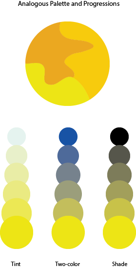
Using these concepts, Tk created the second humument page of her book, which called “Shackles” the idea of this page was intended by the artist to represent the idea of imagination. She used the markers drew the sun in the middle, and putted the chain to connect the sun. Everyone know that sun surface temperature of approximately 5,505 °C / 9,941 °F, Nothing can be closest to the Sun. In this second design, Tk putted the chain to connect the sun, that was her imagination of the page. Even though she didn’t used any concept of this pages, she tried to create something impossible but simple design of her artwork. At this page, she just used color markers and color pencils to create, because she thought the color markers will be more useful of drawing the sun in the middle without using the inking brush pens. The color was the perfect way to represent more detail of the Sun like she used the yellow and orange color markers. Then the chain used the color pencils to create it, who used the green color on the chain that has the contrast between the yellow, orange and the green color.

At Tk’s humument artwork, the last piece of her design called “Don’t You Love Me?”, the idea came from the page who was highlight the text to show the main idea of the character’s feeling. Drawing this page, the concept is selected text to go though the character’s feeling, his mad, sadness and helpless of found his mother. Tk was using the text, “Don’t you love me?” “No one love me” that represents the feeling from the page, then drew the broken heart on the bottom to mention the idea. At the last text of the page, which was “Please bury me.” The sentence raised the character’s feeling of everything that can’t change at the reality. Tk used inking brush pens to cover the word that she didn’t want to show it, and lay out the main sentence to represent the main idea of the feeling. She also cut out some page to paste near the broken heart, when people opened the page, “the boy behind” those words will appear in front of you. Those words was deeply increase the sadness feeling of the this design. All the humument artwork was convey the message who try to contain the idea of her design, even though the story or the characters have their own plot, meaning and story.

Color Interaction Parings: Phase 4

For this project, I learned about simultaneous contrast. Simultaneous contrast is when you have to colors next to each other one of the colors change due to the contrast between the colors. In class we had to go through four studies (shifting value, shifting value with color, shifting hue but not value and shifting hue and value) of changing colors with simultaneous contrast. This was really fun to me because of the way the the middle color that was being surrounded looked like a completely different color. It was like an optical illusion and my eyes felt like they were zooming in on the color which was pretty cool. After getting through this phase the next step was to partner up with someone and create simultaneous contrast with colors that best represents our personalities. As a bonus, we also had to create logos for each other that represents our personalities but at the same time both logos had to be similar in a way. Not only was it fun getting to know my partner but the research in finding colors that represents different traits was fun as well. The challenging part for me was coming up with cohesive logos. I believe it was hard because there was a lot of different traits deal with so it’s was hard finding that one thing that represents everything. For the next project, if it deals with logos what I’ll probably do is do more research on how to create logos so I can have an easier time with that part.

Color Harmony Palettes

analogouspalette  split-complementarypalette

For this lab, the class had to complete two color harmony palettes; an analogous palette and a split-complementary palette. For analogous, I had to choose three colors that were adjacent from each other on the color wheel and add it to the three interlocking forms. I added one color to tint, two colors for two-colors, and one for shade. For split-complementary, I did the same thing except for the colors. I chose one color and two other colors that were either side of its complements on the color wheel.

Color Interaction Pairings: Phase 3

color interaction

I found this project really fun to do. For project #5, the class had to pair up with someone and think of a color that represents their personality. For my partner, I chose a teal color. I chose this because it has a mix of blue and green. For blue, my partner is calm and creative. For green, it’s for his liking in nature. After we chose the colors, we had to choose a shared color that matched both our personalities. The color that we both agreed on was turquoise because we are both calm. We also had to make a logo that represented our partner. I chose a tree because of my partner’s liking in nature. This project took around 3 to 4 hours to complete.


Color Harmony: Phase 2

analogouspalette project                      split-complementarypalette project

In our lesson we learned all about Color harmony. We also learned about the difference between Analogous Palettes and Split Complementary Palettes. In phase 2 of project 6 i downloaded the template for what you can see above and basically had to experiment with any three colors on the color wheel until we came up with two different palettes that have a good sense of harmony between the colors.


Color Interaction Parings: Phase 4

For this project, I learned the meaning of the color interaction such as simultaneous contrast, optical mixing, and complementary colors. The fun part of the project, we have to create total 8 pairs of color studies will explore interaction by shifting value, shifting value with color, shifting hue, but not value and shifting hue and value. It was really fun at the first time and tried to analyze the different between those color. The important part of this project I really liked is phase 3 (Paired Color Identities with Simultaneous Contrast), because we have to observe our partner, try to find the perfect color to represent his/her personality, that is really fun to research the meaning of the color. Since we used the illustrator to create the 8 pairs of color studies, the phase 3 part will be easy and effective to make it. I would not change anything of this project.

tkandklevercolorinteraction

Color Harmony: Phase 2

analogouspalettesplit-complementarypalette

For the those two images, which is analogous palette and split complementary palette. It was the time to understand more about the color harmony. By picking three colors from the color wheel, and looking from the example, is easier to create the new one. Since I know the concept of the shades, tint, tone, gradient, gray scale, and compliments. It took 15 mins to complete at the class.

Color Interaction Parings: Phase 3

tkandklevercolorinteraction

I thought this project was fun. For this project, Klever and me picked a color that represents us for the color and the logo. These logo and color have to represent our personality which is yellow at the logo, because we are positive, clarity, energy, optimist person.  Then Klever chose the blue color that represents my personality such as bubbly, reserved, shy, etc. I never think I’ll be a blue color person, that is the first time someone say it. In my observation, Klever is a talkative, positive, optimistic person, when I see the meaning of an orange color, the color is represent his personality very definitely. After that, we had to come up some idea for the logo, than I saw his necklace which was a bird from the movie (hungry game). I came up some idea like phoenix or bird that prominent his personality, because Klever has leadership at the class participation. When I used to draw the logo of the illustrator, it took me half hour to finish it. I know how to use the illustrator that is more helpful and save a lot of times to create it. I really liked this part of the project 5, and thank you to my partner Klever who understands and help me a lot of this project.

Exhibit Catalogue (Final)

To change a theme of a book by using the text from the original book is not as difficult as it sound. This exhibit is presented by Xingfu, Ye. Ye was born and raise up in Zhejiang, China. Then he moved to New York where now he live. Ye is a student of New York City College of Technology whose major is graphic design. He get inspired by a British artist Tom Phillips’ recreation “The Humument”.

“The Humument” was first publish in 1970, it was a recreation of W H Mallock’s Novel “A Human Document”, and the name “The Humument” was come from the original novel name. Tom Phillips took out “an” from the word human, and “Doc” from document, then he put two words together become Humument. The purpose of this is to recreate a different theme and story of a book to let reader have a different experience of reading the original book and recreated version of the book.

Alice Taylor’s novel House of Memories is a story of resilience in the face of family tragedy. Ye have recreates few pages of House of Memories with different theme, his favorite three pages are “Great Position”, “Death and life”, and “Twisted space”. In first page, Ye try to convey a great position, so he used Ruler, Pigma Micron 05, and PITT artist Big brush to draw lines and solid bridges to support the center. The idea was come from the text where he found the words “Great position”. He is trying to explain that how could a position stand out, a great position is where the surrounds are supporting one area to make it a great position. For this page, if views did not see the word great position, they might be confuse and not understanding about this page. In the second page, life and death, Ye also used Ruler, Pigma Micron 05, and PITT artist Big brush to drew circles and line taps, half of which were filled in with black ink and the other half left blank. The idea was came from the text, the words “dead,” and “live”. Ye is trying to express that live and death are so close. The lines was drawn twisted, because he wants to show that life is difficult so is death. Views might confuse about the circles, Ye said he drew circles was trying to represent spirit, but he did not write in the description, because he think the circles could also represent as events that makes how the life is going to be, different person has different views. In the third page, Ye drew a snake goes in circle like a sea shield also with Ruler, Pigma Micron 05, and PITT artist Big brush, this is trying to convey a Twisted space. Ye said this is how he thinks a twisted space look like, a twisted space in his mind is like a space that everything is twisted and has no end. In this page, views might think that this drawing look like a portal, Ye also had a thought about that, however he thinks inside of the portal there must be another space, and that space is just like what he have described.

Understand Tom Phillips’ Humument project, Ye used with all skills and techniques from Graphic design principle 1100 and English 1101 class to create this humument book.

Ye’s recreations give readers a different point of view of the original novel. From a resilience in the face of family tragedy story to a imagery of fantasy story. Each page contains a small message about the new theme of the story.