Didactic Panels

Panel #1

Tyler Santiago

Born in Ozone Park,                                                                                                         New York, Lives and studies in New York

Geometry, 2015                                                                                                                         Ink brush pen, inking pen, and used hard cover book

In this piece Santiago tries to convey geometric shapes surrounding the word literature, he also tries to convey what he learned in his COMD 1100 class on negative and positive space the book page color being the negative space and the black being positive space and on the ambiguity of this piece.


Panel #2

Tyler Santiago

Born in Ozone Park,                                                                                                         New York, Lives and studies in New York

The Beat, 2015                                                                                                                         Ink brush pen, inking pen, and used hard cover book

In this piece Santiago tries to convey a sound wave to go along his learning of staccato and legato sharp and soft sounds conveyed in a drawing. Santiago’s piece shows his way of seeing a staccato or sharp sounds in his drawing of “The Beat”.


Panel #3

Tyler Santiago

Born in Ozone Park,                                                                                                         New York, Lives and studies in New York

Flakes, 2015                                                                                                                           Ink brush pen, inking pen, and used hard cover book

In this piece of work Santiago shows different variety in this case there are a lot of triangles but not a;ll the same sizes, so the variety is shown by all the different sizes and positions of all of the triangles which to him looks like flakes falling from the sky.

Exhibit Catalogue

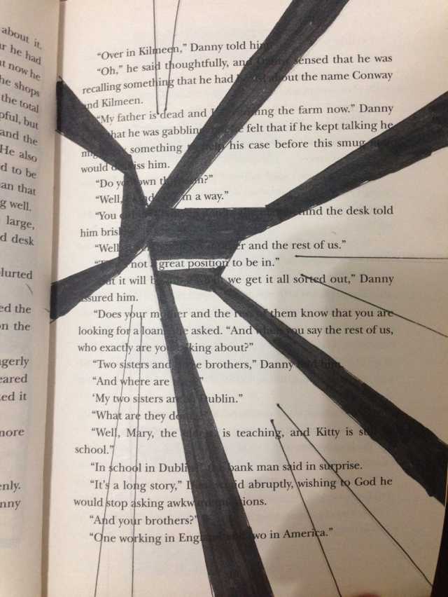
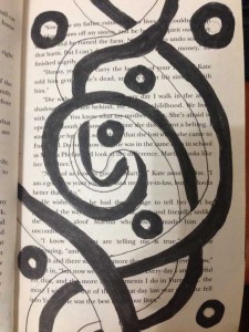
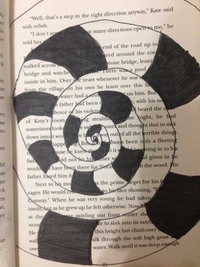
This exhibit is presented by Ayano Morishima. Born and raised in Tokyo, Japan, then moved to New York where she now lives and studies. Tom Phillips, an English artist who set a task himself to find a second-hand book for altering every page by painting, collage, and cut-up techniques to create an new pieces of art, called *Humument. Understanding Phillips’ concept behind his creative art work, Morishima combined different techniques she learned from her *Graphic design principle 1100 and English 1101 class to create a humument book. She changed the theme of the book, Wishes to a crazy wonderland theme to show completely different side of wonderland. She also got ideas from the origin of the story, Alice’s Adventure in Wonderland by a English author Charles Lutwidge Dodgson under the pseudonym, Lewis Carroll in 1865. She used her technique in using ink brush pen, *x-acto knife, old book and folding to show the viewers, the new kind of story that unfolds. For the first design, Morishima used the ink pen brush to make many repetition of connected diamonds to indicate a chandelier, blocking out most of the text in the book to show how visible text are connected to the picture that is shown as a ground. In addition, using figure and ground technique to show the viewers where exactly to see; in her case, the shapes of the ground shows more vividly since the black ink, the figure blocks out other context. For the second, she used x-acto knife to cut open a block of text at the bottom of the page and glued only in the middle. By doing this, she wants the viewers to show there is a book in a book. Same as the first design, she used the technique of figure and ground, showing the ground to block other context with the figure. In addition, by folding the corner to the right top, it shows the next design that shows the technique of a *chromatic gray that Morishima learned. Down into the rabbit hole, it leads the viewers to go though the door to read a little book that came from the concept of the original. For her last design, she created the after math of Wonderland. The madness in wonderland was finally came to the end; still in the land, the ballerina indicates the beautiful dream that it stabilizes the wonders in the wonderland. Many would think that the ballerina could be Alice, however it is not necessary that the ballerina indicates Alice, since her being is the character in the original story, which is completely different from Morishima’s humumet art. She also used ink brush pen to create curtains on the right and left sides to show that she is on a stage, and other words that fits with the concept of the page, such as dancer, moment, felt, perfect, and choice. Morishima, made this humument to attract people who are interested in creating their own story. It conveys though out each pieces of art work and detailed design, where it tells the message in the theme. Single page contains a message where Morishima’s story that she made though out the humument art, she wants the viewers to understand that stories can be can be rewritten to make new ones. Even characters, make them have their own destiny with out following the original story.

*Humument: Entirely new version of book that is created from the original, such as adding painting, collage and cut-up techniques. Link
*Aka. COMD 1100; college courses that is part of Learning Community: Ways of Seeing. Link
*X-acto: aka. Utility knife; short, sharp blade mounted on a pen-like aluminum body, used for crafting and hobbies, such as model making. Link
*Chromatic Gary: Grays that exhibit a subtle, but discernible hue; created by adding larger amounts the complement and white. (COMD |Chromatic Gray Studies) Class 19 Link

——————————————————————————————

  • I gathered information about Exhibit Catalogue from here
  • Link to “How to write Exhibition Catalogue” that I found that I thought it would be great example for other students
  • I mentioned Tom Philips’ work since his is an individual Exhibit Catalogue

Simultaneous Contrast

Image one

Image two

}H06ZU(HRI]A34T7H[]4353    U5)90R$_@QEQO8}8D7007{O

In first image, its like a reflection of a image however the colors are different. On the left, it gives a feeling of cool, and on the right, its the opposite, it feels warm. In the second image, I see that the trees have same color, but the tree on left side, it appears more gray, and the tree on right side, it appears more green because of the surrounding color.

Project #5: Color Interaction Parings: Phase 2

Group 1 – Achromatic gray studies

colorinteractions_value

For group 1, I learned how to make the two achromatic gray small square that in same value look different by vary the value of the large square. It took me about 15 minutes to finish.

Group 2 – Shifting value (with color)

colorinteractions_value2

For group 2, I changed the value of the large square but keet its color. It alters the perceived value of the two small squares that in same color. It took me about 15 minutes to finish.

Group 3 – Shifting hue, but not value

colorinteractions_huenotvalue

For group 3,  I learned how to make different colors have the same value. I chose one hue as my two small squares’ color and make this one color appear as two by varying the color of my two large squares. It took me about 20 minutes to finish.

Group 4 – Shifting hue and value

colorinteractions_huenotvalue2

For group 4, I learned how to shift both hue and value of  my two large squares to make my two small squares that in same color appear as two. It took me about 15 minutes to finish.

Color Interaction Parings: Phase 2

Group 1 – Achromatic gray studies

group 1When I learned on this group, I thought this was easy to create studies, because it was gray color. I didn’t have to think a lot of the value or hue.

Took about 10 minutes.


Group 2 – Shifting value (with color)

group 2This group 2 was a little difficult than group 1 because of the value options. I had to try many times to make it perfectly.

Took about 15 minutes, because I had to double check the color.


Group 3 – Shifting hue, but not valuegroup3

Group 3 was easy to create. I learned how to using two color but had the same value, then saw a difference in the middle square, to create the misconception.

Took about 10 minutes


Group 4 – Shifting hue and value

group 4When I knew how to create the group 3, then group 4 will more easily. Just combine group 1-3 knowledge to create.

Took about 10 minutes.


Group 5 – Extra Credit

Extra CreditThis group was difficult because I had to make sure the color of the middle squares look the same one.

This took about 20 minutes

Didactic Panels

Panel 1

D5C247B1FFE3CD93430082973EB29DC1 Xingfu, Ye

From zhejiang, China

Great Position

Pigma Micron 05, and PITT artist Big brush.

To convey a great postion, Xingfu draw Lines and solid bridges to support the center where the words “Great position” are. He is trying to show that how a great position is like, a great position is where the surrounds are supporting the position to make it a great position.


Panel 2

0906A3A5394746BF3B99887EAA217FF1

Xingfu, Ye

From zhejiang, China

Death and life

Pigma Micron 05, and PITT artist Big brush.

To convey life and death in the image, Xingfu drew circles and line taps, half of which were filled in with black ink and the other half left blank. The idea was came from the text, the words “dead,” and “live”. He’s trying to express that live and death are so close.

Panel 3

9673EC80B025199F4F1231FB7AB9D72B Xingfu, Ye

From zhejiang, China

Twisted space

Pigma Micron 05, and PITT artist Big brush.

In Twisted space, Xingfu drew a snake like tape goes in circle like a sea shield. He is trying to express how a twisted space look like, a twisted space in his mind is like a space that has no end and it keep continue twisting.

Color Interaction Parings: Phase 2

Achromatic gray studies

Group 1: For this study, I learned how to use different shades of grays to change the color of the middle square. The squares in the middle are the same color but the surrounding color makes it appear as though it’s a different color. It took 20 minutes to complete.

Shifting value with color

Group 2: For this study, I learned how to keep the color of the larger squares but change the value. The squares in the middle are the same color but with the change in value within the surrounding color it changes the appearance of the square in the middle. It took 20 minutes to complete.

Shifting hue, but not value

Group 3: For this study, I learned how to make different colors have the same value. The squares in the middle are the same color but the surrounding color make the little squares appear as if they have the same hue as the surrounding color. It took 35 minutes to complete.

Shifting hue and value

Group 4: For this study, I learned how to change the appearance of the middle squares with different hues and different values. It took 35 minutes to complete.


Project #5: Color Interaction Parings: Phase 2

Group 1 – Achromatic gray studies

colorinteractions_value(group 1)In group one, I think its the most easy part of this phase. All I’m doing is pick two different value colors to make center color look like they have different value, in fact, they have exactly same value.

Time took 10 minutes.

Group 2 – Shifting value (with color)

colorinteractions_value(group 2)

Group two is also kind of easy. I picked a color and change the value of the color to support the center color look different in value.

Time took 10 minutes.


Group 3 – Shifting hue, but not value

colorinteractions_huenotvalue(group 3)In group three, it did challenge me a little. I have to find two different color and make them have same value, and they have to support the center color look like they have different value.

Time took 20 minutes.

Group 4 – Shifting hue and value

colorinteractions_huenotvalue(group 4)

Group four is very similar to group three, the only different part is I can change the value of the two color.

Time took 10 minutes.


Group 5 – Extra Credit

colorinteractions_huenotvalue(gourp 5)Group five is similar to group four, however group four end up with center color looks like has different value, and group five is to change the value of center color to make them look like exactly same, in fact the value are different.

Time took 20 minutes.

Color Interaction Pairings: Phase 2

Group 1: Shifting Value
Group 2: Shifting Value in Color
Group 3: Shifting Hue, Not Value
Group 4: Shifting Hue and Value
Extra Credit: Making Two Different Colors Look Alike

According to this project, I learned different compositions will give us different visual effect. Warm back layer gives an effect of pumping out the composition that over it. Cool back layer opposites that, it gives an effect of inward zooming, like a 3D tunnel. Also when you put the same color on both cool and warm back layers, you will see two colors that exactly same will became two different colors, which called simultaneous contrast, an interesting effect tricks your eyes. I think the most painful part is when you are up on group 4 and extra credit part, because you have already stared on compositions with simultaneous contrast for long time, so the illusion may caused headache and eyes damage. It decreased my concentrations a lot, therefore this part is the best part to challenge yourself as a designer.

I spend around 5-10 minutes on each pairs

Exhibit Catalogue Entry

This exhibit is presented by Jaichan Kirty. Jaichan Kirty was born and raised in Guyana, then moved to New York where he now lives and studies. Gathering inspiration from Tom Phillips’s altered text, A Humument, Kirty curate a project that integrates both words and visuals. Like Phillips, Kirty found an inexpensive used book entitled Portrait of Ivan. The Portrait of Ivan is about a young boy coming of age while he is also discovering himself. Kirty transformed this book into new artistic creations both in appearance, using ink, paint, pencil, cut-outs, and folding. Kirty also created a new title and theme for Portrait of Ivan. He had many ideas into the new title but finally decided on one, which is Portrait Van. The idea behind this new title came from the new juxtaposition theme for Portrait of Ivan, which is mysterious and creepy. This is a juxtaposition of Portrait of Ivan because a boy be coming of age is supposed to be nice and pleasant. The opposite of that is mysterious and creepy. In order for Kirty to create these compositions and start changing Portrait of Ivan into Portrait Van, Kirty blocked out a huge amount of the pages and selected words and phrases to emphasize. He then created images using those words and phrases he wanted to emphasize in that page of the book. The first piece of this exhibit is called “So that’s what it looks like”. Kirty has created a new window (a new view) into this book by using over-lapping to create an illusion of a boy, (Ivan) looking through a new page by cutting a square on the next page in the book. Kirty uses an X-Acto knife to carefully cut this square out of the page. Also Kirty uses sharpie markers to cover up a huge amount of the pages leaving out a few words that create its own new story. These words creates a whole new meaning of this page. “So that’s what it looks like”. The second piece is called “inside the house”. Kirty blocked out a huge amount of the page and selected words and phrases to emphasize. “Opening her eyes” and “Photograph of the house when it’s winter”, which he used to create images. The first image is an eye-opening and then he uses white computer paper to cut out the shape of a house to emphasize the “Photography of the house when it’s winter”. Kirty then used the cut out of the house and glued it on the previous page and used sharpie to create what it seems to be the inside of the house. The third and last piece of this exhibit is called “Blue Print”. “Blueprint” was created when Kirty painted over a picture with saturated primary colors. Kirty painted a blue box and inside that box is a print of a foot-step, hence the title Blue Print. After painting over the picture, Kirty then closed the book allowing the paint to print over on the other page creating a paint splatter effect. The resulting work merges image and text for each new project or concept in both courses he was taking COMD 1100 and English 1101.