From doing project 5, I learned a color could look different compare to the original color when it is surround by another color. When the color is surrounded by low value color, the color will appears more brighter, when its surrounded by high value color, it will appears more darker. I also learn some techniques of illustrator. I think what I can done better in the project is I want to make the color illusion look more effective. I wish I could use what I have learned about illustrator for the last project. Total time took 4 hours to finish .


Nice work, to look more professional, add vocab that we learned and add how much time it took you to finish this final work.
Good job, I agree with you, I too learned some new things in illustrator.
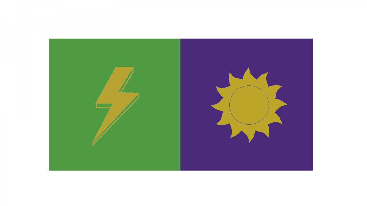
I like how simple the logo designs are. I do agree the simultaneous contrast is lacking here but nice effort. The color in the middle feels like it can be a cool color even though it’s yellowish, which is a warm color.