Day: December 18, 2015
Color Harmony: Phase 2
Exhibit Catalog (Final)
“Emma is Still Alive” is a piece created by aspiring artist Klever Javier Cobena. Drawing inspiration from Tom Phillips “A Humument”, the artist conveys a dark, mystifying, and gruesome atmosphere within his piece, using the contrasting original work of Jane Austen’s “Emma”. The concept behind both of these works is taking any medium of literature (i.e. a book) and turning it it into something completely new using different design aesthetics and artistic techniques. Originally a story of a young girl living in an upper class home in England, Cobena re-works that story with the the intention of driving it as far away from the original concept as possible. Using horror as a medium, Cobena decides to tell a tale of a a gruesome massacre, using only his design aesthetics and few highlighted words already within the pages of the book. Within the composition, a vast majority of the pieces are composed of either black ink, black paint, or black cut paper. Cobena, preferring black as a sort of “negative” color, utilizes materials such as Micron Ink Pens, Pigma Brushes, and Black Gouache Paints to re-work and block out certain words within the pages. With the given emphasis on certain select words that weren’t blocked out, Cobena re-tells the story through the artwork spread throughout the page. Certain examples within “Emma is Still Alive” include pages within like “Here Lies her Sins” and “Vision Of Shadow”, that use overlaps of two pages to create a single composition. Cobena uses nothing more than an exacto knife and a pen to create these overlaps, and express a single idea and theme with an overlap of two pages. Cobena also strongly integrates the concept of certain patterns of staccato nature, and legato nature. Using these concepts, Cobena creates certain moods and certain ideas using patterns differing between these two traits. On one page for example, one can view a sort of blood pattern running down on the words of a page, created using only a colored pencil and an HB sketch pencil. It has a a flowing, smooth pattern, and gives the viewer that feel and imagery of a bloody mess. On another page, there are images of sharp, jagged edges blacked out with a pigma brush, giving the viewer a sense of danger. Other design asthetics included with the piece also include ambigeouity, where Cobena utilizes the words on the page to create a layout that is very eye wandering and complex. There are also stable compositions, where he instead makes a focal point on the composition, drawing the viewers attention to a specific spot. Although most of these pages consists of mostly black color schemes, there are also works of color included within the piece. Cobena skillfully shifts certain traits of pure bright colors like prismatic blues and reds, to make them less saturated, decreasing their value, and keeping the visualities of darkness and negativity to stick to his theme. All while conveying their intense expressions and ideas they were intended to.
Color Interactions: Phase 4
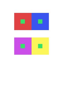
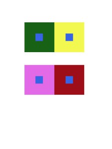
Reflecting on this project, I seem to have some sort of understanding of all the concepts we were intended to learn, although i hope to grasp an even bigger understanding of them throughout more of my courses. With these color interaction studies, i was able to learn how colors are much more than what they seem. I was able to understand how intergrating concepts like saturation, value, hue, and tons can affect a color, and create something completely new.
Color Interactions: Phase 3
With fellow classmate TK, we both researched on how color can be used to express certain personality traits. Not knowing too much about each other, we composed a list of how we saw each others personalities. Based on that list and our research, we created our Paired Color Identities Composition. 
I decided to choose a more lower valued blue, with less saturation for her personality. I felt this color was suitable for her, as i saw her as a more cool, clam, and reserved kind of individual. She is also very shy, (hence why i chose to de-saturate the color). Blue is very commonly used to express these kind of traits in a person.
