Day: October 23, 2015
Project #3 : phase 1
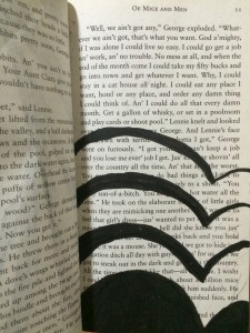
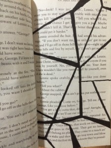
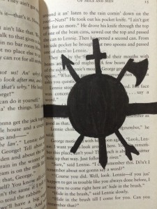
Humument #2
Hierarchy
Noun
A system or organization in which people or groups are ranked one above the other according to status or authority
(Source – Google Definition)
I encountered this word while reading the guideline from Graphic Design project #3. “Use Visual Hierarchy and Movement to clearly direct the viewer’s eye to the focal point.” Now I understand Hierarchy mean something that is judged by its importance. So now I understand that I have to clearly state an important focus point so that the viewer can see it easily.
[Glossary Entry 4]
Value-Added Portraits: Phase 1
The first picture I took is a low key circular light. It is low key because you can see it has more dark than white. The ceiling is dark, only part of it is bright because of the circular light. It gives me a feeling of loneliness. The second picture I took is a window. I took it form inside of the building, so you can clearly see the light shine in through the window and make the window become very light. And it gives me feeling of hope.

