
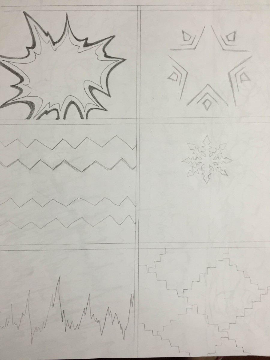
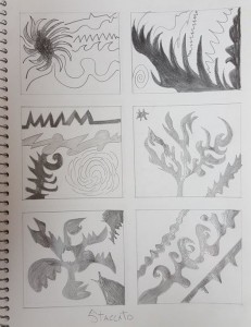
Visualizations: Phase 1
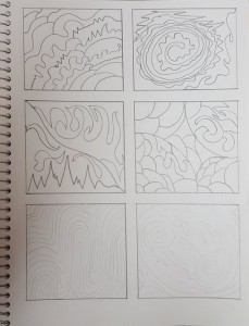
For this part of the project, it took me about 1 hour to finish it. I create these designs with listening two types of music which are Legato and Staccato. Legato is those musics with beautiful, calm, and soft sounds. They can represent by the rough, smooth, and thin lines. Staccato is sound with crazy rhythm, more beats than Legato. This kind of sound can represent by the sharp and thick lines.
Legato
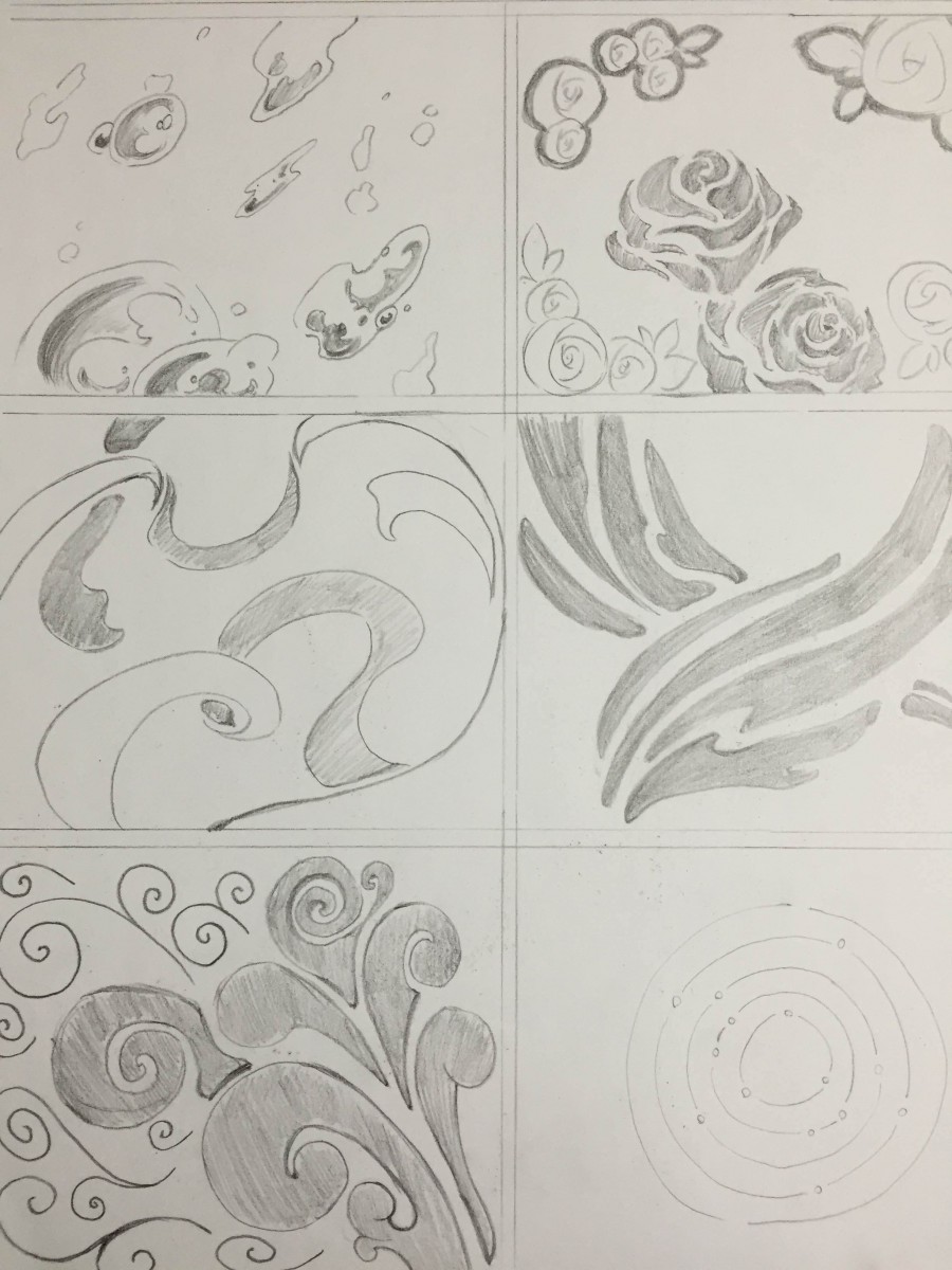
Staccato
Youtube:
Legato: https://www.youtube.com/watch?v=QIgmjlE5ojc
Staccato: https://www.youtube.com/watch?v=ODhBa-_UmTc
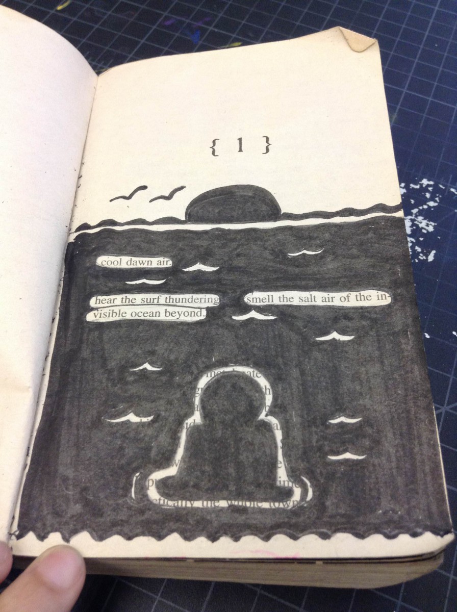
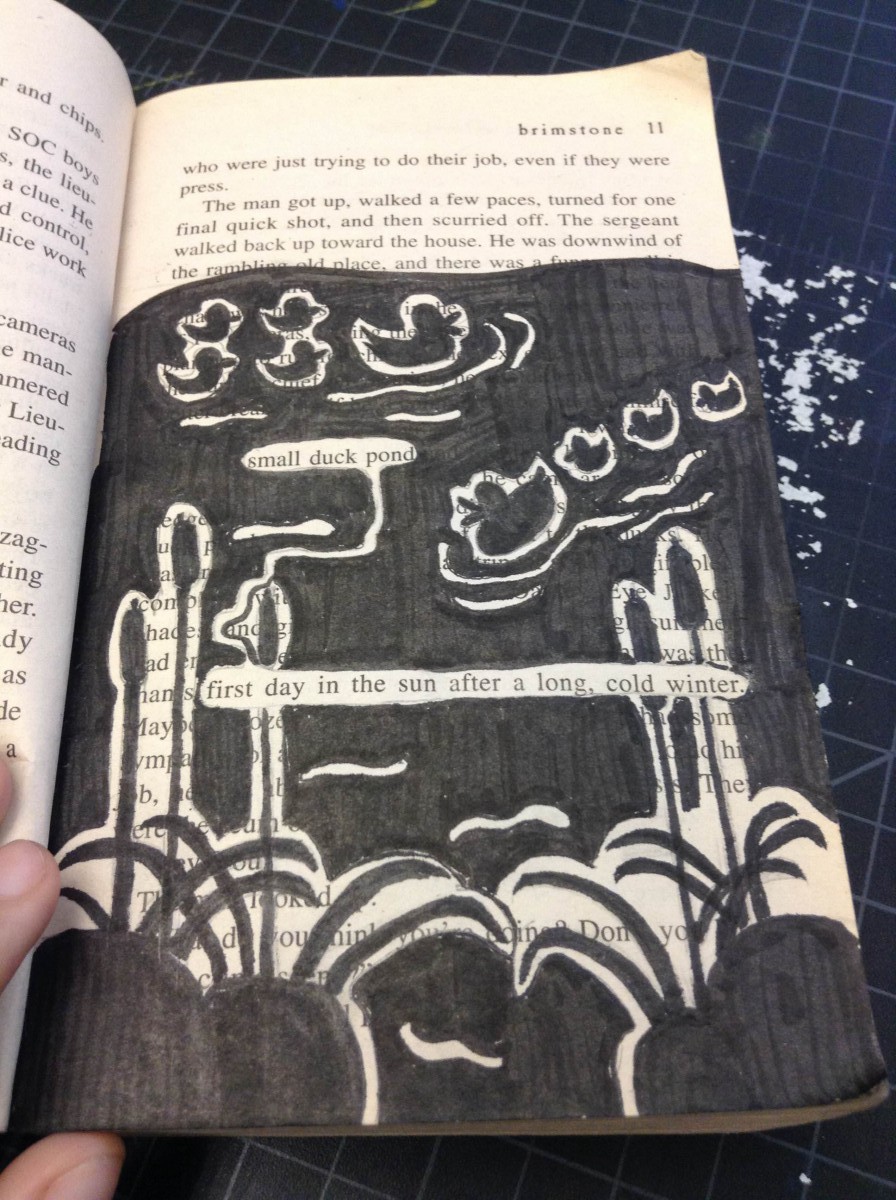
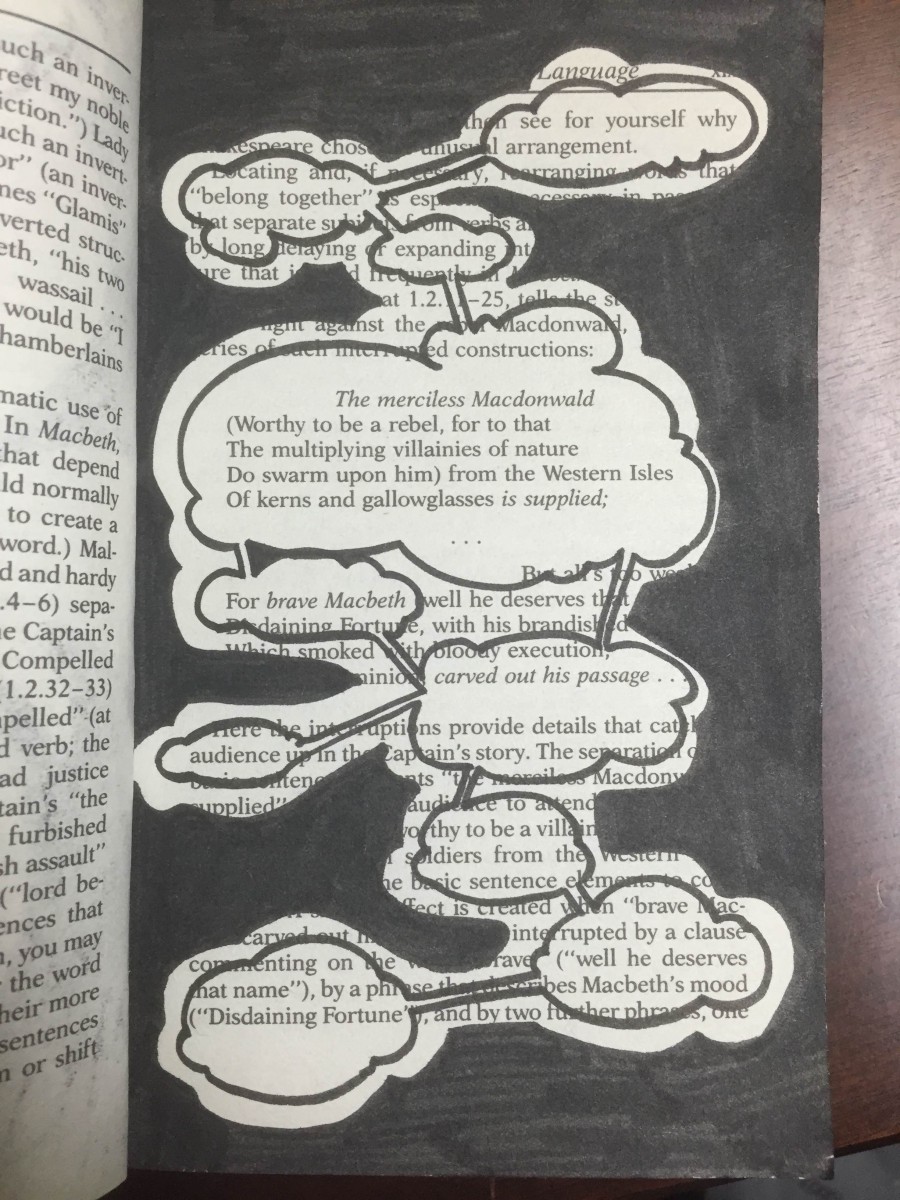
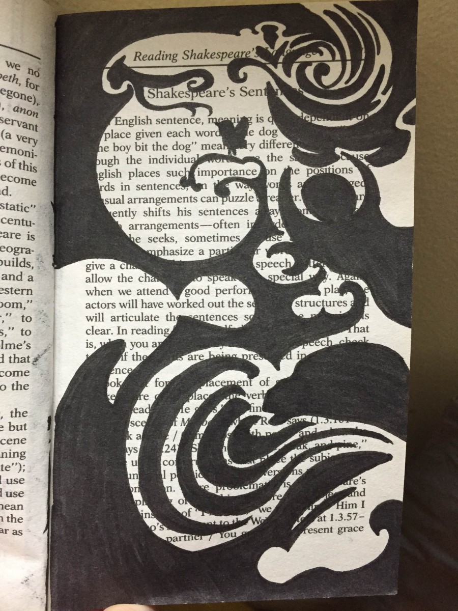
Humument #1


Eng. Project #2 Draft #1
Project #2 Overlapping New Yorks
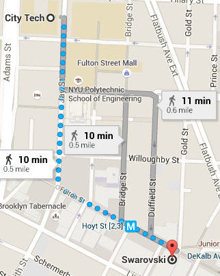
New York is always changing thus leaving different sensory in our neighborhood. I went around the City Tech neighborhood in look to find any overlapping New Yorks, and I did. In order to find the overlapping New York I found, you first need to exit City Tech from the Namm building. Once you are outside, turn right on Jay Street and start walking. As you walk for about 5 minutes, you will pass a parking-lot, a Halal Cart, a resting area where a lot of people will be sitting and socializing with their family or friends. Then the Jay Street Metro Tech subway. As soon as you pass the subway about half way through the block, look across the street and you will see the overlapping New York. You will see a tall beautiful building called the Brooklyn Fire Headquarters and right next to it you will see a small store name Metro Café.
The Overlapping New York here is a big beautiful building (Brooklyn Fire Headquarters) and a small store name Metro Star Café. The Big building is newly renovated, whereas the Café looks old as if it was there for a very long time. It has an old time look to it, but the fire house looks very nice and it fits the time period it is in. The fire house has a pointy roof top, you can see the patterns in the design on the roof, whereas the Café has a flat roof and you cannot even see it from the street view. The Fire house is a huge building about 6 stories high, and it even has a balcony. The café is just two stories high. The fire house has many windows about 20, where the café only has about 3. The fire house is made of brick where the café is not. On the café you can clearly see the name on it right at the top, but you cannot see the name of the fire house on the building anywhere. My guess is they have not put it up as of yet. The fire house has a arch door entrance and a regular door entrance which really makes the design of the building beautiful. As for the café, it has a very basic door entrance.
The Fire Headquarters represents New York’s safety. New York is very quick when it comes to responding to danger. The Café represents New Yorkers and food. New Yorkers love food. New Yorkers live on Coffee, we have to get up early and coffee is the way to get that morning boost.
The photo I took shows the frame of both buildings. On the right is the small café, and on the left is the huge fire house. It captures the juxtaposition nicely. You can clearly see how different these two buildings really are. The main focus here is the fire house because of the size, whereas the café is so small, you barley look at it. These two buildings are completely different, the Fire house is big, tall, and very clean like the other buildings around there, when the café is a small short building smack in the middle of the tall big buildings. Both buildings however are highly maintained.
Project #2: Including senses
The route I chose to walk from city tech was joyful for me. Before I started the walk, I didn’t know what I would meet and experience. I didn’t carefully look at the map. So everything on the route were new for me. And I was really looking forward to it. But when I went across the Tillary street and looked all the way down along the Jay street. I felt like that was nothing special. I could see those surroundings anywhere in Brooklyn. And that made me a little disappointed. But after I kept walking for a while, I realized that there is Brooklyn, that is how it looks like. This route I chose is a part of Brooklyn. And many of those parts made up Brooklyn. Every day I am on the same route from home to school. It keeps repeating and I almost forget the name of the place I live. But when I carefully looked at the buildings, the parks, and the people on the route I chose, I felt like that they were reminding me that there is Brooklyn, the place you are living in. Then I walked on the Sand street. And it surprised me. The buildings were different from the Jay street’s. The buildings looked more Modernized. And I felt like I saw a new face of Brooklyn. The US Post Office, the Surrogates Court, and the Kings Country Supreme Court are Majesty. And they were also telling me that Brooklyn is a part of US.
Project #2: Phase 1
Time Spent: About 1 hour
Endearment
Noun
A word or phrase that shows love or affection
Source: Merriam-Webster
*Little bit of spoiler if you haven’t read the reading yet!
I encountered this word from the reading expert, “Brooklyn was Mine” by Chris Knutsen and Valerie Steiker. I found this word from the third page of the reading, it intrigued me, because of the sound and the word “dear” caught my eyes. Since there was dear in the word, i thought it was some kind of word that “cares one another”. After using our reliable source Merriam-Webster, my thoughts and the definition matched. It definitely connects to the reading, because the main character who was talking about Lucy, explained in details how Lucy and her husband communicated each other after her husband left to join the navy. Her affection toward him was stronger than any other married wife, where she wrote to him every day.
Project #2: Including senses
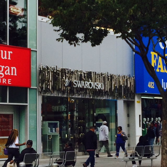
My location I picked is great, because I never been to this place. When I first arrived near the location, it was beyond what I had in mind. The different views and the smell of the mixed cultured food overwhelmed my nose as I entered the corner of the Fulton Street when you make a right turn. It was nothing like what we see in Manhattan, Queens, or Bronx. After the walk, it made me comprehend that Brooklyn is a place where all the borough are collided together. Making a whole new mixed city that does not identify people nor their difference in social class and culture. What I noticed was some of the stores are old and new, the element of juxtaposition of the time makes us realize that old stores contrasts the new stores in was that we don’t see everyday. My photograph frames the location, because it explains the definition of juxtapose. My location and the store next to it was totally different to each other in value that it contrasts. Many stores on Fulton Street in Brooklyn, has variety of differences in each location. Everything depends on where you stand and arrive at a different place even though you only took a few steps. As if you are teleported to a different part of New York City.
Monotony
Noun
sameness of pitch or tone in a sound or utterance.
Source – Google Definitions
I encountered this word from Graphic Design Principles 1 when professor Spevack was teaching the lesson for today. I now understand that Monotony means something repeating. We are starting a new project and we are using a song to draw from, I now understand that this song will have a repeating beat that is the same.
The example of Monotony from class:
[Glossary Entry 3]
Sound Visualizations: Phase 1.
The song I chose is Locked Away by R. City ft. Adam Levine.
The song starts off smooth, then it went to a sharp beat, then a steady repeating beat. Then sharp again and back to smooth. I saw a curve line in the beginning and then it starts going zigzag and then it went back to a nice curved line. I also can see a strait line and then a spike in the middle when I hear the piano beat. I see small spikes and large spikes, depending in the beat. This song has rough, sharp and smooth flowing beats.
(Time spent on this phase – 20 Minutes)

