Didactic Panels

Panel1

12047420_516917015133080_884622610_n

YingYang Zhang

Born in KaiPing, China

Route of Dreams

X-Acto knife, black bristol, and glue

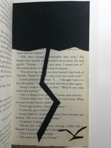
To represent Of Mice and Men’s themes of dreams and loneliness, Yang used an X-Acto knife to cut out shapes of a dark cloud, lightning, and a bird from black bristol, then glued them on the page to create the obvious composition. The dark cloud and the lightning stand for the obstacles of our dreams, and the bird is used to represent loneliness.

Panel 2

IMG_1990

YingYang Zhang

Born in KaiPing, China

Broken

No. 6H pencil and black big brush

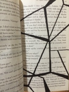
To represent Of Mice and Men’s theme of sacrifice, Yang used a No. 6H pencil and a black big brush to create the concept of pattern. Yang used the No.6H pencil to draw the shape of the pattern, then filled it with the black big brush.  The irregular lines staggered together makes it look like a broken mirror, represent the idea of sacrifice.

Panel 3

IMG_1989

YingYang Zhang

Born in KaiPing, China

Freedom

No. 6H pencil and black big brush

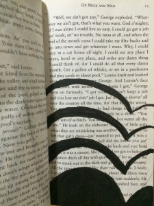
In Freedom, Yang used a No. 6H pencil and a black big brush to create the concept of overlap. Yang first used the No.6H pencil to draw the outline, then filled it with the black big brush. In this page, you only see part of the heart. And the heart is separating in birds shape. Presenting the idea of freedom.

saturation studies: Phase 1

Marcus Cerons color wheel

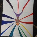
My color wheel was inspired by a series of events throughout my life. When younger, I had gone camping and fished. I loved the relaxation and nature all around me. Also, I love the ocean. It’s a whole other world that goes beyond our deepest imaginations. Two worlds side by side, ours and theirs.

value added : Phase 4

This project, as all projects, is one that I really enjoyed. But what I can say is that it was difficult, but i love a challenge. For my cut collages, I was having a very difficuly time because most of my photo contains my shirt which was plaid. The plaid in grayscale became broad range in itself so when I would try to recreate my narrow range, it was challenging because I was so linited to the areas I can cut. I wanted to use the whole image and tried my best to incorporate a variety of areas from the image. When it came to recrating my broad key in guache i was struggling. I had worked with guache previously but never painted something so deatailed and in grayscale. I wasnt able to catch every detail such as the lines of the plaid so I economized my drawing and stylized it. What I’ve learned through this whole process and project is that there is more that meets the eye. Every image has continous tone meaning every area has different value and saturation from the other. Also, I learned how to use guache and familiarize myself with the medium. Mixing black and white to crate different values is also an addition to my learnings. This project sure wasn’t the easiest but it is one that I gained alot from. My mistakes made me learn that for our next projects incorporating guache, to be patient and really focus on the colors i am mixing.

Sound visualizations phase 4

I found this project to be very enjoyable. I have worked with clipping before in terms of video but never really dug deep into it until this project. I got to work with layers of pictures and audio. In my project I tried to hit every single beat I heard accuratley. I would play the song over and over on the same part until the visuals matched the beats in the audio. What I could have done better is made my animation a few seconds longer because so the viewer can have more to process and analyze.

sound visualations: Phase 1

The song chosen is Liquor by Chris Brown. The beginning of this song is very soft and fades in. Although the beats are soft they remain staccato due to the jumpy, sharp sounds associated. Consistent through out, the beat has a staccatto feel to it but isn’t as sharp and hard like typical stacatto sounds. Instead, the beats kind of have an echo effect to them.

The legatto in this song can be found in Chris Brown’s singing ofcourse. Brown shows contrast through audio by singing legatto notes on a stacatto beat. In addition, his tone throughout the song varies. He starts off very soft and low and gets very loud and high in the middle of the song. At some points he sings legatto notes in the background and pairs it with the instrumental. At the end, he receedes back to a very soft tone.


Color Interaction Parings: Phase 2

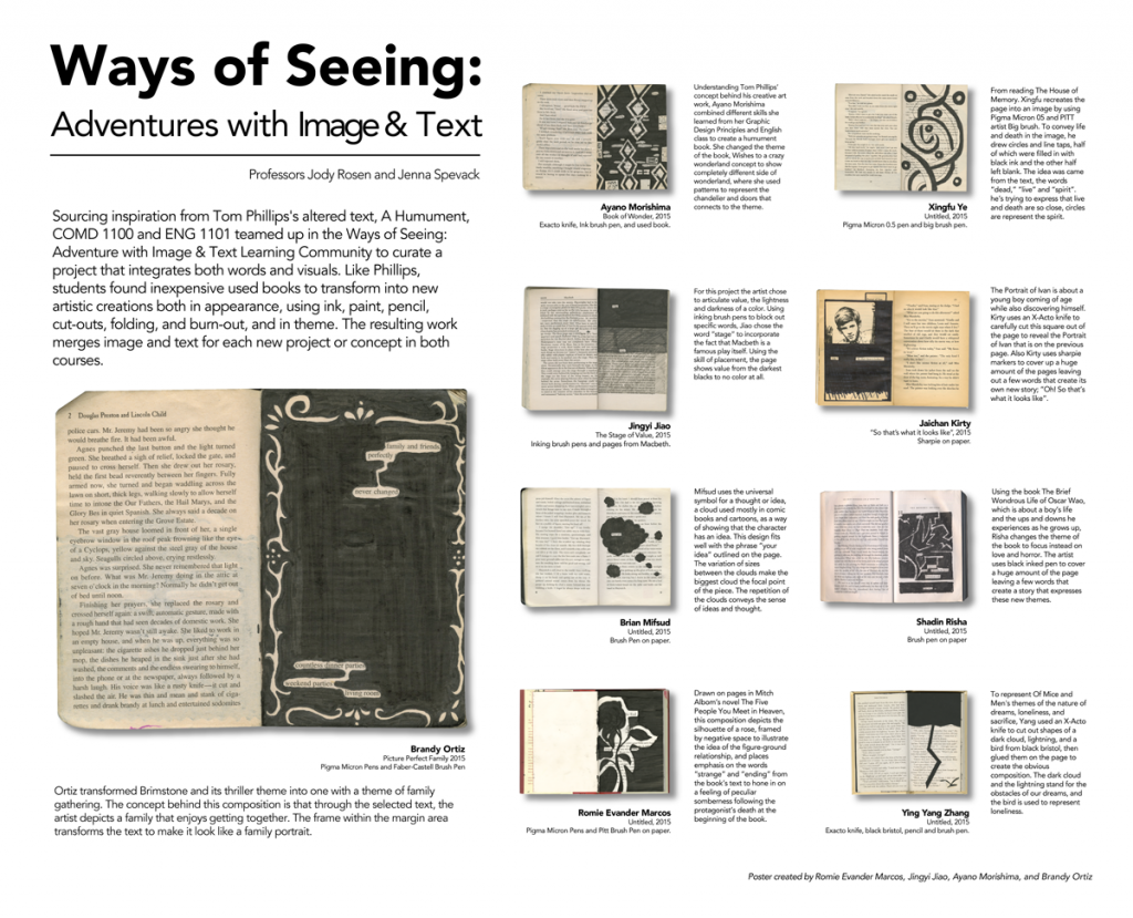
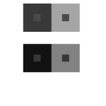
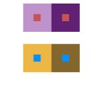
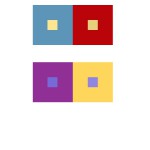
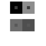
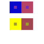
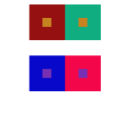
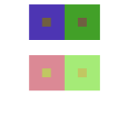
For this project, I had confidence on how to use hue and values to create this type of illusion. Each pair of small and big square/frame contains the difference in value or hue that made tricks on our sights. From our learning from the last project, I learned that our eyes does not capture a light spectrum that is emitted from the color that is actually there. With the help from value in Photoshop, I was able to create this interesting art. It took me about about ten minutes plus five minutes, because I wanted to check in with my professor if I was on a right track. With the knowledge of Photoshop from my Raster and Vector class, it made me easier to work on it and was able to help others with this project.

Color Interaction Parings: Phase 2

achromatic gray studies with shifting values.
color studies with shifting hue and value.
color study interactions with shifting value (in color)
color studies with shifting hue, but not value.
color studies with shifting hue, but not value. 

I learned how to manipulate a color using its surrounding. There are many ways to achieve different effects. Such examples are shown above, you can have a change in hue, value, or both. Color is associated with psychology just as much as it is to art. Our eyes see and brains perceive so I’ve learned how to really observe and see color. I am able to see the effect but also notice it is the same color at the same time. The time taken to complete this was about an hour.

Simultaneous Contrast

First Image
Second Image

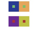
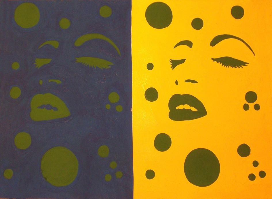
In the first picture, the red dots are being contrast. on the right, the red looks saturated because of the surrounding grays. On the left the dots look really bright and pure. However both red are exactly the same. In the second image the triangles are fading away on the right side while you can clearly see it on the right side. The green triangles are being simultaneous Contrasted.

Project 2: FINAL!

New York city, one of the most sumptuous cities in this universe. Consisting of surplus people who come from different backgrounds, distinctive cultures, who all hold different values. Contrasted through physical features; black, white, tan,tall, thick, skinny, but still remaining as one. New York is an overlap personified and has been for many centuries. Despite differences, people come together through an aesthetic consensus which eventually varies from generation to generation. Ultimately, the aesthetic of older generations revolved around large scale public works in comparison to today’s generation who’s aesthetics are based more on public art. Although they are two different views they can be found in overlaps.

In the past, New York was never as upgraded and innovative as it is today. In fact, New York’s progressive era did not begin until the 20th century. But through out this period, the country’s economy hit a crisis on October 19, 1929 known as The Great Depression. The crisis caused many negative factors to outburst such as deflation, a drop in demand for credit, disruption of trade and ultimately a widespread of poverty and unemployment. In response to this crisis, A New Deal was proposed and the birth of The Public Works Administration (PWA) was created. Seeking to revive the country’s economy, the PWA provided numerous jobs dealing with the building of public infastructures. In all, the PWA helped build the economy, provide people with a better way of living, and introduce prominent structures that were much needed. Projects that provided public welfare was aesthetically pleasing for this time, especially since the country was in need of all the help possible.

Present day, aesthetics aim toward public art. Introduced by The New Deal, public art carries a whole new genre today. In the past, it was predominatly used for propaganda purposes. Current time, it is used as an outlet to engage people with reality and provide conceptual messages. An example is Olek Says’: Rule #1 never be #2. This artwork sends a message to viewers about self-exaltation. Olek connects individuals to reality by reminding that there are people out there who suffer from self abasement. To interpret the concept, critical thinking is involved. One viewer may interpret and apply this message personally or another may ponder about the treatment of others. There are numerous assumptions that can be made. Artwork of all mediums can be found throughout the city whether its murals or sculptures themselves. Benches in Brooklyn Bridge park consist of weird shapes and colors, the Brooklyn Queens expressway underpass is home to two beautiful murals. It is evident today’s generation finds incorporating artwork into the public domain visually appealing and significant in keeping humans aware.

Despite the distinctive aesthetics, they can be found overlapped in current day. A great example that showcases an overlap are the “YES!” murals located under the BQE underpass. The works from the new generation literally overlap the BQE which in fact is a prominent structure to NYC. Although both overlap, they work together to create emphasis on one another. The color from the mural helps the underpass stand out while the large scale of the underpass helps to project the mural. This is how using both artistic tastes can balance each other out while still upgrading the overall look. The overlap generates more audience from all over. In a conceptual way, the underpass is like a doorway into Dumbo.  In a reading titled City Limits , Colson Whitehead writes “The city also puts a lot of effort into making your hometown look really drab and tiny”. This line showcases that regaurdless of generation, the focus is to make the city appear superior and utopian. 

Throughout time New York has lived to see many phases go by. Whether it was the 20’s, or the 40’s or the 70’s, New York has survived many marks and scribbles from countless generations. That being said there are overlaps all around us but sometimes arent that noticeable to the eye because they work seamlessly into your mind. There is a balance between what is and what was and together those two things will always coexist side by side. Like Whitehead says “The city saw all that. Remembers too.” (City Limits, 9) That quote displays how the city has been through history of all kind and remembers through various stains left behind.\

works cited

  • “Public Works Administration.” Wikipedia. Wikimedia Foundation, 2 Dec. 2015. Web. 07 Dec. 2015.
  • Whitehead, Colson. “City Limits.” The Colossus of New York: A City in Thirteen Parts. New York: Random House, 2004. 1-12. Web.
  • “Public Art.” – Wikipedia, the Free Encyclopedia. Wikimedia Foundation, Nov. 2015. Web. 09 Dec. 2015.