Panel #1
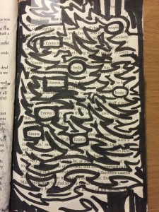
Klever Javier Cobena Ramirez
Title: “Hitlist”
Materials: Micron #02 Inking Pen, Pigma Brush Pen
In this work, Cobena integrates heavy ambiguity into a simple idea; A representation of the idea of “victims” being laid out. Set up as a black and white composition, the author lays out names of the characters in the original work, randomized throughout the page, and using a staccato pattern to separate them as ambiguously as possible. This gives the viewer a mental image of a sort of “crime scene”.
Panel #2
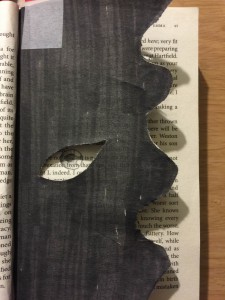
Klever Javier Cobena Ramirez
Title: Vision of Shadow
Materials: Pigma Brush Pen, Scissors, Exacto Knife, HB Artist Pencil
This particular composition stands out among the rest, both literally and figuratively. Composed of two pages, rather than just one, Cobena creates a distinct relationship between these two pages within the composition using an overlap of them. One image is not complete without the other, and together they juxtapose to create a single picture, consisting of a dark and morbid appearance intended to give the viewer a feeling of interested dread.
Panel #3
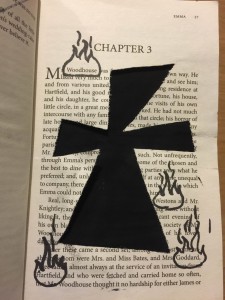
Klever Javier Cobena Ramirez
Title: Here Lies Her Sins
Materials: Pigma Brush Pen, Black Gouache Paint, #2 Round Brush, Exacto Knife
Here Lies Her Sins was intended by the author to represent the idea of an unholy deed. Though without speaking that of which could be said action. Using an overlap of two pages within the book, they alter into one composition. The contrast of the bottom layer make the image of a cross, which is given the focal point in said composition. Cobena also uses images of fire to highlight a “list of possible victims” within the composition.


These didactic panels are interesting, but they each exceed the 60-word required length. What can you cut? Do you need to cut material, or just change your phrasing? You will want to address the theme that your project reflects, too, so you’ll need to figure out how to incorporate that into each didactic panel even as you aim to shorten them.
In your second panel, be careful with how you use the term juxtaposition, which really means the placement of two things side by side to see how they differ. Instead you might write that the juxtaposition of the black inked page with the text-heavy pages creates a dark and morbid image. Relatedly, is dread the overall theme of your work?
As you revise, you can proofread also to be sure your panels are as polished as possible. Also, be sure to categorize your work as ENG 1101 Project #4 to get credit for your work.
If you have any questions, reply here.