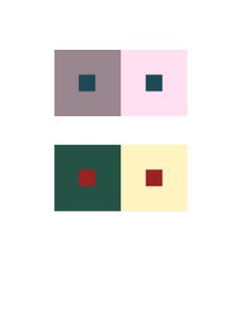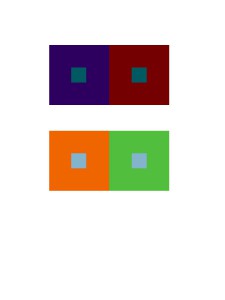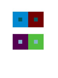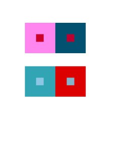


According to this project, I learned different compositions will give us different visual effect. Warm back layer gives an effect of pumping out the composition that over it. Cool back layer opposites that, it gives an effect of inward zooming, like a 3D tunnel. Also when you put the same color on both cool and warm back layers, you will see two colors that exactly same will became two different colors, which called simultaneous contrast, an interesting effect tricks your eyes. I think the most painful part is when you are up on group 4 and extra credit part, because you have already stared on compositions with simultaneous contrast for long time, so the illusion may caused headache and eyes damage. It decreased my concentrations a lot, therefore this part is the best part to challenge yourself as a designer.
I spend around 5-10 minutes on each pairs


Each group seems to have succeeded in fulfilling the study requirements, including the extra credit portion. I forgot about how warm colors give the illusion of coming forward, while cool colors recede, even though I had it in my mind, so it was good of you to mention that in your description. I also agree that staring at all these colors for a while can mess with your perception of the later groups.
For each group, you did great job, each color for each group clearly shows what the image trying to tell. The only part I would question is for group 3, upper image, the center color appears having same value too me, or maybe its because I got bad eyes. However overall, you did very impressive.
Nicely done! I know it must have been easy for people who have knowledge of using Photoshop to do this assignments. Especially I had very comfortable and relaxing time to do this type of classwork/homework. Thank you for helping with the extra credit~
I definitely agree with the zooming in effect you mentioned when looking at these squares. I feel like my eyes are like a camera trying to focus on an object. For the top squares of group 3 and 4 I don’t see the shifting effect though but the bottom of those squares I do see it. Besides that, nice job 🙂