These are my two pictures that I took, where one on the left is High Key and the right is Low Key. The one on the left is High Key, because the more of the white and gray tone of the stair case stands out. On the other hand, the right side of the image contains more value in Low Key, which it contains more black shadings. Most of the figures of people or an objects turns out to be more of the Low Key.
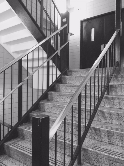
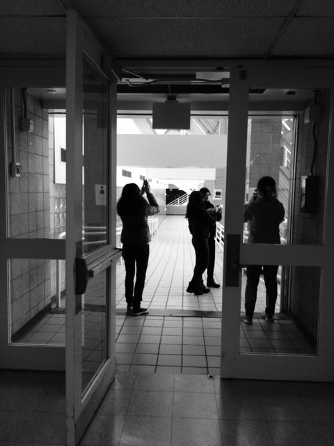


For your high-key image, I think it would be better if you cropped everything else out except for the bright light at the top, since a high-key composition should feature more light than either grays or darks. Your low-key image looks good though, as the sharply defined shadows make your focal points very obvious. The fact that they’re out in the light and bordered by higher darks makes it feel dramatic too.