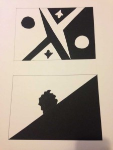
Stable figure took 30 minus to finish, and ambiguous figure took 60 minus to finish, overall it took an hour and half to finish.
In this phase, the project compare to previous one. I used more time to finishing it, and I also changed some small detail. However, you can still easily figure out which one is stable and which one is ambiguous. One thing, this phase is better than the previous one is that the dark space is more completely and filled than the previous phase.


The reversal in the top image is very effective for the proper demonstration of an ambiguous figure-ground composition. My eyes start with the sharp geometric shapes in the center which begin the alternation between figure-ground representations of your objects, and end on either side with the lone circular shape. The pattern is reminiscent of what one might see on an ornate card of sorts, or a type of flag design. As for the stable design, I get the impression of something rapidly rolling down hill; the presence of the figure in the center is supposed to cement its identity as a stable design, as it shifts the figure-ground ratio in favor of the figure, though because there’s an initial diagonal division of negative and positive space which goes 50-50, it could have gone either way. I think adding another figure might make that image stronger.