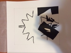
I chose this stable and ambiguous design, because it intrigued my attention that these two design have a connection. Both designs pulls in each others energy of ground and figure composition. It balances out together since the top design have more ground and the bottom has more figures.
It took me about 3 hours of completing, such as tracing, measuring, cutting, and pasting. I was wondering if I am suppose to outline the measuring.


I really like how such simple and unusually shaped objects were able to make very interesting and distinct illustrations. The distinction between ambigeuity and stable is clear as day, and they would definitely hold anyone’s attention and make them wonder what you used.
With your stable design even though you used one artifact you still managed to pull off an energized feeling which makes the portrait more interesting.The feeling of energy comes from the fact that the stable image looks like an explosion. Your ambiguous design gives off that same energized feeling as the stable design but with more going on instead of being simple. Next time try taking the picture with the flash on to get rid of your shadow.