“Emma is Still Alive” is a piece created by aspiring artist Klever Javier Cobena. Drawing inspiration from Tom Phillips “A Humument”, the artist conveys a dark, mystifying, and gruesome atmosphere within his piece, using the contrasting original work of Jane Austen’s “Emma”. The concept behind both of these works is taking any medium of literature (i.e. a book) and turning it it into something completely new using different design aesthetics and artistic techniques. Originally a story of a young girl living in an upper class home in England, Cobena re-works that story with the the intention of driving it as far away from the original concept as possible. Using horror as a medium, Cobena decides to tell a tale of a a gruesome massacre, using only his design aesthetics and few highlighted words already within the pages of the book. Within the composition, a vast majority of the pieces are composed of either black ink, black paint, or black cut paper. Cobena, preferring black as a sort of “negative” color, utilizes materials such as Micron Ink Pens, Pigma Brushes, and Black Gouache Paints to re-work and block out certain words within the pages. With the given emphasis on certain select words that weren’t blocked out, Cobena re-tells the story through the artwork spread throughout the page. Certain examples within “Emma is Still Alive” include pages within like “Here Lies her Sins” and “Vision Of Shadow”, that use overlaps of two pages to create a single composition. Cobena uses nothing more than an exacto knife and a pen to create these overlaps, and express a single idea and theme with an overlap of two pages. Cobena also strongly integrates the concept of certain patterns of staccato nature, and legato nature. Using these concepts, Cobena creates certain moods and certain ideas using patterns differing between these two traits. On one page for example, one can view a sort of blood pattern running down on the words of a page, created using only a colored pencil and an HB sketch pencil. It has a a flowing, smooth pattern, and gives the viewer that feel and imagery of a bloody mess. On another page, there are images of sharp, jagged edges blacked out with a pigma brush, giving the viewer a sense of danger. Other design asthetics included with the piece also include ambigeouity, where Cobena utilizes the words on the page to create a layout that is very eye wandering and complex. There are also stable compositions, where he instead makes a focal point on the composition, drawing the viewers attention to a specific spot. Although most of these pages consists of mostly black color schemes, there are also works of color included within the piece. Cobena skillfully shifts certain traits of pure bright colors like prismatic blues and reds, to make them less saturated, decreasing their value, and keeping the visualities of darkness and negativity to stick to his theme. All while conveying their intense expressions and ideas they were intended to.
Category: Coursework
Color Interactions: Phase 4
Reflecting on this project, I seem to have some sort of understanding of all the concepts we were intended to learn, although i hope to grasp an even bigger understanding of them throughout more of my courses. With these color interaction studies, i was able to learn how colors are much more than what they seem. I was able to understand how intergrating concepts like saturation, value, hue, and tons can affect a color, and create something completely new.
Color Interactions: Phase 3
With fellow classmate TK, we both researched on how color can be used to express certain personality traits. Not knowing too much about each other, we composed a list of how we saw each others personalities. Based on that list and our research, we created our Paired Color Identities Composition. 
I decided to choose a more lower valued blue, with less saturation for her personality. I felt this color was suitable for her, as i saw her as a more cool, clam, and reserved kind of individual. She is also very shy, (hence why i chose to de-saturate the color). Blue is very commonly used to express these kind of traits in a person.
Color Interactions: Phase 2
The first color interaction observed is based off shifting hue, without touching the value, while the second shifts BOTH hue and value.
Hue Change, No Value
Shift in Both Hue and Value
Color Interaction Pairings: Phase 1
These color interactions are based off of adjusting the hue, but without touching the value.
Shifting Value (Greyscale)
Shifting Value (Color)
Exhibit Catalogue: final
Inspired by Tom Phillips’ humument, New York city artist, Marcus Ceron creates Wonderfilled using old material. By Re-configuring Brian Zelzack’s Wonderstruck, Ceron juxtaposes the themes of realism and fantasy. Juxtapositions are observed through a novel that discusses realistic journeys and through poems exploring copious impossibilities . Wonderstruck also displays how all things can relate to one another, so for this purpose, Ceron uses numerous fantasies to project how humans are unique in their own way. Words are a means of communication and has been for many years. Aside from type, visuals are another way to speak to viewers. Starting as far back as hieroglyphics, graphics posses a great power in grabbing attention. Together both type and visual embody a powerful strategy for communicating fantasies onto book pages. Through three works of art, Ceron demonstrates the overlaps of fantasy and reality.
In the two page spread, The lightness of dark, Ceron articulates a story about believing in fairies. Using marker to block out areas, Ceron left words that worked coherently and spoke of a fantasy. With remaining space, he incorporated visuals of fairies. A cut out was applied to expose words from pages beneath and to create depth. The power of placment helps direct the viewer around the image. Fantasy tranlated visually with the help of color, placement, and focus.
For Treasure Island, fantasy was displayed through a fictional world. In Ceron’s artwork, a young girl opens a bush to witness a candy utopia. Emphasizing variety, a broad range color scheme was chosen. To focus attention, a one point perspective was used. His piece juxtaposes the idea of realism because such a place could never exist.
For the last work of art, Glowing curious, the design tactic of simpicity was kept consistent throughout. Using a page of all words, Ceron articulated a poem revolving around super powers. Simplicity was kept by using a minimalistic layout that featured a poem in the center and the visual on the bottom. Ceron used color pencil as his medium and stars to select words.
In all, Ceron takes on a dream like approach by talking about fantasies as if they were memories. But using visual and English language, Ceron personifies fantasy in to book pages. Contrast can be found in many forms whether it be color, size, shape, etc.. but sometimes two things that contrast can work together harmoniously. If there are two elements that work against each other, there is always a way to find common ground.
Color Harmony: Phase 2
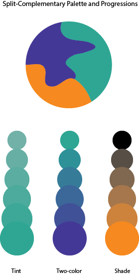
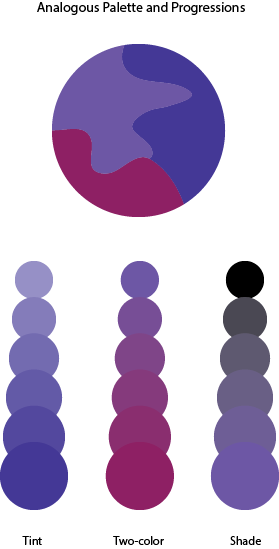
In this phase I learned about more behind color by learning about color harmony. When certain colors are together it feels as though it’s very pleasing. Colors can be harmonious in terms of shading, tints, compliments, tone and gradient. For the split-complementary palette, I had to choose one main color then choose two colors that is on either side of its complement. I chose orange as the main color while blue-green and blue-violet are the other two colors. For the analogous palette, I had to chose colors that were adjacent to each other on the color wheel. In this case I picked red-violet, blue-violet and violet. It took me 2 hours to complete this phase.
ENG 1101 Project #4 Cover letter and process post
Please write a private post to share your thoughts as you ordinarily would in class on paper for the cover letter, and on the site for the process post.
To make your post private when you write it, click on Edit next to Visibility in the right sidebar, and choose Private instead of Public or Password protected.
In combining both letter and process post, please write about the following:
- What are you most proud of in Project #4?
- What challenged you the most in Project #4?
- How did you figure out your approach to the topic, both in terms of page choices and in terms of the theme?
- How did you approach writing critically about your own work your project?
- How did you approach writing didactic panels that were exactly 60 words?
- Did you meet the requirements of the assignment?
- When you found out you had more time, what did you change?
- How much time did you spend on each phase of the project?
- What did you take away from reading your classmates’ work, from their comments, from my comments, and from class discussions?
- If you could have changed the assignment, how would you have changed it? What would you insist on not changing?
- Is there anything else I should know about your work or about you as a writer or as a student?
Please categorize your post as ENG 1101 Project #4, and find and use the tag Phase 4: Deliver, plus any additional tags you find useful.
color interaction pairing
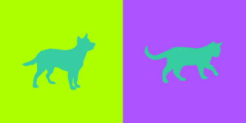
doing this project was actually pretty fun and was a nice experience. i got to know my partner better and see what we have in common and what is different about us. i also got a better understanding of color interaction and the way my eyes would see color. i chose a mixed color of pink and blue and that is the color you see on the right because of my partner Brandy Ortiz’s personality. her personality consist of being serious, giggly, passionate, and outgoing. i chose a cat as her icon because thats what she reminds me of because she can be giggly and happy at one point and switch it up real quick and be a very serious and straight forward person.
Exhibit Catalogue (Final)
The artist Brandy Ortiz was born on 1997 in New York, NY. She currently lives and studies in the city she was born in. She was inspired by the works of Tom Phillips in his A Humument book to create compositions that combined linguistic language and art into three pages of her vision. Tom Phillip was an English artist who purchased a cheap book to use as the basis of an art project known as A Humument. Behind his artwork, he paints, collages or draws over the pages, leaving some of the text peeking through in serpentine bubble shapes, creating a found text with its own story, different from the original. Ortiz made compositions with themes that juxtapose from the original theme from the novel Brimestone by Douglas Preston and Lincoln Child. While Brimestone theme was thriller, the artist decided that her artwork known as Glass Child would have a softer tone. Within her creation of Glass Child contains Ocean Breeze, Picture Perfect Family, and Love Exists, which are different representations of the gentle theme behind Glass Child .
Ortiz used Pigma Micron Pens(0.2, 0.5 and Brush), Faber-Castell Brush Pen, pencils(HB-6B) and a pair of scissors as her materials for her artwork. For her first design, Ocean Breeze, she shows a silhouette of a boy relaxing in a beach setting with the sun rising. She first made outlines of the boy and the waves by using the micron pens. Afterwards she used the Faber-Castell Brush Pen to ink the ocean and the sun. The top half of the page is left blank creates positive space while the inked image within the bottom area creates negative space. These spaces create a figure and ground relationship due to the equal amount of negative and positive space. The revealed message that the artist created says “Cool dawn air. Hear the surf thundering. Smell the salt air of the invisible ocean beyond”. The boy in the image feels the cold breeze from the sea as the sun is rising. He hears the rippling waves thrash against the sandy land only to be pulled back into the ocean once again. The thrashing of the waves creates the smell of the salty air. He is taking in the different sensations that are happening around him.
For her second design, Picture Perfect Family, she first creates an outline of a frame within the margin area of the page with the micron pens. Next she uses the Faber-Castell Brush Pen to black out the rest of the page leaving out the frame and the revealed text. The revealed message that the artist created says “Family and friends perfectly never changed. Countless dinner parties, weekend parties, living room”. The message conveys a family that enjoys getting together for parties in their living room. A frame is a boundary made from either a rectangle, square or circle that is placed on the edges of the paper or the margins drawn within. The concept behind the frame was to transform the text to make it look like a family portrait since the idea behind the message was family gathering.
For her third design, Love exists, she used scissors to cut out pieces of the page to reveal words from other pages. Instead of blacking out the page to show her message, Ortiz creates a message from cutting out certain words from various pages to show all on one page. The revealed message that the artist created says “Love was fantastic to obtain in the vast world”. The artist made a heart in the lower left corner of the page while everything was shaded by pencil to show low key, in which the values of the image is predominantly dark. The heart shows that love will always be there even when surrounded by this darkness. The idea behind the message was that love is a great feeling to have in the world we live in.
With her vision behind Glass Child, Ortiz wanted to show her ideas of different messages through the language and the art she depicted. The title of the artist’s humument is a piece of alternated text much like the pages inside. Glass Child was made by picking out letters from both of the author’s names behind Brimestone. The work of alternated texts along with visual images creates a new story from a preexisting one. It creates more room for stories that have yet to be told as the original source is left as inspirations behind those stories. Whether it be about relaxing, family gathering or love; each page correlates back to the original theme of Glass Child.

