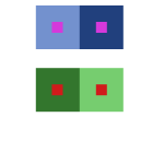
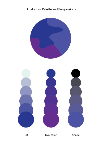
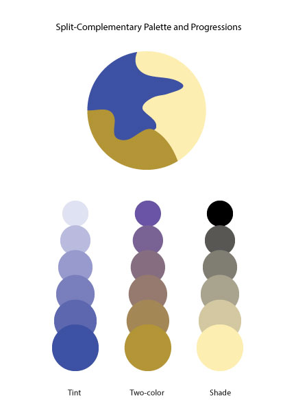
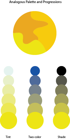
Color Interaction Parings: Phase 4

For this project, I learned about simultaneous contrast. Simultaneous contrast is when you have to colors next to each other one of the colors change due to the contrast between the colors. In class we had to go through four studies (shifting value, shifting value with color, shifting hue but not value and shifting hue and value) of changing colors with simultaneous contrast. This was really fun to me because of the way the the middle color that was being surrounded looked like a completely different color. It was like an optical illusion and my eyes felt like they were zooming in on the color which was pretty cool. After getting through this phase the next step was to partner up with someone and create simultaneous contrast with colors that best represents our personalities. As a bonus, we also had to create logos for each other that represents our personalities but at the same time both logos had to be similar in a way. Not only was it fun getting to know my partner but the research in finding colors that represents different traits was fun as well. The challenging part for me was coming up with cohesive logos. I believe it was hard because there was a lot of different traits deal with so it’s was hard finding that one thing that represents everything. For the next project, if it deals with logos what I’ll probably do is do more research on how to create logos so I can have an easier time with that part.

Indignation

noun

anger caused by something that is unfair or wrong

(Source: Merriam-Webster)

IĀ came across this word inĀ The Boston’s Photograph by Nora Ephron. It is found in the sentence, “In this case, of course, the objections were all dressed up and cleverly disguised as righteous indignation about the privacy of death.” I think what this sentence is saying is that the objections were just hidden as anger about the privacy of death.

Color Harmony Palettes

analogouspaletteĀ Ā split-complementarypalette

For this lab, the class had to complete two color harmony palettes; an analogous palette and a split-complementary palette. For analogous, IĀ had to choose three colors that were adjacent from each other on the color wheel and add it to the three interlocking forms. IĀ added one colorĀ to tint, two colors for two-colors, and one for shade. For split-complementary, I did the same thing except for the colors. I chose one color and two other colors that were either side of its complements on the color wheel.