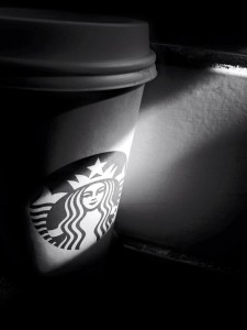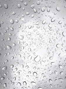

These are two pictures that I took , the Starbucks cup is low key and the raindrop is high key. The low key I used the filter to change the color become black&white, also putted the cup under the sunshine that shows the Starbucks logo. The high key is the raindrop when I take it at the car roof. Also, I change a little bit of the color become more white then make the picture prominent.


I like how the low key image emphasizes the Starbucks logo with the little lighting that there in the black. It’s pretty cool how you made the raindrops part of the high key feel. I would say that the with the black from the edges of the drops makes the image a bit on the broad range.
I agree with Brandy, I like how the light shines on the logo revealing it from the rest of the cup. I also like the high key composition, it looks really cool with the water droplets.