project 4: humument (didactic panels)

Marcus Ceron

The land before time

Ink brush on paperback book page


In recreation of Tom Philips’ humument, Ceron produced a story only using image and text. Inspired from the human life span, his story touches on topics of time and regrets. Achievable through value and contrast Incorporation of stopwatches connect harmoniously with the text leaving viewers with a message of their own.


Marcus Ceron

Glistening love

Ink brush on book page


Using the method of blocking out words, Ceron invents a graphics related poem. Themes of passion, love and nostalgia are experienced throughout allowing viewers to connect a story of their own. Glistening love signifies purity and passion at its finest.


Marcus Ceron

Tinted love

Ink on bookpaper


Not every love is the same. Love varies between friends, family, significant others and even pets. To symbolize variations of love, Ceron illustrates repitition of hearts each distinct from the other. 
Didactic Panel (Draft)

Ayano Morishima

Pattern
Pattern

Born in Japan, Tokyo
Lives and studies in New York City
——————————————————————————————-
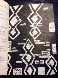
Gates of Wonder, 2015
Ink brush pen, and used paper bag book.

Understanding Tom Phillips’ concept behind his creative art work, Morishima combined different skills she learned from her Graphic design principle and English class to create a humument book. She changed the theme of the book, Wishes to a crazy wonderland concept to show completely different side of wonderland, where She used patterns to represent the chandelier and doors that connects to the theme.

Ayano Morishima

Didactic Panel #2
Didactic Panel #2

Born in Japan, Tokyo
Lives and studies in New York City
——————————————————————————————-
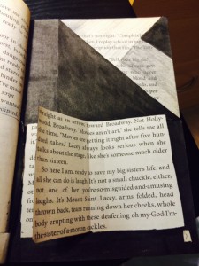
Book of Wonder, 2015
Exacto knife, Ink brush pen, folding, and used paper bag book.

Book of Wonder was created when Morishima used a Exacto knife to cut open a block of text at the bottom of the page and glued only in the middle. Creating a piece of story that continues from Gate to Wonder, which follows the theme of Wonderland. Falling into the rabbit hole, it leads the reader to go though the door to read a little book that Morishima created.

Ayano Morishima

Didactic Panel #3
Didactic Panel #3

Born in Japan, Tokyo
Lives and studies in New York City
——————————————————————————————-
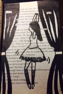
Dreams of Wonder, 2015
Ink brush pen, and used paper bag book.

Dreams of Wonder was created from the after math of Wonderland. The madness in wonderland was finally came to the end; still in the land, the ballerina indicates the beautiful dream that it stabilizes the wonder in the wonderland.

Didactic Panel

Xingfu, Ye

Born 1997 in Zhejiang, China
Lives and studies in New York
——————————————————————————————-

From reading The House of Memory. Xingfu recreates the page into a image by using Pigma Micron 05 and PITT artist Big brush. To convey life and death in the image, he drew circles and line taps, half of which were filled in with black ink and the other half left blank. The idea was came from the text, the words “dead,” “live” and “spirit”. he’s trying to express that live and death are so close, circles are represent the spirit.

Didactic Panel for the Poster

  • describe Tom Phillips’s project
  • guidelines for our project
    • in a used book, represent different projects and concepts
    • re-envisioning of the book’s theme
  • use inspiration from Tom Phillips to incorporate visual and written expression: a goal of our Learning Community
  • the complete project is slated to be on display in the library in the Spring 2016 semester

First sentences:

  • The Humument book by Tom Phillips was an inspiration for this project.
  • Tom Phillips’s Humuments refashioned books as platforms for visual art while making use of the book’s written contents in order to create something entirely different.
  • Sourcing inspiration from Tom Philllips’s A Humument, Learning Communities COMD 1100 and ENG 1101 teamed up in order to curate a project that includes both text and visuals.

Draft of text for the poster:

Sourcing inspiration from Tom Phillips’s altered text, A Humument, COMD 1100 and ENG 1101 teamed up in the Ways of Seeing: Adventure with Image and Text Learning Community to curate a project that integrates both words and visuals. Like Phillips, students found inexpensive used books to transform into new artistic creations both in appearance, using ink, paint, pencil, cut-outs, folding, and burn-out, and in theme. The resulting work merges image and text for each new project or concept in both courses.


Didactic Panel (Final)

Ayano Morishima

Born in Japan, Tokyo
Lives and studies in New York City
——————————————————————————————-

Book of Wonder, 2015
Ink brush pen, and used paper bag book.

Understanding Tom Phillips’ concept behind his creative art work, Ayano Morishima combined different skills she learned from her Graphic design principle and English class to create a humument book. She changed the theme of the book, Wishes to a crazy wonderland concept to show completely different side of wonderland, where She used patterns to represent the chandelier and doors that connects to the theme.

Didactic Panel

YingYang Zhang

To represent Of Mice and Men’s themes of dreams, loneliness, and sacrifice, Yang used an X-Acto knife to cut out shapes of a dark cloud, lightning, and a bird from black bristol, then glued them on the page to create the obvious composition. The dark cloud and the lightning stand for the obstacles of our dreams, and the bird is used to represent loneliness. Yang also used a No. 6H pencil and a black big brush to create the concept of pattern. The irregular lines staggered together makes it look like a broken mirror, represent the idea of sacrifice.

Didactic Panel

Jaichan Kirty
Born 1996 in Guyana
Lives and studies in New York
___________________________________________
“Oh! So that’s whats it looks like”, 2015
Sharpie on paper, 7.5″ x 5″

The Portrait of Ivan is about a young boy becoming of age while he is also discovering himself. The Artist has created a new window (a new view) into this book by using over-lapping to create an illusion of a boy, (Ivan) looking through a new page by cutting a square on the next page in the book. The artist uses an X-Acto knife to carefully cut this square out of the page. Also the Artist uses sharpie markers to cover up a huge amount of the pages leaving out a few words that create its own new story. These words creates a whole new meaning of this page. “So that’s what it looks like”.

———————————————–

For the Poster;

Jaichan Kirty
Born 1996 in Guyana
Lives and studies in New York
___________________________________________
“Oh! So that’s whats it looks like”, 2015
Sharpie on paper, 7.5″ x 5″

The Portrait of Ivan is about a young boy coming of age while also discovering himself. Kirty uses an X-Acto knife to carefully cut this square out of the page to reveal the Portrait of Ivan that is on the previous page. Also Kirty uses sharpie markers to cover up a huge amount of the pages leaving out a few words that create its own new story; “Oh! So that’s what it looks like”.


Didactic Panel (Progress)

Ayano Morishima

Born in Japan, Tokyo
Lives and studies in New York City
——————————————————————————————-

Book of Wonder, 2015
Exacto knife, Ink brush pen, and used paper bag book.

Understanding the concepts though the graphic design principle, Ayano Morishima learned different types of technique to use ink bush pens to construct creative, humument book which it made connection with the texts from the book itself. Morishima changed the theme of the book, “Wishes” to more “Crazy Wonderland” concepts. She chose this concept, because she wanted something totally different than the original. The Book of Wonder was created by using Exacto knife to cut open the text at the bottom of the page and placed glue only in the middle on the same place and using the inked brush pen to color the triangular part of the top right corner to show the image of flipping the page and the pop art of book; representing the Book of Wonder. Morishima created this Book of Wonder to show others to see “more” crazy side of original book; the creation of book and the flip page is a door way to the readers vision.