Simultaneous Contrast

color-wheel-interpretation simultaneous-contrast-2-small-web1

https://kayreincolor.files.wordpress.com/2012/10/color-wheel-interpretation.jpg

https://nelldart.files.wordpress.com/2012/03/simultaneous-contrast-2-small-web1.gif

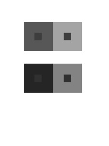
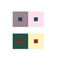
Same color has different appearance of value on the top of different backgrounds. They gave us a illusion of when it on the top of a bright layer, it looks it has a lower value. But when it on the top of a darker layer, it looks it has a higher value. This phenomenon is called simultaneous contrast. Two images above are the examples of it. Do you see the difference between the colors?

Didactic Panels Draft

IMG_2402

Jingyi Jiao

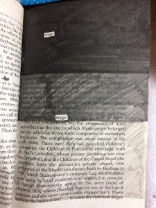
Title: “The Stage of Value”

Materials: Inking brush pens (black, dark gray, and light gray) and book pages from Shakespeare’s Macbeth.

For this project the artist chose to articulate value, which is the lightness and darkness of a color. Using inking brush pens to block out specific words, Jiao chose the word “stage” to incorporate the fact that Macbeth is a famous play itself. Using the skill of placement, the page shows value from the darkest blacks to no color at all.

———————————————————————————————-

IMG_2400

Jingyi Jiao

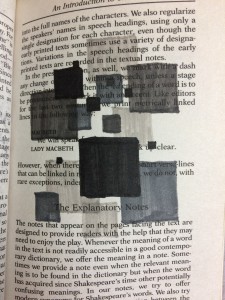
Title: “Box of dimension

Materials: Inking brush pens (black, dark gray, and light gray) and book pages from Shakespeare’s Macbeth

In Box of dimension, Jiao shows technique of overlap. Using inking brush pens to color boxes into different values, the transparent gray colors merged up, and becomes overlapped. By overlapping the boxes with different ranges of value together, it tricks your eyes and gives a 3D feeling.

———————————————————————————————-

IMG_2403

Jingyi Jiao

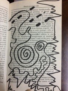
Title: “Music Party DO-RE-MI

Materials: Inking brush pen (black) and book pages from Shakespeare’s Macbeth

In Music Party Do-Re-Mi, it shows Jiao’s learning of rhythmic pattern that she connects with her interest in music. This composition shows the two different rhythms of staccato and legato. Staccato represents sharp patterns while legato represents round patterns. Jiao combines them up by using the creativity to turn music into art.

Project #3 (Final)

Beauty, nature, and entertainments bring us good moods, usually we don’t realized them but they are always exist and surrounding in our daily life. Maybe they are on our passing routes, however we don’t see them because sometimes we walked without looking at front, rushing for being on time for school, or it located on the street next to the street you are walking on, so we missed up them. To avoid this kind of instance keep happening in your life, start using this app today. This app will guide you to walk through a new route, and brings you to the beautiful environmental places you have never been before. The memory from the boring routes you walked everyday will be immediately gone as you used this app for once. Good mood will make your life more colorful.

The five places that waiting you to explore are Commodore Barry Park, Commodore Barry Pool, Golconda Playground, Oxport Playground, and Trinity Park. They are located on the Nassau St and Flushing Ave, horizontally, near each other, and with a segment of one or two vertical streets shown on the map. The starting point is from City Tech (New York City College of Technology), located on the Jay St. Turn left when you get out of City Tech. And then turn right when you see the first crossroad, take 10 minutes walk on the Tillary Street. Turn left on Duffield street. When you get on the Nassau St, Trinity Park will appears in front of you. Turn right after you explored Trinity Park, keep walking on the Nassau St. The rest of other locations are all on the same street and the same direction, shown on the map horizontally.  Including midway break, this journey will taken you about a hour, unless you spend few minutes to visit inside the location.

These five locations have the same logo design. You could find them on a green board of location signs, it builded on the wall or fences next entrance. The logo design is a circle with a maple pattern in it. This logo represents NYC Parks or City of New York Parks & Recreation, means they all under control by the same association. The season now is autumn, when people think of autumn, the first thing comes to mind is maple, the idea is overlapped with the maple logo.The logo helps you to easier to discover their exact location, so you won’t miss out when you are  near them.

Four of these locations are parks. Commodore Barry Pool is the only place not in the park genre, but it is a part of Commodore Barry Park, occupy a small area. Commodore Barry Pool operates in summer, and the late of spring only. Because it is outdoor, so when the weather turns cold, temperature went down, the water in the pool becomes freezing, to prohibit kids play in there, they closed the pool. The time in the pool area seems froze up, other than bird chirps, you can not hear anything sounds. Before the next summer came, Commodore Barry Pool is the best option for people who need quite, silent, and secluded for themselves. You can find wood bench in anywhere of these five locations, they are all good places for you to take a break, so people don’t need to worry about the siting place. Commodore Barry Park is the largest park from these five park locations. It also contains a kid playground. The recreational facilities are same as what Golconda Playground and Oxport Playground have. There always are many kids play around, no matter what season. For people have children at home, welcome to bring your kids to these three playgrounds, let them have fun and made new friends there, and when summer came you could bring them to the Commodore Barry Pool.

Other than playgrounds and swimming pool, all of these five locations are good places to view foliage. Season now is autumn, leaves turn to orange, red, and yellow, its interesting to see the different type of leaves with the different patterns, and how they slowly falling down on the ground. Beautiful leaves on the ground makes up a golden trod, looks like a picture of a beautiful landscape. In spring you will view cherry blossoms, so the color you see in the park will be the mix of white and light pink. Sharon Begley states: “…but with simple peace and quiet or getting away from the daily grind, as in studies finding that hauling participants into the wilderness improves their feelings of well-being.” It indicates nature can heal your fatigue from daily grind, can bring you a feeling of peace.

You will gain a lot piece of beautiful memories through this short but valuable journey. For experienced beauty, nature, and entertainment, get start using this app now. Enjoy your walk.
vehement

adjective

: showing strong and often angry feelings : very emotional

source: Merriam

I encountered this word from one of someone’s bibliography: ” Fruit Street Sitting Area”. In my understanding to this word, this word has kind of same meaning as madness or angry, instead of these two words, I’ll try to use “vehement” next time.

illuminati

noun plural

  1. capitalized : any of various groups claiming special religious enlightenment
  2. persons who are or who claim to be unusually enlightened

source: Merriam

I encountered this word from one of someone’s bibliography: ” The Advantages of a New Perspective: A Literary Walk in Brooklyn Heights”. I know “illuminate”, but never heard about “illuminati”. Most people don’t know this word because this is not a universal word, so I put it as one of my glossary to let more people learn the meaning of it.

Saturation Studies: Phase 2

image image image

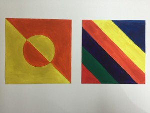
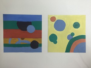
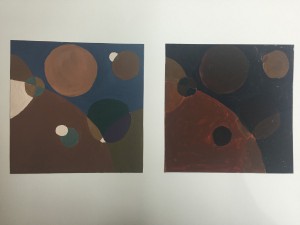
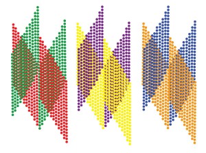
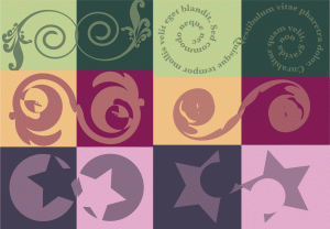
Through all phases of project #4 (chromatic Studies, muted Studies, and prismatic studies), I realized to understand them well you should know two things, they are value and saturation. My understanding to saturation is pure and intensity of the color, and value means lightness and darkness of the color. After memorized these two artistic vocabularies, they helped me better to understand the color mixing since I started painting. I think the most challenging step was when I had not enough color for my compositions, so I had to mix it more, but it is really hard to mix a color to be exactly the same like the color I mixed before. Each of them took me around 3 hours to finish. Since after the project #3, I’m glad to have another chance to work on painting physically, I can feel the improvement of my painting skills, and also the knowledge of color mixing.

Saturation Studies: Phase 3

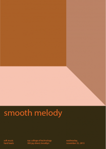
smooth melody

I created this piece of composition with my partner Ruky. We followed the theme provided, they are color (warm), composition, and style (touch, and sound). We chose orange to be our basic color, means every chromatic, muted and prismatic colors in this composition are orange with changes of value and saturation. It took us about a hour to finish this during the course time, after that, I brought it home and spend 5 minutes to make a final revising.

Revising Didactic Panel


Jingyi Jiao

Title: The Stage of Value

Materials: Inking brush pens (black, dark gray, and light gray) and book pages from Shakespeare’s Macbeth.

For this project the artist chose to articulate value, the lightness and darkness of a color. Using inking brush pens to block out specific words, Jiao chose the word “stage” to incorporate the fact that Macbeth is a famous play itself. Using the skill of placement, the page shows value from the darkest blacks to no color at all.