For this project, I had confidence on how to use hue and values to create this type of illusion. Each pair of small and big square/frame contains the difference in value or hue that made tricks on our sights. From our learning from the last project, I learned that our eyes does not capture a light spectrum that is emitted from the color that is actually there. With the help from value in Photoshop, I was able to create this interesting art. It took me about about ten minutes plus five minutes, because I wanted to check in with my professor if I was on a right track. With the knowledge of Photoshop from my Raster and Vector class, it made me easier to work on it and was able to help others with this project.
The OpenLab at City Tech:A place to learn, work, and share
Support
Help | Contact Us | Privacy Policy | Terms of Use | CreditsAccessibility
Our goal is to make the OpenLab accessible for all users.
top
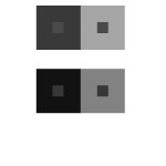
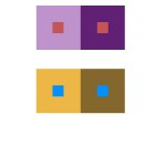
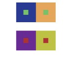
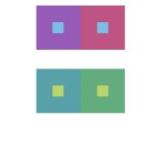
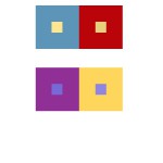


Not much to say because as far as I can tell, these all seem pretty successful in their execution. The only bit of criticism I have though is that you could have used a lighter pair of small squares in the Shifting Value group since both pairs of small squares are pretty similar in value. I also like that you had a lot of color variation between each group, as I myself seem to have gravitated towards a common set of colors.
These are all very good compositions, they all looks very successful to me. I can clearly see a difference in color in the middle squares. And nice job on the extra credit. The colors look the same to me. Great job overall.
I do not have much to comment on, overall you did pretty good job. However for group 4 the upper image center color looks like they have the same value to me, or maybe its because I have bad eyes.
My only criticism would be or group 4, I don’t really see the shifting effect of the middle square. Besides that, everything else is executed nicely. I like how you chose a wide range of color for your boxes, it’s very eye catching to me. Keep up the good work 🙂