Took me about an hour to finish each collage.
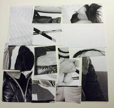
Changed due to the class critique
Took me about an hour each to complete.
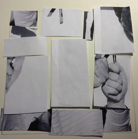
Took me about an hour to finish each collage.
Changed due to the class critique
Took me about an hour each to complete.
Comments are closed.
The OpenLab is an open-source, digital platform designed to support teaching and learning at City Tech (New York City College of Technology), and to promote student and faculty engagement in the intellectual and social life of the college community.


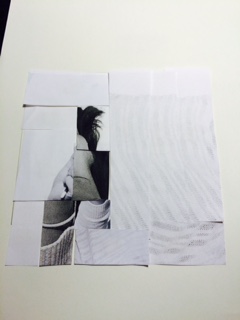
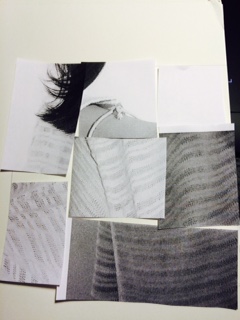
I like how complex your broad range collage is and you did a pretty good job putting different shades. Your high key collage looks as though it is a frame with the white in the middle. I’m going to guess that the white center is your focus.
I actually forgot about the focus point, I didn’t know I needed it~ (Thanks for reminding!) As you mentioned, the white on the middle would be focus. Like Romie mentioned to this design, I have to cut that hand and rearrange to make I not obvious. Plus, finding/arrange the focus point for the broad range.
In the broad range image, I’m not sure what your focal point is as a result of various different values coming together in a frenzy, although it does seem to convey a sense of movement. You can try and experiment on it by reusing certain areas of your given photocopies and replacing some of your cutouts in that image, probably the more negative space parts. You should also cut up the image with the hands in your high key composition and rearrange them so they aren’t recognizable as per the project requirements.
Thanks for the comment! Will work on it if I have time, during class. It will have been great if you commented earlier than three in a morning, so that I could have changed it.