More than 3 hrs to get done .
The OpenLab at City Tech:A place to learn, work, and share
Support
Help | Contact Us | Privacy Policy | Terms of Use | CreditsAccessibility
Our goal is to make the OpenLab accessible for all users.
top
First Year Learning Community
Our goal is to make the OpenLab accessible for all users.
Our goal is to make the OpenLab accessible for all users.

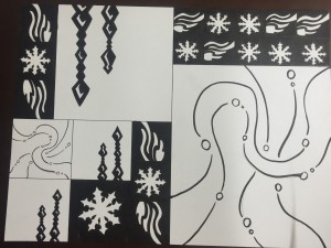
I really like your design on how, your design looks so simple but yet the final design made it to a bigger picture. I noticed that there is details going on if you look at each design carefully. I am also seeing a some kind of logo in the design, maybe an influence from the class for Tuesday? Above all, the design and the figure ground composition made a great design!
I really get the “chills” when looking at your sketch. It feels as though I’m going through a winter wonderland. I agree with Ayano on your use of figure-ground here. It makes your design and your elements of staccato and legato very distinguishable. I like how you added the white on your crystals, it makes a nice shine that makes it look like icy pillars hanging from a cave.
As Brandy mentioned, your mashup is a really successful illustration of wintry elements (possibly a wintry song too), and as Ayano said, the use of four different patterns in a relatively simple grid design is executed in such a way that makes it flow very well. I’d like to elaborate on one use of figure-ground though, in that the off center positioning of the crystal chimes makes the negative space more apparent, thereby letting it stand out. Additionally, I think it’s pretty neat that you chose to keep the crystals in the smaller boxes on the side closest to the snowflakes, which causes more negative space to be distributed around the smaller ‘wind’ design, which calls attention to itself even moreso with all of the crystals pointing in at it.