Exhibit Catalogue (Revised, Final)

This exhibit is presented by Ayano Morishima, who was born and raised in Tokyo, Japan, then moved to New York, where she now lives and studies. She was inspired by Tom Phillips’s work, Humument of transforming a used book into an art and poetry project. Morishima then created, La Fay-Vaile a new name she picked out from the original book she used for her project. She also changed the theme of a book to dark wonderland to show the difference from the original theme, Wish. She was also inspired by the original creator of Alice in Wonderland by Charles Lutwidge Dodgson under the pseudonym, Lewis Carroll in 1865. The three design Morishima created, Gates to Wonder, Book to Wonder, and Dreams to Wonder are from the book that represents to the theme the most and an message about how anyone can rewritten a destiny of the book. Though Morishima’s knowledge and techniques from her studies in COMD 1100 and ENG 1101, college courses that is part of Learning Community: Ways of Seeing, it helped her to be able to create this project. To create her designs, she used her technique in using ink brush pen, x-acto knife, old book and folding to show the viewers, the new kind of story that unfolds.

For the first design, Morishima title the design, Gates to Wonder. Because of multiple doors of the design, indicating a way to the wonderland. A starting point that everyone must encounter. She used the ink brush pen to make many repetition of connected diamonds to indicate a chandelier also, blocking out most of the text in the book to show how visible text are connected to the picture that is shown as a ground. Each words representing the meaning behind the design, such as went, door, worse, cry, wondered, etc. In addition, used figure and ground technique to show the viewers where exactly to see; in this case, the shapes of the ground shows more vividly since the black ink, the figure blocks out other negative space.

Down into the rabbit hole; the second design, Book to Wonder leads the viewers to go though the door to read a little book that came from the concept of the original, Alice in Wonderland. She used x-acto knife to cut open a block of text at the bottom of the page and glued only in the middle. By doing this, she wants the viewers to see that there is a book in a book. Same as the first design, she used the technique of figure and ground, showing the ground to block other negative space. In addition, by folding the corner to the right top, it shows the next design that shows the technique of a chromatic gray; grays that exhibit a subtle, but visible hue; created by adding larger amounts the complement and white.

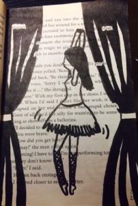
Dreams to Wonder is a design that was created to show “the after math of Wonderland”. Story goes as the darkness in wonderland was finally came to the end. Many would think that the ballerina could be Alice, however being the character in the original story, Morishima completely disconnected the characters from her project. The ballerina indicates a spirit that it stabilizes the wonders in the wonderland. She also used ink brush pen to create curtains on the right and left sides to show that she is on a stage, and the visible words that fits with the story of the page, such as dancer, moment, felt, perfect, and choice.

Ayano Morishima, made this project from her understanding in COMD 1100 and ENG 1101, college course she is taking in New York, where she lives. She made this mainly to attract people who are interested in creating their own story. It conveys though out each pieces of art work and detailed design, where it tells the message in the theme. Single page contains a message where Morishima’s story that she made though out the art she loves, she wants the viewers to understand that stories can be can be rewritten to make new ones. Even characters, make them have their own destiny with out following the original story.
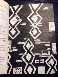
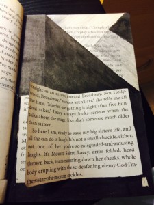
Exhibit Catalogue (Final)

The artist Brandy Ortiz was born on 1997 in New York, NY. She currently lives and studies in the city she was born in. She was inspired by the works of Tom Phillips in his A Humument book to create compositions that combined linguistic language and art into three pages of her vision. Tom Phillip was an English artist who purchased a cheap book to use as the basis of an art project known as A Humument. Behind his artwork,  he paints, collages or draws over the pages, leaving some of the text peeking through in serpentine bubble shapes, creating a found text with its own story, different from the original. Ortiz made compositions with themes that juxtapose from the original theme from the novel Brimestone by Douglas Preston and Lincoln Child. While Brimestone theme was thriller, the artist decided that her artwork known as Glass Child would have a softer tone. Within her creation of Glass Child contains Ocean Breeze, Picture Perfect Family, and Love Exists, which are different representations of the gentle theme behind Glass Child  .

Ortiz used Pigma Micron Pens(0.2, 0.5 and Brush), Faber-Castell Brush Pen, pencils(HB-6B) and a pair of scissors as her materials for her artwork. For her first design, Ocean Breeze, she shows a silhouette of a boy relaxing in a beach setting with the sun rising. She first made outlines of the boy and the waves by using the micron pens. Afterwards she used the Faber-Castell Brush Pen to ink the ocean and the sun. The top half of the page is left blank creates positive space while the inked image within the bottom area creates negative space. These spaces create a figure and ground relationship due to the equal amount of negative and positive space. The revealed message that the artist created says “Cool dawn air. Hear the surf thundering. Smell the salt air of the invisible ocean beyond”.  The boy in the image feels the cold breeze from the sea as the sun is rising. He hears the rippling waves thrash against the sandy land only to be pulled back into the ocean once again. The thrashing of the waves creates the smell of the salty air. He is taking in the different sensations that are happening around him.

For her second design, Picture Perfect Family, she first creates an outline of a frame within the margin area of the page with the micron pens. Next she uses the Faber-Castell Brush Pen to black out the rest of the page leaving out the frame and the revealed text. The revealed message that the artist created says “Family and friends perfectly never changed. Countless dinner parties, weekend parties, living room”. The message conveys a family that enjoys getting together for parties in their living room. A frame is a boundary made from either a rectangle, square or circle that is placed on the edges of the paper or the margins drawn within. The concept behind the frame was to transform the text to make it look like a family portrait since the idea behind the message was family gathering.

For her third design, Love exists, she used scissors to cut out pieces of the page to reveal words from other pages. Instead of blacking out the page to show her message, Ortiz creates a message from cutting out certain words from various pages to show all on one page. The revealed message that the artist created says “Love was fantastic to obtain in the vast world”.  The artist made a heart in the lower left corner of the page while everything was shaded by pencil to show low key, in which the values of the image is predominantly dark. The heart shows that love will always be there even when surrounded by this darkness. The idea behind the message was that love is a great feeling to have in the world we live in.

With her vision behind Glass Child, Ortiz wanted to show her ideas of different messages through the language and the art she depicted. The title of the artist’s humument is a piece of alternated text much like the pages inside. Glass Child was made by picking out letters from both of the author’s names behind Brimestone. The work of alternated texts along with visual images creates a new story from a preexisting one. It creates more room for stories that have yet to be told as the original source is left as inspirations behind those stories. Whether it be about relaxing, family gathering or love; each page correlates back to the original theme of Glass Child.

Exhibit Catalogue (Revised)

This exhibit is presented by Ayano Morishima. Born and raised in Tokyo, Japan, then moved to New York where she now lives and studies. Tom Phillips, an English artist who set a task himself to find a second-hand book for altering every page by painting, collage, and cut-up techniques to create an new pieces of art, called *Humument. Morishima created a humument called, La Fay-Vaile a new story that shows the viewer the three designs, Gates to Wonder, Book to Wonder, and Dreams to Wonder about how anyone can rewritten the destiny of the book.

Understanding Phillips’ concept behind his creative art work, Morishima combined different techniques she learned from her *Graphic design principle 1100 and English 1101 class to create a humument book. She changed the theme of the book, Wishes to a crazy wonderland theme to show completely different side of wonderland. She also got ideas from the origin of the story, Alice’s Adventure in Wonderland by a English author Charles Lutwidge Dodgson under the pseudonym, Lewis Carroll in 1865.

To create the humument design, she used her technique in using ink brush pen, *x-acto knife, old book and folding to show the viewers, the new kind of story that unfolds. For the first design, Morishima used the ink pen brush to make many repetition of connected diamonds to indicate a chandelier, blocking out most of the text in the book to show how visible text are connected to the picture that is shown as a ground. In addition, using figure and ground technique to show the viewers where exactly to see; in her case, the shapes of the ground shows more vividly since the black ink, the figure blocks out other context. For the second, she used x-acto knife to cut open a block of text at the bottom of the page and glued only in the middle. By doing this, she wants the viewers to show there is a book in a book. Same as the first design, she used the technique of figure and ground, showing the ground to block other context with the figure. In addition, by folding the corner to the right top, it shows the next design that shows the technique of a *chromatic gray that Morishima learned. Down into the rabbit hole, it leads the viewers to go though the door to read a little book that came from the concept of the original. For her last design, she created the after math of Wonderland. The madness in wonderland was finally came to the end; still in the land, the ballerina indicates the beautiful dream that it stabilizes the wonders in the wonderland.

Many would think that the ballerina could be Alice, however it is not necessary that the ballerina indicates Alice, since her being is the character in the original story, which is completely different from Morishima’s humumet art. She also used ink brush pen to create curtains on the right and left sides to show that she is on a stage, and other words that fits with the concept of the page, such as dancer, moment, felt, perfect, and choice.

Morishima, made this humument to attract people who are interested in creating their own story. It conveys though out each pieces of art work and detailed design, where it tells the message in the theme. Single page contains a message where Morishima’s story that she made though out the humument art, she wants the viewers to understand that stories can be can be rewritten to make new ones. Even characters, make them have their own destiny with out following the original story.
——————————————————————————————
*Humument: Entirely new version of book that is created from the original, such as adding painting, collage and cut-up techniques. Link
*Aka. COMD 1100; college courses that is part of Learning Community: Ways of Seeing. Link
*X-acto: aka. Utility knife; short, sharp blade mounted on a pen-like aluminum body, used for crafting and hobbies, such as model making. Link
*Chromatic Gary: Grays that exhibit a subtle, but discernible hue; created by adding larger amounts the complement and white. (COMD |Chromatic Gray Studies) Class 19 Link
——————————————————————————————

  • I gathered information about Exhibit Catalogue from here
  • Link to “How to write Exhibition Catalogue” that I found that I thought it would be great example for other students.
  • I mentioned Tom Philips’ work since his is an individual Exhibit Catalogue.

Exhibit Catalogue

The artist Brandy Ortiz was born on 1997 in New York, NY. She currently lives and studies in the city she was born in. She was inspired by the works of Tom Phillips in his A Humument book to create compositions that combined linguistic language and art into three pages of her vision. Tom Phillip was an English artist who purchased a cheap book to use as the basis of an art project known as A Humument. Behind his artwork,  he paints, collages or draws over the pages, leaving some of the text peeking through in serpentine bubble shapes, creating a found text with its own story, different from the original. Ortiz made compositions with themes that juxtapose from the original theme from the novel Brimestone by Douglas Preston and Lincoln Child. While Brimestone theme was thriller, the artist decided that her artwork would have a softer tone. Within her creation of Glass Child contains Ocean Breeze, Picture Perfect Family, and Love Exists, each having their own messages that relate to a gentle tone.

Ortiz used Pigma Micron Pens(0.2, 0.5 and Brush), Faber-Castell Brush Pen, pencils(HB-6B) and a pair of scissors as her materials for her artwork. For her first design, Ocean Breeze, she shows a silhouette of a boy relaxing in a beach setting with the sun rising. She first made outlines of the boy and the waves by using the micron pens. Afterwards she used the Faber-Castell Brush Pen to ink the ocean and the sun. While having the top half of the page not inked and most of the image within the bottom area leave a visual sense of figure and ground. Figure and ground is the relationship between positive and negative space. The revealed message that the artist created says “Cool dawn air. Hear the surf thundering. Smell the salt air of the invisible ocean beyond”. The boy in the image is taking in the soothing sensation of the environment that the text creates.

For her second design, Picture Perfect Family, she first creates an outline of a frame within the margin area of the page with the micron pens. Next she uses the Faber-Castell Brush Pen to black out the rest of the page leaving out the frame and the revealed text. The revealed message that the artist created says “Family and friends perfectly never changed. Countless dinner parties, weekend parties, living room”. The message conveys a family that enjoys getting together for parties in their living room. A frame is a boundary made from either a rectangle, square or circle that is placed on the edges of the paper or the margins drawn within. The concept behind the frame was to transform the text to make it look like a family portrait since the idea behind the message was family gathering.

For her third design, Love exists, she used scissors to cut out pieces of the page to reveal words from other pages. Instead of blacking out the page to show her message, Ortiz creates a message from cutting out certain words from various pages to show all on one page. The revealed message that the artist created says “Love was fantastic to obtain in the vast world”.  The artist made a heart in the lower left corner of the page while everything was shaded by pencil to show low key. Low Key is when the values of an image are predominantly dark. The idea behind the message was that love is a great feeling to have in the world we live in. The heart shows that love will always be there even when surrounded by darkness. With her vision of the humument, Ortiz wanted to show her ideas of different messages of through the language and the art she depicted. Even though each page had its own concept the overall tone was pleasant.

Didactic Panels

Panel #1

Tyler Santiago

Born in Ozone Park,                                                                                                         New York, Lives and studies in New York

Geometry, 2015                                                                                                                         Ink brush pen, inking pen, and used hard cover book

In this piece Santiago tries to convey geometric shapes surrounding the word literature, he also tries to convey what he learned in his COMD 1100 class on negative and positive space the book page color being the negative space and the black being positive space and on the ambiguity of this piece.


Panel #2

Tyler Santiago

Born in Ozone Park,                                                                                                         New York, Lives and studies in New York

The Beat, 2015                                                                                                                         Ink brush pen, inking pen, and used hard cover book

In this piece Santiago tries to convey a sound wave to go along his learning of staccato and legato sharp and soft sounds conveyed in a drawing. Santiago’s piece shows his way of seeing a staccato or sharp sounds in his drawing of “The Beat”.


Panel #3

Tyler Santiago

Born in Ozone Park,                                                                                                         New York, Lives and studies in New York

Flakes, 2015                                                                                                                           Ink brush pen, inking pen, and used hard cover book

In this piece of work Santiago shows different variety in this case there are a lot of triangles but not a;ll the same sizes, so the variety is shown by all the different sizes and positions of all of the triangles which to him looks like flakes falling from the sky.

Exhibit Catalogue

This exhibit is presented by Ayano Morishima. Born and raised in Tokyo, Japan, then moved to New York where she now lives and studies. Tom Phillips, an English artist who set a task himself to find a second-hand book for altering every page by painting, collage, and cut-up techniques to create an new pieces of art, called *Humument. Understanding Phillips’ concept behind his creative art work, Morishima combined different techniques she learned from her *Graphic design principle 1100 and English 1101 class to create a humument book. She changed the theme of the book, Wishes to a crazy wonderland theme to show completely different side of wonderland. She also got ideas from the origin of the story, Alice’s Adventure in Wonderland by a English author Charles Lutwidge Dodgson under the pseudonym, Lewis Carroll in 1865. She used her technique in using ink brush pen, *x-acto knife, old book and folding to show the viewers, the new kind of story that unfolds. For the first design, Morishima used the ink pen brush to make many repetition of connected diamonds to indicate a chandelier, blocking out most of the text in the book to show how visible text are connected to the picture that is shown as a ground. In addition, using figure and ground technique to show the viewers where exactly to see; in her case, the shapes of the ground shows more vividly since the black ink, the figure blocks out other context. For the second, she used x-acto knife to cut open a block of text at the bottom of the page and glued only in the middle. By doing this, she wants the viewers to show there is a book in a book. Same as the first design, she used the technique of figure and ground, showing the ground to block other context with the figure. In addition, by folding the corner to the right top, it shows the next design that shows the technique of a *chromatic gray that Morishima learned. Down into the rabbit hole, it leads the viewers to go though the door to read a little book that came from the concept of the original. For her last design, she created the after math of Wonderland. The madness in wonderland was finally came to the end; still in the land, the ballerina indicates the beautiful dream that it stabilizes the wonders in the wonderland. Many would think that the ballerina could be Alice, however it is not necessary that the ballerina indicates Alice, since her being is the character in the original story, which is completely different from Morishima’s humumet art. She also used ink brush pen to create curtains on the right and left sides to show that she is on a stage, and other words that fits with the concept of the page, such as dancer, moment, felt, perfect, and choice. Morishima, made this humument to attract people who are interested in creating their own story. It conveys though out each pieces of art work and detailed design, where it tells the message in the theme. Single page contains a message where Morishima’s story that she made though out the humument art, she wants the viewers to understand that stories can be can be rewritten to make new ones. Even characters, make them have their own destiny with out following the original story.

*Humument: Entirely new version of book that is created from the original, such as adding painting, collage and cut-up techniques. Link
*Aka. COMD 1100; college courses that is part of Learning Community: Ways of Seeing. Link
*X-acto: aka. Utility knife; short, sharp blade mounted on a pen-like aluminum body, used for crafting and hobbies, such as model making. Link
*Chromatic Gary: Grays that exhibit a subtle, but discernible hue; created by adding larger amounts the complement and white. (COMD |Chromatic Gray Studies) Class 19 Link

——————————————————————————————

  • I gathered information about Exhibit Catalogue from here
  • Link to “How to write Exhibition Catalogue” that I found that I thought it would be great example for other students
  • I mentioned Tom Philips’ work since his is an individual Exhibit Catalogue

Didactic Panel (Draft)

Ayano Morishima

Pattern
Pattern

Born in Japan, Tokyo
Lives and studies in New York City
——————————————————————————————-
Gates of Wonder, 2015
Ink brush pen, and used paper bag book.

Understanding Tom Phillips’ concept behind his creative art work, Morishima combined different skills she learned from her Graphic design principle and English class to create a humument book. She changed the theme of the book, Wishes to a crazy wonderland concept to show completely different side of wonderland, where She used patterns to represent the chandelier and doors that connects to the theme.

Ayano Morishima

Didactic Panel #2
Didactic Panel #2

Born in Japan, Tokyo
Lives and studies in New York City
——————————————————————————————-
Book of Wonder, 2015
Exacto knife, Ink brush pen, folding, and used paper bag book.

Book of Wonder was created when Morishima used a Exacto knife to cut open a block of text at the bottom of the page and glued only in the middle. Creating a piece of story that continues from Gate to Wonder, which follows the theme of Wonderland. Falling into the rabbit hole, it leads the reader to go though the door to read a little book that Morishima created.

Ayano Morishima

Didactic Panel #3
Didactic Panel #3

Born in Japan, Tokyo
Lives and studies in New York City
——————————————————————————————-
Dreams of Wonder, 2015
Ink brush pen, and used paper bag book.

Dreams of Wonder was created from the after math of Wonderland. The madness in wonderland was finally came to the end; still in the land, the ballerina indicates the beautiful dream that it stabilizes the wonder in the wonderland.

Saturation Studies: Phase 3

spicy pop

For this saturation study, I worked with Brandy and TK. In this project, we had to create a band poster using a name that is a cross-sensory word or phrase. We were given three cards; a color card, a composition card, and a concept card. For, color card, we were given was warm color. For the composition card, we chose to do taste and sound. We came up with the name “Spicy Pop” by making a list that were taste and sound. We played around with the words until we came up with Spicy Pop and were satisfied with it. Since we were given warm color, we chose to do red. We used prismatic, chromatic, and muted. Overall it took about 3 hours to complete this project.


Saturation Studies: Phase 2


Fixed Prismatic Studies
Muted Studies
Muted Studies
Chromatic Studies
Chromatic Studies

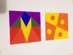
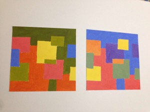
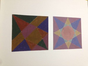
Total time took 6 hours to finish. By doing chromatic studies, I learn when mixing two opposite color on color wheel with same amount. The color will become darker. When doing muted studies, I learned when adding different amount color can change the volume of the color. Fixed prismatic studies are the easiest part of the project, its only using six pure color to paint.

Saturation Studies: Phase 3

spicy pop

For this phase I was out in TK and Ashley’s group, we had to make a poster that follows 3 cards that was assigned to our group. We had to make a title that was a cross-sensory metaphor. In other words using, words that involves the senses of the body such as touch, taste smell, etc. For our title we used the sense of taste and sound which is “spicy” and Pop Our main primary color had to be a warm color, so we went with red. We went with a bad religion style for our composition. This poster took 3 hours to complete.