Project #3

People are different in many ways some like to take long walks while other just want to get from point A to point B in the fastest time. When people go for a walk there are different things people would like to see or do on that walk. Everyone is different some people like to see different things on their walks like things that they may deem beautiful to them. Others might not want or care to see anything beautiful on their walks; some might just want to get from one place to the next in the fastest time while others want to go somewhere peaceful and beautiful. For me I love to take nice long walks, I don’t even need to be going anywhere in particular as long as I am not busy. But for me the ideal place to walk through, that is by the water.

On the walk I choose to take I walked from Citytech over the Brooklyn Bridge too City Hall. I choose this mainly because I love to be by the water so when I went over the Brooklyn Bridge it was refreshing to see the river instead of the usual tall buildings of the city. “No mere river crossing, this span is an elegant reminder of New York’s history of architectural innovation. When it opened in 1883, the Brooklyn Bridge was a feat of engineering: It was the first structure to cross the East River.” It was also really nice to feel the wind blowing in my face and being able to see Brooklyn and Manhattan from a different view. In a way it helps give us a different perspective on the way we see Manhattan and Brooklyn. For this walk I started from City tech and walked to Tillary st. where the entrance of the Brooklyn Bridge is. As I was walking I watched as the buildings stopped and I began to see the river. Even though it may have been noisy due to the passing cars on the bridge it still was very peaceful for me because seeing the river and both skylines of Manhattan and Brooklyn are pretty breathtaking. I continued on my way until I made it to City Hall Now if you would like to enhance your walk I would say that crossing the Brooklyn Bridge at night is your best bet, the view of the city is enhanced due to the light emitted from the city. Even other people agree that the Brooklyn Bridge is the best spot to get the most beautiful views. On different websites you can see that people have a lot to say about how beautiful the view can be from the bridge. “Everyone should walk the Brooklyn Bridge, I have been to New York quite a few times and have never walked the Brooklyn Bridge. It is such an amazing view and worth it to do this especially as the sun is setting, its perfect!” another person said “it has a Magnificent view, excellent experience, refreshing from the building infested city, either for a romantic walk, or for a friendly catch up with a view or a family trip.”

Another walk you could take that also delivers on the breathtaking view of the Manhattan skyline is the Brooklyn Heights Promenade. This location is another one that I enjoyed walking through mainly due to the fact that it is also by the water. The Brooklyn Heights Promenade is one third of a mile long, here it gives you a beautiful view of the Brooklyn Bridge connecting two people, people from Manhattan and people from Brooklyn.

“The Brooklyn Heights Promenade will take your breath away. Made famous by cameo appearances in movies like Annie Hall and Moonstruck, it is one of the most romantic spots in New York City, and has been the destination for thousands of first dates, wedding proposals and anniversary celebrations.”

I would also like to reiterate what I said before in that this locations view is enhanced when it is night time. For this walk I also went up Tillary st. but instead of going onto the Brooklyn Bridge I continued straight noticing the nice architecture of the post office as I went along until I got to Cadman plaza W. from there I made a left until I got to Pierrepont st. noticing the Columbus park as I passed. From there I followed Pierrepont st. until the end. On that street you can see some very beautiful architecture from the nice houses there so take your time when walking.

All in all I want to impart these locations so that others can experience the same beautiful sights I have because in its own way you have to be there yourself to truly experience the sights. No picture can truly give you the same emotion as being there for yourself.


Works cited page


Terzian, Peter. “must-see Brooklyn Heights March” 03, 2014. Web. November 16, 2015.

“Brooklyn Heights Promenade” New York Harbor Parks. November 16, 2015.

Freudenheim, Ellen. “How to Walk the Brooklyn Bridge—Manhattan to Brooklyn, Brooklyn to Manhattan” November 16, 2015.
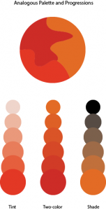
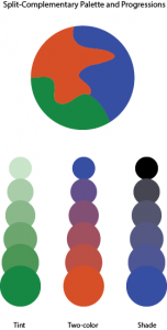
Exhibit Catalogue (final)

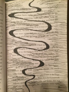
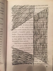
The artist Brian Mifsud was born on March 29, 1997 in Queens New York. He now currently lives in Manhattan and studies in Brooklyn. The artist drew inspiration from Tom Phillips “A Humument” to create his own versions of this style of composition which combines both language and art to convey anything the artist desires. Tom Phillip was an English artist who purchased a cheap book to use as the basis of an art project known as A Humument. Behind his artwork,  he paints, collages or draws over the pages, leaving some of the text peeking through in serpentine bubble shapes, creating a found text with its own story, different from the original. In this case Brian made three compositions with a theme that juxtaposes with the theme of the original Book. In this exhibit Brian chose the book Hunger Games Catching Fire which has more of a darker and serious theme to it so Brian juxtaposes this theme by making it a bit lighter and more into a comedy. To help convey this Brian also change the title of this composition to Off the Hinge.

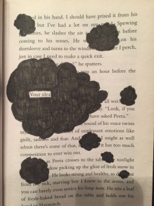
Brian created the compositions using a variation of sizes of Micron pens mainly using 0.25, 0.35 and 0.45 mm. Also he used a Faber-Castell Brush pen. For his first design, your idea he creates a composition the perfectly conveys the title of the composition that being your idea using the universal symbol of an idea being a cloud which can be seen in different forms of media, from comic books to cartoons you can see the thought bubble used to convey an idea. The artist also uses different techniques like repetition of the clouds and variation of the cloud sizes to help create emphasis on the main large cloud surrounding the phrase your idea. This composition helps to also convey the theme Brian is trying to get across because the imagery of clouds gives the feeling of dreaming and happiness to help create that lighter theme.

For his second design, Unity, he first had to envision what color combined would make a nice color that is not too harsh so he came up with two colors blue and red which when mixed created a nice purple. So with that Brian colored in one half of the page with red and the other half of the page with blue so when they met in the middle they created a nice shade of purple to show the unity between the colors. The purple line in the middle also has this rhythmic vibe too it that also gives it a nice sense of design.

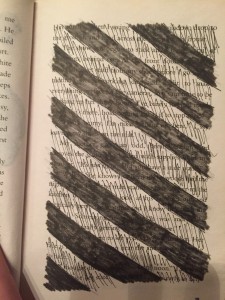
For his third design Brian wanted to have another design that was in black and white but also did not use the words on the page for his design either. In this design Brian tries again to convey a lighter tone compared to the darker tone of the book. In this composition we see a nice soothing line that goes in a type of wave formation that with dark lines that fill up around the line but not touching the main line with a gap between it. This to the artist gives the composition a lighter tone.

With his composition Off the Hinge, Brian wanted to convey certain ideas that can change the darker tones of the book too the lighter tones of Brian’s new creation. The work of alternated texts along with visual images creates a new story from a preexisting one. It creates more room for stories that have yet to be told as the original source is left as inspirations behind those stories.

Color Harmony: Phase 2

analogouspalette project                      split-complementarypalette project

In our lesson we learned all about Color harmony. We also learned about the difference between Analogous Palettes and Split Complementary Palettes. In phase 2 of project 6 i downloaded the template for what you can see above and basically had to experiment with any three colors on the color wheel until we came up with two different palettes that have a good sense of harmony between the colors.


Idiosyncratic

Adjective

a peculiarity of constitution or temperament :  an individualizing characteristic or quality

(Merriam Webster)

I first heard this word while listening to a collider heroes video on YouTube where Max Landis writer of the new comic book series Superman: American Alien describes his version of Superman as idiosyncratic.

Arbitrary

Adjective

not planned or chosen for a particular reason : not based on reason or evidence

(Merriam Webster)

I came across this word while looking throught the article “Why collaborate?”when it starts talking about being forced into teams that have no particular reason in the name of social correctness.

Consensus

Noun

general agreement

group solidarity in sentiment and belief

(Merriam Webster)

I found this word while reading the article “What If You Could Choose Between the Fastest Route and the Most Beautiful?” where they talked about using algorithms to come to a consensus about what is the best route to take.

didactic panel

Brian Mifsud

When looking at this page we can see that the artist Brian has taken a simple phrase and actually  was able to flesh out and make a connection between the word and the phrase. Using the universal symbol for a thought or an idea, a cloud used mostly in comic books and cartoons as a way of showing that the character has an idea. This design fits very well with the phrase “your idea” outlined on the page. The use of variation of sizes between the clouds helps make the biggest cloud the focal point of the piece. Even the repetition of the clouds helps get across the sense of ideas and thought.