Project #1 Introducing Yourself Draft

Jaichan Kirty (Jay) graduated from high school, Hillside Arts and Letters Academy in 2015. He is now nineteen years old and a freshman in college. Jay was born in Guyana but moved to the United States eight years ago. He is a shy and quiet person at first, but when you get to know him that’s when he does not stop talking. Jay major is Graphic Design. He chose this as my major because this is something He really like doing, and he like to expressing myself by designing what he think of. Jaichan is very good at computer graphics. He does numerous of designs. For plays, random videos, and power point. Many people consider his skill is “graphic designing” although Jaichan thinks otherwise. Jaichan claims he does this for “fun” but he is an amazing artist and has a great sense of creativity. His drawing are beyond imaginable. He is the most caring, most wonderful person you’ve ever met.

Jaichan is known for his graphic designing on facebook, and what he has done in high school. The administrators at his high school even asked him to create the official website for the school, which he had the honor of doing all by himself. That is something he is very proud of. You can check it out, its http://hillsidearts.org/ I also created and managed my high school’s facebook page. (https://www.facebook.com/HillsideArtsAndLettersAcademy) He created all the material posted on the page. He is mostly proud of the videos he created for my school. You can watch some of them on the facebook page. Many people tells him he’s talented when it come to that. Jay is very passionate about his works, especially graphic designs, his style is random really. He creates what inspires him. When you are down in the dumps Jaichan is always the one to make you rise like the sun bursting with joy and happiness. Although it may rain on Jaichan end, he never lets the rainy days get the best of him. He’s super smart, fun to be around, likes to mingle and always the one to laugh or make a sound. In five to ten years Jay sees himself owning his own designing company and starting to be known around the country.

Avatar

The avatar I chose to represent myself is a hot-air-balloon. Firstly this picture of the balloon is not a photograph, it has been graphically designed, which is my passion. This picture means more to me than just it being graphically designed. The balloon is rising in the air just like how I will not give up on something that I put my mind to accomplish. The balloon is rising just like how I like to soar in life.  I said I am very creative and as you can see in this picture this graphic is also very creative. I like how the designer uses the colors to make the subject pop out. This balloon is by itself, just like how I like to be by myself sometimes. I like to work in a peaceful and quiet place with no distractions. This balloon is the only thing recognized just like how I like to be recognized also. This is why I choose this subject as my profile avatar.

My avatar could be misleading to some because you really need to dig deep and think deep to understand how it connect to me. People may see this picture and think I like to ride on hot-air-balloons, which I never even tried in my life but something I can see myself doing for fun.

My complete profile will convey that I am a very creative and hard working person. My passion is graphic design and I have a lot of experience is this field already. I will not give up on something that I put my mind to accomplish. I express myself throughout my works because that’s the best way I know how. This matters because if someone is to hire me for a job they need to know that I give my best. I will work day and night if I have to do give the best product the client will love. They need to know I am very good at what I do and that will give me recommendations and more jobs.


Project #1

Comment on: Wind, Sand and Stars “The Tool” by Antonie de Saint- ExupĂ©ry


The Wind, Sand and Stars “The Tool” by Antonie de Saint -ExupĂ©ry, tells the reader how design is not to only to add, but to take away as well. This sentence from the chapter “to refine the curve of a piece of furniture, or a ship’s keel, or the fuselage of an airplane, until gradually it partakes of the elementary purity of the curve of ‘a human breast or shoulder
”, shows that there are elements that are necessary to make an object function to achieve its purpose. It connects to our graphic design principle and our everyday life, because in drafting it will take many hours and it will not be complete if elements are missing from the objects. The key is to start with something simple where you can go back and change. It will eventually take you another step closer to the finish line.

Urban Artifacts: Phase 1

My Discovery

My three urban artifacts that discovered seems to have nothing in common. Unless you put it in a category, “In a use for everyday life”. The three artifacts were a Kit Kat wrapper, Bobby Pin and a piece of plastic. Each artifact has a little bit of history of why it’s been left the place that I found. The Kit Kat wrapper was found near the gas station, it seems like someone ate the chocolate bar and just left the wrapper outside on purpose. Without thinking of throwing it in the garbage can. Or someone in the car, ate the chocolate bar and throw the wrapper out its window. Wrapper itself was not damaged, just wrinkles and the hint of smell stained the inside. Color is red and the Kit Kat logo stands out. Texture is smooth and no stains. The Bobby Pin was found near the City Tech College. It is a bit rusted, like it was being there when it rained. One side of the pin was broken; making the pin sharp and dangerous. Texture is smooth, there is some wavy part of the pin, which it supposes to grip into its hair. Color is black, I have never seen a colored one. The last artifact that I found was this weird shaped plastic. I found it also near the gas station, and it might be some sort of piece it fell off from the car. The color is light green, and the texture is a little bit rough. Since it is plastic and there is one pointed part, it can be dangerous if it pokes people.

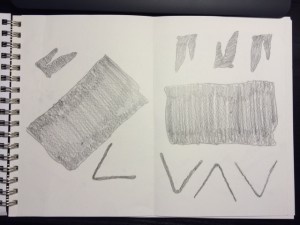
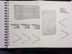
Sketches

Took approximately 5~10min drawing each

Stable:

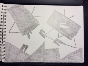
Stable Sketches

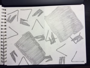
Sketch #3&4

Stable Sketches
Stable Sketches

Ambiguous:

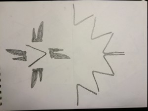
Sketch #1&2

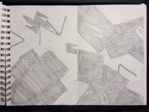
Sketch #3&4

Sketch #5&6
Ambiguous Sketches

Discovery: Avatar

Person Avatar: Jingyi

What I Observe:

  • Calico Cat
  • Humor
  • Anime
  • Pushing its face on a Glass

Interpretation:

  • Comical action
  • Who does stupid things
  • Making trouble
  • This is a fictional character

Paragraph:

The avatar that I picked was an animated Calico Cat who behaves in a humorous way. By pushing its face on a glass surface, it makes the viewer chuckle to the cat’s reaction I believe that this cat makes these faces, because he/she is a trouble maker. By making this type of expression, it makes the viewer catch its attention to this adorable, humorous and trouble making cat. Another way to interpret this avatar is how this Calico Cat can make a smile on everyone’s face. Whenever someone is sad or angry, this image of a cat can bring a laughter to cheer and make everyone happy. In addition, the cat looking through the glass can be a hit, that it is curious what is behind it.

Connection to the member:

The avatar does represent Jingyi, because when we introduced ourselves to the class, her humorous personality brought the class into laughter. Making our heavy nervous tension into more comfortable atmosphere. Also, she can be curious about knowledge that she haven’t encountered yet, just like the cat looking through the glass

Jingyi's Profile Picture
Jingyi’s Profile Picture