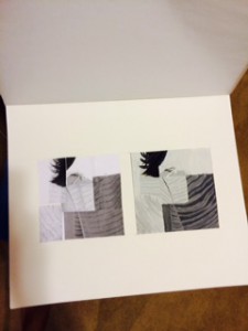
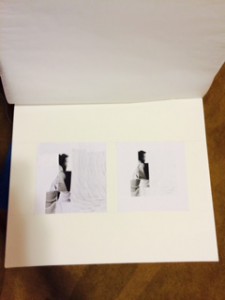
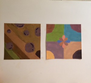
Each painting took me about almost three hours. It was hard for me to make the broad color than the narrowed one. I was not really sure about the colors for the narrow high key, because I saw example from my classmate. However, like how it turned out including the shapes that I picked.
Author: Ayano Morishima
Amid
Preposition
In or into the middle of (something)
Source: Merriam-Webster
I encountered this word when I was doing my assignment on annotating bibliography. (Source 2) This word is located at the first paragraph which it made me catch my attention, where I thought it was some kind of religious name. After I searched it on Merriam1Webster dictionary, I couldn’t believe that it meant, into the middle of (something). It is surprising that I have never heard of this word before. I am just wondering where in my conversation that I am going to use this type of word.
Project #3: (Annotated Bibliography)
“The Advantages of a New Perspective: A Literary Walk in Brooklyn Heights” Blog: Walking Of The Big Apple (No name, Published October 12, 2010. Web. November 16, 2015.)
The buildings were famous from the churches in the nineteenth century and its elegant homes created by the merchants and sea captains in the shipping trade. The picture itself connects to the theme of beauty and quietness, and the photograph looks as the same when you visit this location. Also, it mentions about an author who wrote about the beauty of a yellow brick house. Since, we are in the generation of using technology, many social media is connected also so that people can comment on the site and share their experience at that location.
This website connects to the project, because it talks about the background of the location. It includes such pictures and detailed promotion toward the area that I picked for my location. Even with my knowledge of the Brooklyn Heights, it talks more about different things that I believe that it motivates the reader to go to the place.
Keywords: Beauty, Quiet, History -AM
Kaysen, Ronda. “Midtown’s Vanishing Historic Architecture” New York Times. June 5, 2015. Web. November 16, 2015.
Historic District Council deemed worthy of preserving 12 location and 36 were recently demolished. She mentioned in her article that, “None of these sites were designated New York landmarks, but for many people, they were nevertheless among the treasures that define the city’s neighborhoods — the mix of terra cotta and stone amid the glass and steel that makes the city unique.” Midtown’s Vanishing Historic Architecture, an article published in the New York Times by Ronda Kaysen explains the reader about the how some buildings in NYC should not be demolished. Ronda explains the reader how many buildings should be kept in preserved, because of the significant architectural built of each premises. It is in the matter time that the Midtown will reach the tipping point of losing these old and new mixture of architectural buildings.
This articles relates to the project in a way that can help the Brooklyn heights to preserve its worth. Such explained in the Midtown vanishing architecture, buildings are demolished each day’s. People should know this reality that these old memorable places should be kept. We should keep our eyes open for any changes though the Brooklyn Neighborhood. Such occurrence happening in Manhattan, there is still possibility that it is not safe in Brooklyn or any other boroughs.
Keywords: Beauty, Demolished, News -AM
“Walking New York” New York Times By: Different blogger, dates are all different also
This website is very high-tech in displaying each location with the picture in the background and scrolling once by reading the next page. Each location are explained in details that are not like a long boring text to read like in one of the article. However, it is a whole collection of people explaining each of their experience with the location that have visited. There is a map that it shows the location of the place they mentioned in the text. The images that is behind can be moved by your mouse or hand. Showing the bird’s eye view, like the google globe that goes endless with right and left.
Even though, the location and the website does not make any connection in which is about Brooklyn Heights. However I believe that it some how shows different aspect in where the background map moves when you drag it, which is cool that people who made this kind of technology should do it for different borough, such as Brooklyn. Sure, Brooklyn Heights is fun. However, there is so much more in different locations. By reading articles from different people, I am sure that however reading it would lead them to the location that they want to see.
Keywords: Creative, Beauty -AM
McGrath, Ben. “New York City Walk” January 03, 2005. Web. November 16, 2015.
An amazing person, Caleb Smith who walked all the streets and island of Manhattan in NYC. He explains in his own website that he took two years to complete this project. He explained in his website, what exactly he done in his walk and in his days in the summer he woke up five in the morning and began started his daily walk. He have a map that is marked with black marker which it shows all the line so of the street covered. He also have many thumbnails to show people what he had accomplished, and this is something that any of us could do.
This article relates to our project because it is something that we could do as a Brooklyn community. We can do what Caleb Smith have done, where he walked all the street in Manhattan. We can walk Brooklyn Heights and see the different views and architectures. We can learn from his unique walk and it does relates to our project, because he have done something similar to our walk in Brooklyn.
Keywords: Beauty, Creative -AM
Terzian, Peter. must-see Brooklyn Heights March 03, 2014. Web. November 16, 2015.
Small summary about the Brooklyn Heights which it explains the architecture and the history behind the location. It contains more picture than the text itself, because showing beauty with words is different than showing the actual place if that person been to. In addition, comparing it to different source, each pictures is taken differently in perspective angles. It also has a link to some of the words that the author included, so that readers can understand what he means on the website.
This article also relates to our project, because it shows the different perspective of pictures. It have taken from different angles and some are taken at night to show the difference in day and night. I think that this little description is good enough to say to the people who wants to visit Brooklyn Heights, because giving off too much could lead the reader to know everything, which I am sure that they want to figure out things themselves.
Keywords: Beauty, -AM
Gist (Week 11/2~8)
Noun
The ground of a legal action
The main point or part
Source: Merriam-Webster
I encountered this vocabulary from one of our reading, “What If You Could Choose Between the Fastest Route and the Most Beautiful?” by . This word can be found at the last paragraph where the author of the article explains, how people should experiment on taking a different route. The word, gist shows the reader how the main point of this article is taking another route can change a person’s view on their walk.
Project #3 (Pitch/Draft)
Beauty, the quality of being physically attractive is something that the user who downloads this app will encounter. My co-workers and I, Ayano Morishima are making an route simulator known as “Route & Beauty” (Or Road to Beauty) that takes the user to a journey that can lead them to a beautiful location. Many people uses other apps to locate their shortest and fastest route, so that they could get to their location much faster. What if there is a app that can take you to the location, where the route is short, fast, and beautiful?
Many apps from the apple store contains route simulator that pinpoints to the users location and calculate time to show them different option in best or shortest route to get there quickly. However, is it time that the users want to save up to get to their destination? Sure, people want to get there quickly and do whatever they needed to do. But what if there is an app that can change the users surrounding views? Think about it, looking at the same route over and over is boring. The user might already know whats built there, even if they are blind! Our app focuses on people’s daily route and time, however what is different is users can use this app to encounter a new places just by taking a different route. Simple right? By changing just a little routine of users route to the final destination, and even if it takes just an extra few minutes, sure the surroundings of the users view will changes; maybe dull to beauty.
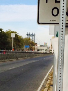
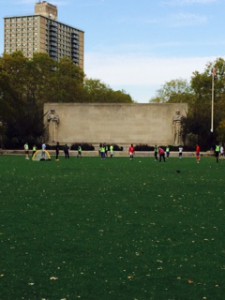
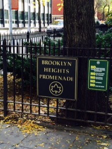
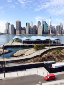
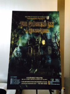
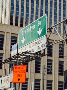
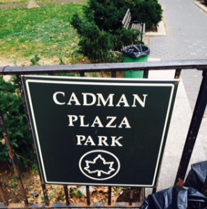
One of the ongoing project route starts from the Voorhees building. This building is a center for engineering technology for students who does to NYC College of Technology. Once you left the building to make a right, you will see a big road. If you turn right again, you would encounter an entrance of Brooklyn Bridge. Brooklyn Bridges connects the two boroughs, Manhattan and Brooklyn crossing over the East River. As you go further straight, you will see a huge park called, Cadman Plaza Park. A huge park where you can play any sports. Walk to right and left again, where you will encounter location called, Brooklyn Heights Promenade. As you go in though this location, and keep walking straight, you will see a Brooklyn Bridge Park Pier 2. Place where it features in basketball, handball, etc. Finally you go back to turn around from where you are looking at the pier. Go straight and you will see the same park again, go further more where you turned right to encounter the Brooklyn Bridge. Without turning right to the bridge, than go straight. You will see NYC College of Technology, as you keep going you will see a whole different scenery than before. More busy and modern structure to each buildings. Finally, you can take a subway, A,C, and R train.
These exampled location is a place where the users will encounter in the app. Such as the caption below will pop up to explain a little information that the user could do, when they arrive at certain locations. Many volunteers contributed to this route making, so that it shows the best time to go to the location, where it also shows the “best time” to go to the location at the top right corner. An example for the location above is, “the best time to go to the location” is between 2:30pm to 5:30pm. One of the volunteer commented, “It is a great place to go, especially since it is quite. You can see how houses are made of different structure comparing it to different locations. Going with friends or family would be a great way to explore a new route!” Thanks to our volunteers, this app does contain other features, such as little game that satisfies the users time traveling, voice active system where you use it like Siri, time countdown where it countdowns time to get to the location, and
Seeing different surroundings would motivate users to look though into new location, where they haven’t discovered yet. By using this app Road to Beauty, not only they gives the best option in shortest route, but to think about the user’s preference in showing beauty for getting to their location. Many people looks for quick way to get to the destination that they are seeking. However what if there is a route that is short and beautiful enough to make you use this app again? Why won’t you not give it a try?
Value-Added Portrait: Phase 4
Project#3 was very interesting where I got to use paint and Photoshop in order to create my finial work.I learned many things from this project that will benefit me to the next project. Hardest part of this project was the painting, since the last time I painted was when I was in elementary school in Japan. I also screwed up on measuring my collages, so that the final project looks off for the Photoshop. I do not know what happened when I printed out my image version in JPEG. I specifically out it into 6″x 6″ however, I do not know how library printer works so the image came out smaller. Also, since my collage’s measurement was off by 2 to 5 millimeters, I had to add in more to the side. When I looked the final project, I noticed many errors that I can work on further more. Above all, I did pretty much “Ok” with the above all project #3. However, I could do them better next time.
Value-Added Portrait: Phase 3
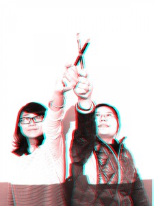
Took me about three to four hours to complete the painting, and the animation took about hour and a half. Mounting to Bristol took me about 2 hours. When I was working on it, the print out for the Photoshop version did not came out right. I specifically out it into 6″x6″ however, I do not know how library printer works so the image came out smaller. Also, since my collage’s measurement was off by 2 to 5 millimeters, I had to add in more to the side. (Will explain more in phase 4) The 3D Anaglyph was easier for me to do them, because I learned almost everything from my other class.
Project #3 (Location Guide)
Beauty is something that you will encounter after you download this app. My co-workers and I, Ayano Morishima are making an route simulator known as “Route & Beauty” (Short for R&B) that takes the user to a journey that can lead them to a beautiful location. Many people uses other apps to locate their shortest route, so that they could get to their location much faster. What if there is a app that can take you to the location, where the route is short, fast, and beautiful? One of the ongoing project route is shown below.
These exampled location is a place where the users will encounter in the app. Such as the caption below will pop up to explain a little information that the user could do, when they arrive at certain locations. Many volunteers contributed to this route making, so that it shows the best time to go to the location, where it also shows the “best time” to go to the location at the top right corner. An example for the location above is, “the best time to go to the location” is between 2:30pm to 5:30pm. One of the volunteer commented, “Its a great place to go, especially since it is quite. You can see how houses are made of different structure comparing it to different locations. Going with friends or family would be a great way to explore a new route!”
Project #3 (Location)
As you can see from the map, I picked very different locations where it took me about two to three hours in walking. I picked the first location, Voorhees Building because of an event that happened where drama department put this amazing Halloween Haunted Hotel. Next was the entrance of Brooklyn Bridge, I wanted to pick this location because of the mentioning in class. I went to the nearest park which was Cadman Plaza next to the court. The most farthest place I went was the at the end of Clark Street where I saw the river between Manhattan and Brooklyn. The view was very nice, where it showed me the different side views of from Brooklyn to Manhattan. Lastly, I picked Lawrence Street where I found many Asian cuisines restaurants.
Consensus & Nebulous
Consensus:
Noun
A general agreement about something
An idea or opinion that is shared by all the people in a group
Source: Merriam-Webster
Nebulous:
Adjective
Not clear
Difficult to see, understand, describe, etc.
Source: Merriam-Webster
I encountered both words from the reading expert, “What If You Could Choose Between the Fastest Route and the Most Beautiful?” by Lex Berko. This article was about how, people usually take the fastest route to their destination. However, what if there is a beautiful route that you can take but takes a little longer? The word consensus, agrees on a general or broad idea. Meaning, you just agree with someone like for example, “Yeah, I know there is more beautiful places in the city, but I rather get to my destination faster”. Which is agreeing to a broad idea, “Yeah, sure there is beautiful part of the city and I will eventually get to that”. Another word, nebulous means difficult to see. In my definition, I think that means “I do not understand the meaning, why would I want to choose the most beautiful” Cannot see the picture or to comprehend the meaning of seeing something beautiful, where they only thinks about moving forward. Taking the fastest route.