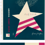
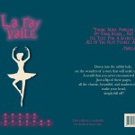
For this project, I picked dominant, sub-dominant, and accent colors from the design museum we went as a group. It was called, Cooper Hewitt. As I saw varieties of different designs, this book cover made me catch my eyes since it had all I need for this project. I picked it since it was simple to work with, and the choice of the color matched my theme itself. I used the eye dropper from the color inventory and used Photoshop over all to make the new book cover (at the right). I picked ballerina for my cover since I used a ballerina in one of my design it self. I used my theme for my style in the font also. I gotten the quote for the back and I done everything else at the back with the bar code and the numbers and the lines are all changed to the color I picked from my inventory. Over all for this project, other than the time we went to the museum, it took me about two hours to work on it. I also liked this project, since I was able to express freely about the theme of my book and how I was able to use technology to work on it.
Author: Ayano Morishima
Color Harmony: Phase 3
I picked this from the design gallery at the Cooper Hewitt, Smithsonian Design Museum; Book cover, Amerika, 1947 design by Alvin Lustig. The explanation of why Lustig made this cover is said from the the didactic from the web site that states, “…employ abstracted iconography and simple typography and lettering to create emotionally compelling representations of a book’s themes.” I picked this cover, because it was simple. As in, it had simple colors compared to others. Others tend to have multiple colors that it didn’t identify it, for my connection in the theme. Since my dominant color is dark blue, the use of shade in the ballerina drop shadow was difficult. However, if you see it closely it is actually a more dark shade of blue. I also used tint in the title of my book and also a shade for my name at the bottom. For over all phase 3, I spend about two hours. I didn’t use any tin or shade at the back cover, since I wanted the reader to actually see the text. I used Photoshop to complete this phase. Link to Cooper Hewitt Research: Here
Exhibit Catalogue (Revised, Final)
This exhibit is presented by Ayano Morishima, who was born and raised in Tokyo, Japan, then moved to New York, where she now lives and studies. She was inspired by Tom Phillips’s work, Humument of transforming a used book into an art and poetry project. Morishima then created, La Fay-Vaile a new name she picked out from the original book she used for her project. She also changed the theme of a book to dark wonderland to show the difference from the original theme, Wish. She was also inspired by the original creator of Alice in Wonderland by Charles Lutwidge Dodgson under the pseudonym, Lewis Carroll in 1865. The three design Morishima created, Gates to Wonder, Book to Wonder, and Dreams to Wonder are from the book that represents to the theme the most and an message about how anyone can rewritten a destiny of the book. Though Morishima’s knowledge and techniques from her studies in COMD 1100 and ENG 1101, college courses that is part of Learning Community: Ways of Seeing, it helped her to be able to create this project. To create her designs, she used her technique in using ink brush pen, x-acto knife, old book and folding to show the viewers, the new kind of story that unfolds.
For the first design, Morishima title the design, Gates to Wonder. Because of multiple doors of the design, indicating a way to the wonderland. A starting point that everyone must encounter. She used the ink brush pen to make many repetition of connected diamonds to indicate a chandelier also, blocking out most of the text in the book to show how visible text are connected to the picture that is shown as a ground. Each words representing the meaning behind the design, such as went, door, worse, cry, wondered, etc. In addition, used figure and ground technique to show the viewers where exactly to see; in this case, the shapes of the ground shows more vividly since the black ink, the figure blocks out other negative space.
Down into the rabbit hole; the second design, Book to Wonder leads the viewers to go though the door to read a little book that came from the concept of the original, Alice in Wonderland. She used x-acto knife to cut open a block of text at the bottom of the page and glued only in the middle. By doing this, she wants the viewers to see that there is a book in a book. Same as the first design, she used the technique of figure and ground, showing the ground to block other negative space. In addition, by folding the corner to the right top, it shows the next design that shows the technique of a chromatic gray; grays that exhibit a subtle, but visible hue; created by adding larger amounts the complement and white.
Dreams to Wonder is a design that was created to show “the after math of Wonderland”. Story goes as the darkness in wonderland was finally came to the end. Many would think that the ballerina could be Alice, however being the character in the original story, Morishima completely disconnected the characters from her project. The ballerina indicates a spirit that it stabilizes the wonders in the wonderland. She also used ink brush pen to create curtains on the right and left sides to show that she is on a stage, and the visible words that fits with the story of the page, such as dancer, moment, felt, perfect, and choice.
Ayano Morishima, made this project from her understanding in COMD 1100 and ENG 1101, college course she is taking in New York, where she lives. She made this mainly to attract people who are interested in creating their own story. It conveys though out each pieces of art work and detailed design, where it tells the message in the theme. Single page contains a message where Morishima’s story that she made though out the art she loves, she wants the viewers to understand that stories can be can be rewritten to make new ones. Even characters, make them have their own destiny with out following the original story.
Evaluating Glossary
Oscillate
Inextricable
Braggarts
Endearment
Commit
Mitigate
Querulous
Consensus
Nebulous
Gist
Amid
Didactic
Bucolic
Quirk
AP Wire Service
Exasperate
The glossary assignment for the semester was very effective in helping me. It made me understand each words, with meaning and the use of parts of speech wise. It definitely helped me in the process of reading, however other than reading the article provide to us, it did not. I do not mean that it didn’t help me, however I actually had no time reading such other materials. By checking the definition, on Merriam-Webster which I thought it would be the best dictionary source, it showed me a clear view on each vocabulary. One of the definition was found from the use of Thesaurus because I wanted to discover new words that had a similar meaning, I believe that using other resource and different dictionary might be just sufficient resource, like google define for a quick search. There was many vocabulary words that contained two definition for a single word, I learned that I had to make sure which one best fits the sentence as a whole. By coordinating with my classmates for this crowd-sourced project, it made a resourceful site and it helped others build on to their vocabulary. In addition, this project will going to help me in the future where I probably need so that I can be more professional speaker and writer. This project felt and united as a being in a community, such we done in the COMD class for the humument project where we picked our single significant page that meant each to us and the class didactic post for the presentation downstairs.
Project #3 (With Work Cited List)
Beauty, the quality of being physically attractive is something that the user will encounter after they downloads this app. My co-workers and I, Ayano Morishima are making an route simulator known as “Road to Beauty” that takes the user to a journey that can lead them to a beautiful constructed location. Many people uses other apps to locate their shortest and fastest route, so that they could get to their location much faster. Taking a different walk from your usual course of route would open your view on beauty after downloading this app, which it contains features of short, fast and beautiful route.
Many apps from the apple store contains route simulator that pinpoints to the users location and calculate time to show them different option in best or shortest route to get there quickly as possible. However, is it time that the users want to save up to get to their destination? Sure, people want to get there quickly and do whatever they needed to do. But what if there is an app that can change the users surrounding views? Think about it, looking at the same route over and over is boring. The user might already know whats built there, even if they are blind! Our app focuses on people’s daily route and time, however what is different is users can use this app to encounter a beautiful constructed location just by taking a different route. Simple right? By changing just a little routine of using the same route to their destination; even if it takes just an extra few minutes, sure the surroundings of the users view will changes. Peter Terzian states that “The Heights wears its rich history on its sleeve, with the area a showcase of stately architectural styles, august churches and schools and literary landmarks.” Basically, the author is saying that there is a lot to see at the Brooklyn Heights. Such as churches, beautiful architecture, school, etc. Its beauty captivates people hearts and its amazing location with in Brooklyn heights conveys the inner beauty in Brooklyn.
One of the ongoing project route starts from the Voorhees building. This building is a center for engineering technology for students who does to NYC College of Technology. Once you left the building to make a right, you will see a big road. If you turn right again, you would encounter an entrance of Brooklyn Bridge. Brooklyn Bridges connects the two boroughs, Manhattan and Brooklyn crossing over the East River. As you go further straight, you will see a huge park called, Cadman Plaza Park. A huge park where you can play any sports. Walk to right and left again, where you will encounter location called, Brooklyn Heights Promenade. As you go in though this location, and keep walking straight, you will see a Brooklyn Bridge Park Pier 2. Place where it features in basketball, handball, etc. Each locations shows the beauty of each aspect in how it was constructed for. For example, since the Voorhees building was built unique, which it intrigues people who are interested in architecture or simply how different they are. Also, Brooklyn Bridge Park Pier 2’s building is constructed beautiful, because of the surrounded body of Hudson river and the view of the sky scrapers of Manhattan. Ronda Kaysen states that “As it is, many preservationists worry that Midtown could soon reach a tipping point in which the architectural mix of old and new is lost to a wash of sparkly glass.” Basically, the author is saying that not only in Manhattan, but other boroughs such as Brooklyn architecture are in need to keep an eye out. Soon or later it would be demolished without knowing.
These exampled location is a place where the users will encounter in the app. Such as the caption below will pop up to explain a little information that the user could do, when they arrive at certain locations. Many volunteers contributed to this route making, so that it shows the best time to go to the location, where it also shows the “best time” to go to the location at the top right corner. An example for the location above is, “the best time to go to the location” is between 2:30pm to 5:30pm. One of the volunteer commented, “It is a great place to go, especially since it is quite. You can see how each location are constructed differently comparing it to other locations. Going with friends or family would be a great way to explore a new route!” Thanks to our volunteers, this app does contain other features, such as little game that satisfies the users traveling, voice active system where you use it like Siri, time countdown where it countdowns time to get to the location. The article of The Adventure of a New Perspective: A Literary Walk in Brooklyn Heights states that, “Brooklyn Heights still retains a sense of dignity and quiet, the legacy of a residential neighborhood that was famous in the nineteenth century for its churches and for its elegant homes built by merchants and sea captains in the shipping trades.” Basically, the article is saying that Brooklyn Heights is the best place to go and explore about the legacy of a residential neighborhood and the beautiful scenery that smooths people heart.
Seeing different surroundings would motivate users to look though into new route to their destination, where they haven’t discovered yet. By using this app Road to Beauty, not only they gives the best option in shortest route, but to think about the user’s preference in showing beauty of how the location was constructed. Many people looks for quick way to get to the destination that they are seeking. However what if there is a route that is short and beautiful enough to make you use this app again? Why won’t you not give it a try?
Work Cited List:
Terzian, Peter. must-see Brooklyn Heights March 03, 2014. Web. November 16, 2015.
Kaysen, Ronda. “Midtown’s Vanishing Historic Architecture” New York Times. June 5, 2015. Web. November 16, 2015.
No name. “The Advantages of a New Perspective: A Literary Walk in Brooklyn Heights” Blog: Walking Of The Big Apple. October 12, 2010. Web. November 16, 2015.
Rosen, Jody. “Write about resources” OpenLab. Web. November 6, 2015.
Color Interaction Parings: Phase 4

For this project, I had to use my knowledge of color interaction, where the color are the same but the background color tricks our eyes to see differently. Also, because of how one is more d saturated, and other are much more muted color. Making the logo stand pop out or sinks it in. The hardest thing to do for this project was where we have to come up with a logo. We had trouble at first, however we decided on using abstract piece. (Explained in Phase 3) Took me about four hours and forty minutes in total, with sketching and everything.
Exasperate
To make (someone) very angry or annoyed
Source: Thesaurus to Merriam-Webster
I encountered this word, from the synonym, word tired. Because of the final is coming up, and just seeing your grade at the almost end of semester is unbelievable. Its not something “Oh semester is almost over, I don’t really care”. I actually want to revised grades if it is lower than C+. However there is limited time to fix it unless if I do not know your grade before the end of the semester. From the experience I had in the semester, maybe it is something that I have to ask for my grade constantly if it is not updated.
Color Harmony: Phase 1
Photo Link: 1st|2nd|3rd
I found these photos from google images and provided a link where it actually from. The first image is a sky with two colored progression. In which two colors are mixed in the middle and both sides takes two different colors that to show how it progressed to make the middle color. It also contains a little bit of chromatic gray shades in the middle since there are clouds. Secondly, I this image was posted in some kind of corner form, called Big Blue interactive which it said, “In honor of Flowers…” one of the post by Pete from Woodstock on 5/5/2015 11:21 am. There is different types of color that pansies produces as they flower. I picked this one instead of others since others had a relationship in using tint. I can see the progression of shades going on from outer petals toward the inside where it gets darker. Lastly, I picked a flower that had a tint of progression in pink. I was surprised that this is from someone who is using OpenLab and he/she went to a botanical garden and gathered this photos. It clearly shows the tint where the color progressed from the middle of the flower to the outer petals. Since we really different have time to go anywhere as a class, and since I gathered this information from the internet. It took me about five to ten minutes to gathered this images and inks, however it took me about twenty to twenty-five to write this post. About thirty-five minutes to finish this phase.
Color Harmony: Phase 2
From our lesson, I learned the color harmony. There is different kinds of harmony such as use of gray scale, shades, tint, tone, compliments, and gradient. There is color relationships that I learned also, Analogous, Near-Compliments, and Split-Compliments. For our phase 2 of the project #6, I downloaded a template that my professor provided for us to understand and take practice in using tone, two-color, and shades. By picking three colors from the color wheel and using the Analogous and Split-Compliments. This part of the project was pretty easy and understandable, since we learned so much about color, and the way that how each relationships of the color works from our learning today. It took me the whole class to complete phase 2, so about three hours.
Color Interaction Parings: Phase 3

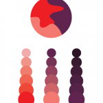
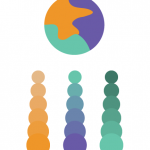
I really liked this part of the project, since we were able to work with a partner and use illustrator. For this project, me and my partner Romie picked a color that represents us both for the logo color and picked a relative personality color that represented us separately. We came up with idea for the logo should be a abstract. I think it was a great idea, since many people done a silhouette of an animal. I came up with this logo that combined with Romie ‘s hobbies. (*On the right) Including the curves that represents the creativeness and the pointy thorn looking curves indicates his smartness that goes straight to his point. Lastly, the little circle shows his personality that makes everything in put together. It took us about the whole class time to work on gathering ideas of personality wise, colors and hobbies. Including working on the illustrator and finishing it. It took me about hour and thirty minutes to place the logo on to the actual color paring. Ruffly it me about in total of four hours and thirty minutes.
