This project was very different and interesting from any other art projects I’ve done. The whole process was a little stressful for me because it took such a long time and a lot of steps but it was good to see my final product and my classmates’ final products. I did learn how to visually achieve ambiguous and stable compositions, which I think a lot of other people achieved, I just don’t think I achieved that. However, I was fine with going into class to present my final compositions and getting the constructive criticism that I did. Now that I know what to do for upcoming projects, like posting everything and trying to rework certain things, which I look forward to future projects.
Urban Artifacts: Phase 4
It’s wasn’t the most challenging project that I’ve done nor I didn’t take it very serious, but I did have a bit of fun and I’ve learned a lot besides drawing such as describing the part of a drawing and understand its meaning of a figure. I could’ve done better if I added a little more for my ambiguous sketch by taking that small figure, converted into a larger figure and draw it on the extra space that I had left. If I have done it, then my perspective of my drawing would’ve been better and consider that as a challenge.
Urban Artifacts: Phase 3

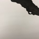

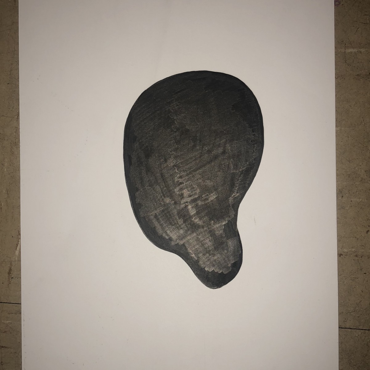
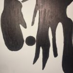
The first image is a stable sketch because the only figure in this image is the dots on the top, bottom, left and two in the right. For some, people think that it’s a Ambiguous image because the dots are moving around at different directions but I say it’s still stable because the dots are just very calm and just staying in one position to another. The second image is a ambiguous sketch because we see this very large object on the top right corner that doesn’t show where it starts or ends. It just crosses the whole image on a side. Unfortunately, I do not have the original picture that is only draw with black market because I’ve already hand it out the original picture to the professor and that is because I’m only showing the sketch version.
Update (October 11, 2018):
The two images on the top are the complete and ink figures.
Urban Artifacts: Phase 3
For this part of the project I worked about an hour for both to come out how I wanted them to. I picked two different pictures, and they both ended up being stable compositions. However, the reason why I chose those two pictures which were both paintings. One was ribs and the other a human heart, they both showed organic, natural curves and I really wanted to show that. I decided to really make the shapes stand out by having them both contrast each other which is something i recieved positive criticism for.
Urban Artifacts: Phase 4
My thoughts on this project are that it was fun, I enjoyed and like the final look of what I’ve done for the project, yes it took different steps and a longer time period but it was a fun process. What I’ve learned would be the difference between ambiguous and stable drawing along with the elements it needs to be considered one or the other or any details that can be added to it. To the criticism I recieved on the project, making the lines a bit thicker would be best in changing of the artwork and something I would keep in mind for the next project and consider its effect it can have on what I do in future projects.
Urban Artifacts: Phase 4
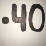
After the criticism i received from class, i needed to make these two pictures relate to each other. By doing that i took the circle from the stable figure and added it to the ambiguous figure. With the circle, the ambiguous figure looks like something spilled and covered up the 40. From what i learn from the critics, for the upcoming projects i will use figures that are able to relate to each other.
Urban Artifact: Phase 3
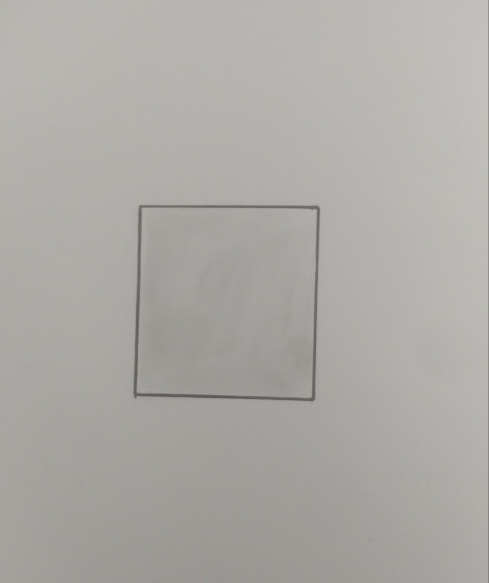
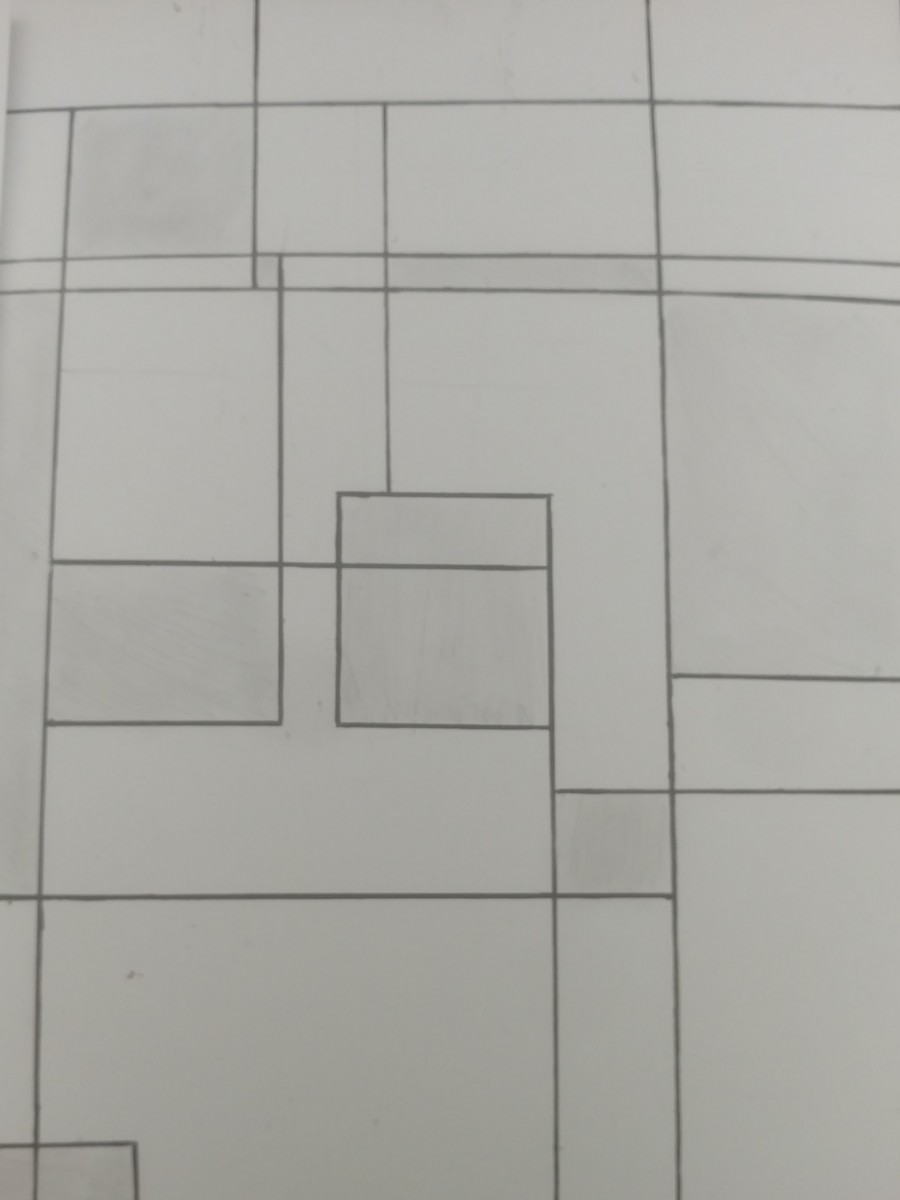
Here you have one stable and ambiguous figures. It took me a few minutes to do. I was inspired by the subway wall tiles where it’s all perfect and squares. So I wanted to incorporate that for the stable figure as one somewhat perfect square. For the ambiguous, I wanted to break that perfection and make it all distorted while adding new lines and shapes. This phase relates the other phase where we had to take pictures of stable and ambiguous and now we have to sketch it out for more understanding of it.
Urban Artifacts: Phase 4

Time: 45 minutes
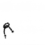
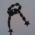
Manhole cover – Star bracelet
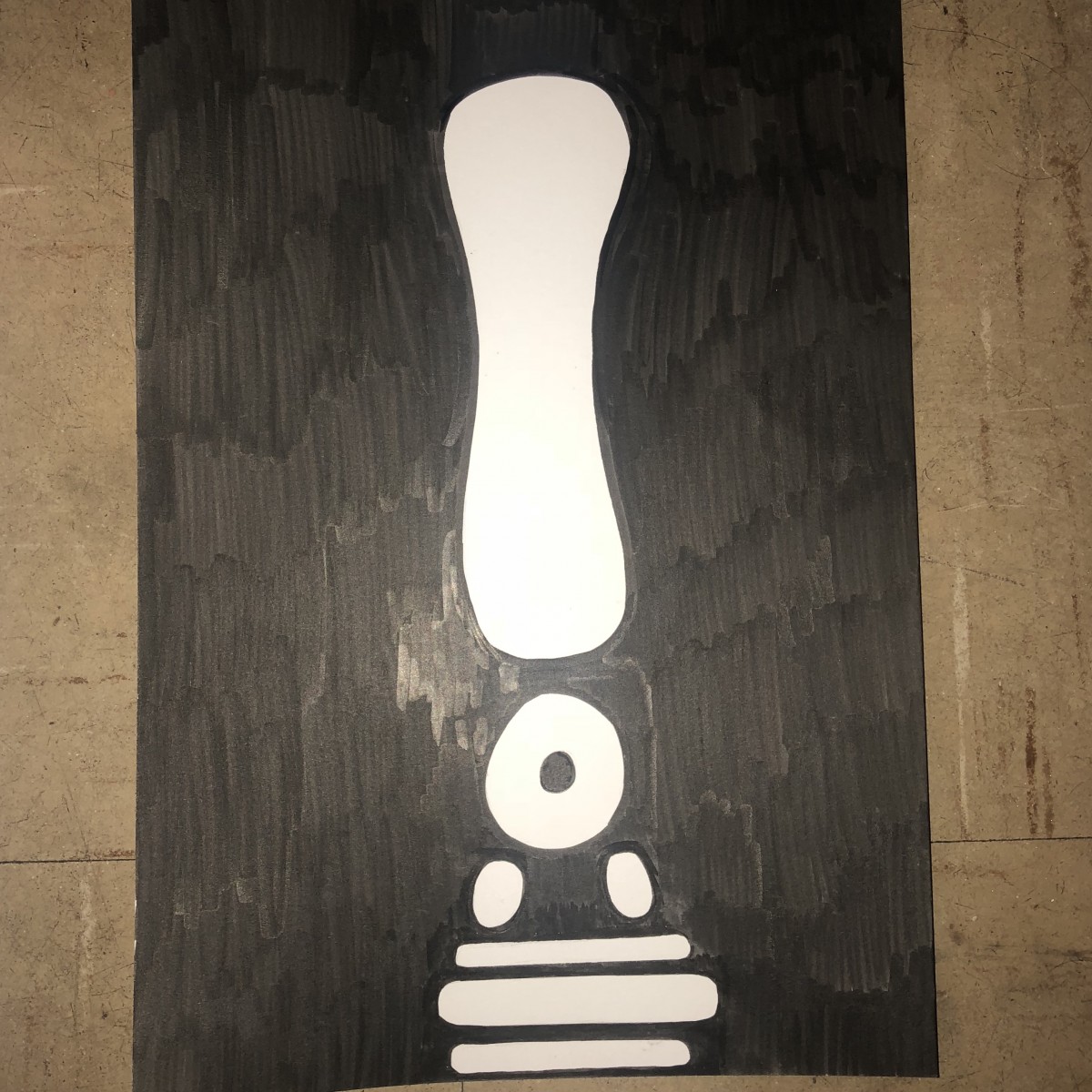
I learned that a stable figure can still be interesting with good composition and scale. This project reminds me of a stencil project I did back in high school and detail didn’t matter there. A stable figure is a 30/70 while an ambiguous is almost a 50/50 when it comes to background and figure. What I could have done better was made it more of a solid black until the marker strokes disappeared. I will bring this into my next project by attempting to work slower and more accurate.
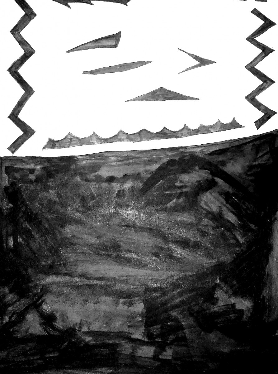
Urban Artifacts: Phase 3
I finished the stable image in class and chose to shrink it and move it more towards the top of the page (I centered it in this image but not on canvas). The way I drew it looks like it could be hanging from somewhere and it looks more interesting to me. This is stable because the background surrounds the object. 30/70 ratio.
I finished inking the other image also in class but had to go over it again at home because my marker was dying. This is clearly ambiguous because compared to the bracelet there is a 50/50 relationship between the background and figure which makes it unclear what the figure is.
The story between the two images is that the bracelet fell into the manhole.
I think this was about the last 45 minutes of class, it took me 5 minutes for the first one because I made it smaller.
urban artifacts phase 3
 Ambiguous
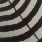
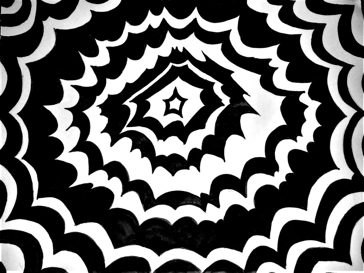
These are the finished, inked, design of the urban artifacts phase 3 project. I chose the tree stump photo, and the Trash, because i felt there was a lot to simplify and stylize. I decided to go with a simplified pattern or design to make it seem more like a textile.
the stable design, is black and white, split roughly in the middle, with easy triangular shapes to show some sort of definition. While the Ambiguous peice is a black and white repeated pattern. vaguely replicating the rings of a tree stump.