Color Interaction Parings: Phase 1

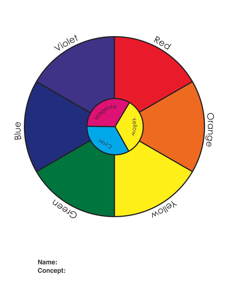
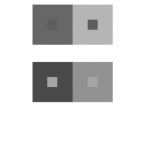
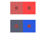
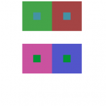
In this article by Maria Popova, I learned that color is both mental and physical. In the article the author states that we see but at the same time we don’t see. The author also quotes, “In visual perception a color is almost never seen as it really is — as it physically is. This fact makes color the most relative medium in art”. This quote to me means that color can be seen in different perspectives than just from what’s actually there. I also learned about the after-image effect. The ‘afterimage effect’ demonstrates the interaction of color caused by interdependence of color. Color comes in many shapes and forms and can be expressed through many other things. Another thing I gasped from this article is the concept of illusions and how color makes illusions more visible and more effective.

Source: https://www.brainpickings.org/2013/08/16/interaction-of-color-josef-albers-50th-anniversary/

Saturation Studies: Phase 2

This is my painting chart. The whole of this phase was to understand the mixing of colors and how saturation affects primary colors to create new colors. As you could tell I had a hard time with this. At first I had gotten the hang of the first two boxes on each side of the chart but towards the middle i kind of gave up partly because I ran out of paint. All in all, I watched a youtube video after and I had gotten the hang of it.

Hours: I spent about 3-5 hours on this phase of the project.

Saturation Studies: Phase 1

For my color wheel I wanted it to be based off eyes, I did different eye colors that exist and some eye colors that are fictional. The reason I chose eyes is because eye color varies and its very distinguishable. So I thought I would search up different eye colors. Three of my eyes are not fictitious and the others are.

Time spent: I spent about two to three hours doing this phase of the project.

Color Interaction Parings: Phase 2

I spent 5 hours and 30 minutes on this. I struggled to see the difference between the two last ones so I needed to check in with some people I knew. I still can’t see the difference so I’m getting that checked.


Color Interaction Parings: Phase 1

I learned that colors have “physical facts and physic effect. Factual color is how we first perceive a color through experience. Actual color is achieved because “seeing one color makes our eye want to compensate by seeing its complement” That’s why when we see the two X’s there appears to be two colors when it’s actually three, the yellow, purple/gray and the X. Optical mixture changes the way we perceive color too, changing one color can make the whole image look different (brick example). She says a quote “Practice before theory” which basically means you have two types of knowledge. Knowledge by description (direct knowledge through background knowledge) and knowledge by an acquaintance – perform it via experience (as you see/perceive it) (Color in context)

The article is about how our brain there’s an afterimage effect. Our brain likes to stick with what it expects which is why we see an illusion. In the audio Alber says “The majority of the people miss the true reality” which means our brain is wired to perceive things quickly just enough for our survival that we don’t stare long enough to actually “see through” what’s happening around us. In the article, if you stare long enough at the dot, you can see yellow diamonds on the right because of the contrast reversal. What I learned from this is that if we stare hard enough and try to pay attention to detail, we can see colors that others normally wouldn’t see at first glance. (The Magic and Logic of Color)

Saturation Studies: Phase 4

For this project was slightly more challenging, but not impossible. For the color wheel, i had fun with choosing the topic of roses in different colors. For the painting, it was cool to mixed colors to get saturated, desaturated, and muted colors in each row. In the future, i would apply my painting skills to mixed colors i might not have in the kit, and used photoshop for future assignments. For the painting, i could blended more better to be more accurate. The poster was easy enough and i liked that i can make up my own name. Overall, this project was good, but won’t do again though.

Phase 1

Phase 2

Phase 3

Saturation Studies: Phase 3

So for  this project,  the main name is Luscious Fragrance because the topic me and my partner had was cool so we chose this name to help represent “cool.” So the colors you see below are in the cool side with the vibrant blue and violet. For colors, i wanted to keep the colors and its shape since it helps represent the idea. The hours spend on this was about 3 hours at most.

Value-Added Portraits: Phase 4 – Deliver

This project taught me that i need to get better with painting and using brushes. And also that i hate dealing with glue. There are many things i did during this project i wish i could have done differently, such as my planning and documentation.  I also wish that i didn’t have to see 15 cut out photos of myself. I think what’ll take away from this is that composition is just as important as the drawing aspect of it.

Phase 1

Phase 2

Phase 3

Value-Added Portraits: Phase 2

Broad range design, followed by Narrow (low key).

This first image was meant to be campy and more artistic, while the second piece is more grounded in reality.

hours spent, roughly 8