Sound Visualization: Phase 4


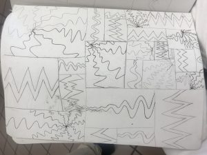
During this project, I learned how to work photoshop to create a mashup of different pieces of drawings that I made. though I did feel like I wanted to do more, I am still happy with the outcome. I also wish that I had made my inking piece a lot better because the lines were not straight at all, that made me have to put in a black background instead of a white one. in the future, I would like to do this a lot better and with more legato and staccato pieces.  I would also like to learn how to use the animations in photoshop more so that it could be more smooth the next time we do something like this.


https://openlab.citytech.cuny.edu/rosenspevackfylcf18/2018/10/29/sound-visualization-phase-1-2/

https://openlab.citytech.cuny.edu/rosenspevackfylcf18/2018/10/31/sound-visualization-phase-2-2/

https://openlab.citytech.cuny.edu/rosenspevackfylcf18/2018/10/25/sound-visualizations-phase-3-3/


Project 3 Draft

Introduction:


For my juxtaposition project i took ann picture of two buildings that happen to intersect between each other. One building was  roughly rigid, eroded, and looked very old. On the other hand the other building was more like a common style skyscraper . The juxtaposition in this picture was the view/perception of what’s considered new and old. It’s crazy to think that in a civilization/economy as advanced as New york city is so ancient but also advanced at the same time  in the exact same space.


Section 1: Similarities

Although my juxtaposition flick may look like two regular buildings that happen to intersect. It’s way more than than it appears to the naked eye. They have similarities such as that they both have adjusted windows which happened to be organized in the same way. The other similarity is that they both just happen to be on the same space going back to my first point which supports juxtapositions being in a mutual area. Another similarity that these two buildings have in common is that they share the same background. The background is the clouds and the blue sky that alternates the pictures.


Section 2: Differences


On the other hand the juxtaposition photo that I took has many differences. One major difference is the height difference. Nowadays New york city is known to be the major city that has a whole bunch of skyscrapers. The difference in height explains the age of the buildings. Usually in new york city if a building is small it’s usually old unless it’s some kind of store. Also the taller the building (example skyscrapers) the more innovative and new it is. Also in the new building, the outside layer of the walls looks very new and clean. It’s also looks as if the building was made for some kind of professional business. On the other hand the shorter building is more old and eroded. Signs of erosion on walls usually mean one of two things. Either the building is old or its sanitary condition isn’t up to par. These differences prove my point on how much juxtapositions can be two different concepts but similar things.  


Section 3: More about juxtapositions


Although my juxtapositions have many differences and similarities, the environment that they are in matters also. When i took that photo the surroundings around me were very urban. First and foremost in order to travel to where my juxtapositions were you had to just walk around the block from city tech until you got towards the bookstore and you would see the two buildings. In terms of sensory experience while I was taking this picture I smelled halal food from the halal cart that just so happened to be on the same sidewalk i was standing on. I imagined a whole herd of people walking in to get some food after a long days hard work. In terms of sound there was a whole bunch of noise comig from the cars tat were in traffic and all around me i heard phone calls. Also the middle school kids just so happened to be going home from school and stuff and maybe probably about to get lunch.


Conclusion:


In short juxtapositions just so happens to be around us without us even noticing. Just like the picture I happened to take. It brings all things into may aspects. Many aspects such as locations, sensories, sensations, touch and many other things happen to be in place. Similarities and differences are what makes my juxtaposition photo meaningful. Time frame also plays a huge aspect on my points and opinion within the photo.


Project #2 revision and Project #3 draft cover letters

For Project #2:

What’s different about your finished version?

How does it meet the assignment requirements now?

How does this version respond to or incorporate my suggestions?

Any thoughts about the kind of feedback I provided? What worked and what didn’t?

What grade does this new finished version deserve, based on the grading rubric? Consider all 4 categories in the rubric.

For Project #3:

What have you accomplished for this draft?

What work still needs to be done? Be thorough, since this will help me see your vision for your project.

How has this become a topic you’re interested in?

What feedback do you want from me to move you from draft to finished product?

How much more time do you think you need to devote to Project #3?

What grade do you think you have already earned? What grade are you aiming for with the revised version that you’ll submit next?

perforating

Part of speech: Verb

Definition: “To make a hole through, especially: to make a line of holes in to facilitate separation.”

Site: https://www.merriam-webster.com/thesaurus/perforating

The tool: “what is it makes them think that the plowshare torn from the bowels of the earth by perforating machines,…”

I understand now that a plowshare is a part of the plow, and the plow itself is putting the holes in the ground. when the “plow” in “perforating” its putting holes in the ground that helps for farming and planting seeds.

Project #3 Draft

The building in the foreground, made possibly in the 1920’s, is forced to assimilate to modern day, plastered with signs and made into a retail store, while a building currently in construction, sits in the background, waiting to be completed. The juxtaposition is time, old against new

This building was constructed during the  architectural period known as Art Deco or simply Deco, and is described as “influenced by the bold geometric forms of Cubism; the bright colors of Fauvism and of the Ballets Russes.” ( this is from wikipedia, so i need to change the source). This older building, and the period in which the building was constructed, was known for it’s exterior design, and every building made during that time period are easily visible, yet here we see it’s design partially blocked by  signs, hiding the other decorative sculpture like carving behind it, leaving only one visible.  To add onto this, just below our Art Deco building, we can see that the first floor was renovated and transformed from a time capsule into an Ann Taylor.  (old building with ann taylor and the signs, why not do the whole building? are different floors owned by different people?)(elaborate n stuff) ( and add a quotation, maybe from that ny guy) It appears as though, that instead of modernizing the second floor, they did what they thought would be  just as good, and plastered signs outside. But all this does is make its presence more known, it stands out even more( add on ) ( only talk about the tiny building here, compare everything there then move onto the other building) ( maybe you could even compare the art deco to Ann Taylor? for a different section. since it is the bottom half that got updated.) (so it would be building to signs. then building to Ann Taylor. then whole building to new building)

construction:  which brings me to my next point, the new (yet unfinished) building in the background, looming over our older building.  As i had said earlier, what reason was it that they renovated the first floor, but kept the original design on the upper level, and why not just demolish the entire things, and start over? what did this art deco building have that the newly made building didnt have, or the building that was there prior. It seems as though our shorter building, against it’s signs and first level, in addition to the new building under construction, has been left behind. Left to remain as old as it is, forced to assimilate into modern times by adding in signs, but these attempts are in vain. ( quote in here)( because its still old and i ran out of ideas )  (maybe talk about the skyscraper race, when they really wanted tall buildings, that was when the empire state building was made, and thats when art deco was around in the US, now that skyscrapers are more common the building in the background is taller just cuz)(also separate some points, like the height)

conclusion: (basically the intro, wrap it up)( i have no more ideas)

Gentrifying

verb

“the process of repairing and rebuilding homes and businesses in a deteriorating area (such as an urban neighborhood) accompanied by an influx of middle-class or affluent people and that often results in the displacement of earlier, usually poorer residents” – Merriam-Webster Dictionary

The word was encountered through the article”Here, Poverty And Privilege Are Neighbors; Income Gaps Are a Source Of Resentment and Guilt” by  

The sentence it was used in is “They range from Ms. Davis’s neighborhood, where two public housing projects bookend a gentrifying corridor of brownstones and row houses, to an area along the beach in Brooklyn where West End Avenue appears to be a stark line of demarcation ( marking of the limits) between the serene old-immigrant opulence (great wealth or luxuriousness) of Manhattan Beach and the teeming new-immigrant enclave ( social unit enclosed within or as if within foreign territory) of Brighton Beach.”

When the author utilizes this word he’s basically saying that the houses are under construction. Ms. Davis’s neighborhood has two housing projects that is in the process of repairing and rebuilding in a deteriorating alley way of brownstones and row houses. This word is also utilized in the juxtaposition project because many places in New York is constantly under construction so it relates to in progress vs completed.

Definition

Value-Added Portraits: Phase 1

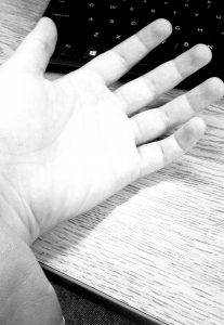
  High Key image is meant to be more pale, with more lighter tones and almost has pure white in the image. This composition makes the photo look almost colder, maybe even with more added sunlight, and very little black. photo was taken underneath a bright light.

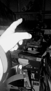
  Low Key image has a bright hand in the frame, but very little white in any other part of the photo. All potential brightness is directed towards the hand. The rest of the photo is darker with tones of gray. The way this photo was lit, it gives off the impression that this photo was taken at night with a flash illuminating it.

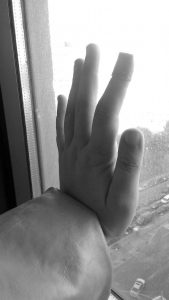
Broad Range this last photo has tones of gray, black and white mixed throughput to create a full gray scale. The palm, while not shown, is facing towards the outside, towards the light, meanwhile the back of the hand is receiving little light. This image, in my opinion, feels more natural, having the most ranges in tone, while the others feel more forced. I would say this is because having a range like this is more natural.

low key
high key
broadrange


Class Notes 10/29: (re)Outlining Project #3

use our senses: what are all the different sensory experiences you have there on site? be detailed! Definitely *sight, maybe also *touch, *sound or its absence, or a soundtrack you layered on to the juxtaposition, *smell, *taste?

[think about time of day, time of year, climate, weather, etc]

Use your photograph as well as the experience of being on location

well-organized essay: organize your ideas into paragraphs!

900-1200 words: use this as a guide to get a sense of scope, to drive your revision, but not to make your language awkward and repetitive

make a claim: this is your argument. It comes at the beginning of your work (usually end of first paragraph) and you express it as a thesis statement. Then you bring your ideas back to this point throughout.

juxtapose/compare the elements: the bulk of the writing, very detailed, think about organizing your comparison into a point-by-point or block format or some combination of the two.

use 2 quotations: use these to support your claim, or to push against to make your claim. Your ideas are primary, theirs are secondary, so not in the introduction. Better to include these as you’re making your argument/doing the comparison, though there is a way to bring one (maybe both) quotations into your conclusion–this is much trickier.

You can refer to the ideas from these quotations throughout your project.

OUTLINE:

Write a rough draft of your outline of Project #3. Be as specific as possible.

Section 1: Introduction with claim

Section 2: Describe the sensory experience at the location [this could be divided into each point in your comparison]

OR describe where the location is, or where it is in relation to City Tech OR the story it tells you, OR why it’s important

Judge for yourself: how important is it to include things like 1-how to get there; 2-story it tells you; 3-why it is important to you; 4-sensory experience

Section3:(point 1) time frame of the two elements of the juxtaposition


Another possibility:

Introduction

similarities

differences

(point 1, point 2, point3, in different sections)

more about juxtaposition

conclusion


OR

Introduction

More about juxtaposition/claim (here or after more comparison) Q might go here

point 1

(element 1)

(element 2)

Q might go here

point 2

(element 1)

(element 2)

Q might go here

point 3

(element 1)

(element 2)

point 4

(element 1)

(element 2)

Draft to submit for comments (to guide future revision): 10/31