Saturation Studies: Phase 3


The temperature of my group was cool and we also got the poster named “Ween”. My group decided to have the word soft echo. The sense relating to Soft was the sense of touch and the sense relating to echo was the sense of sound. For a cool temperature some would usually think of blue of green but I thought of the color white and orange. The color white is known to reflect heat is that was the reasoning behind picking white. The color orange may seem like its the color that relates to heat but I look at it as a cool breeze while the sunset is coming closer toward the ocean breeze. I wanted to use a Helvetica font but for some reason my computers fonts were not changing my word into the font I wanted. But al in all this is the poster we thought of.

Color Harmony: Phase 3

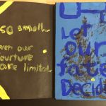
I based my book cover on the picture I had uploaded on phase 3’s color proportions and shades. Since my book had to do with the theme of opposition and dullness I had to put colors that seemed like opposites and I tried doing a formal book cover based on stripes. I think the creation of my book got my point across to the following audience.

This part of the project took me 2 hours to compete since I had to try to paint carefully and in between the lines.

Color Harmony: Phase 3

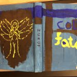
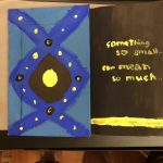
This is my cover book for my glossary collection. The title of this book cover is called Cold Fate because the theme color of the book with the glossary cover is based on something sadistic way and it just describes the experience of someone or your lifetime. This cover book was made with white sticker tags, painted with black, blue and yellow gouache paint. One part I like about this project is the back of the cover book and there’s an angel character painted yellow, yellow represents light, hope, this psychologically fits certainly well with this angel. I also put two quotes on both the inside the front and back side and these quote are kind of like facts about our life time, experience we had all face and our coincidence.

Duration: 2-3 hours.

Saturation Studies: Phase 3

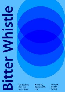
the  prompt we were given was ‘Cold’, so we went with band name that would showcase that, we all chose ‘Bitter Whistle’ because not only did it match our prompt, but i feel like you can almost feel it, i would describe it more as a cold wind. We also chose Icy Shriek and Sharp Snarl, to match.  To further evoke this feeling of a cold temperature, i went with lighter blues, and a navy blue for the text. While working on the poster, what i struggled with was the circular design. I wanted it to be near black in the center, but i couldn’t figure out how.

Color Interaction Parings: Phase 3

This entire project, i would say, took me around an hour, it was fun to do designs for each color

For my partner in this project , Gary, I went with a deep dark blue. While getting to know him, he said his favorite color was black, but his personal interests were vibrant and held a lot of emotion in them. A music style he said he liked was jazz, which Immediately associated with the song ‘ rhapsody in blue’. so I chose this particular shade of blue because when you first glance at it, it’ll look black, but looking at it more you’ll see that it’s blue, which I hope can visually express how when you first meet Gary he might appear as   g o t  h   but he’s actually really cultured and talented

Color Interaction Parings: Phase 3


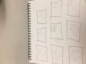
This project will be focusing on animal theme that compares between our persona’s description or our ways of describing our characters. Rose and I decided to choose an animal theme that we have to think of an animal that could describe each other in general or basically about our own main character design. Before we started that, we had to choose as well the color that describes us first and then we come up with an idead of what we can place in our boxes. Rosa chosed an phoenix for the describtion of my fictional character and I chosed a chameleon for her fictional character as well.

Duration: 5-10 minutes.

Color Interaction : phase 3

Step 1 – Color Research Process

calm, friendly, sports, video games.

Step 2 – Color Mockups 

I picked blue for sally because that just so happens to be one of her favorite colors. Also blue happens to be a primary color so i thought that blue for her would be very nice. Also blue is a shared color between us.

Step 3 –  Icon Research Process

I chose to pick a duck for sally because shes free spirited. Shes also very calm in many ways. last but not least she told me that she likes ducks.

Step 4: ICON MOCKUP

This part of the project took me 2 hours.


Color Interaction Parings: Phase 3

Step 1 – Color Research Process

calm, relax, classical music, video games, friendly

Step 2 – Color Mockups 

I picked gray for my partner Evelynn’s color because she likes gray and also she has a sort of neutral personality. The video that I saw on youtube explains gray as a neutral color and gray is also a color that’s desaturated and plus evelynn always wear neutral colors so that’s why I picked gray. The color we both shared was a greenish color that we both find amusing and drawn to.  The medium green also gives the concept of calmness and relaxation.

Step 3 –  Icon Research Process

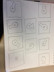
Lando’s Thumbnails

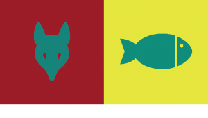
I chose a fish for evelynn because she interested in sea mammals. She also fishes as pets and she enjoys the simple things in life. Shes also a very calm person and shes nice.

Step 4: ICON MOCKUP

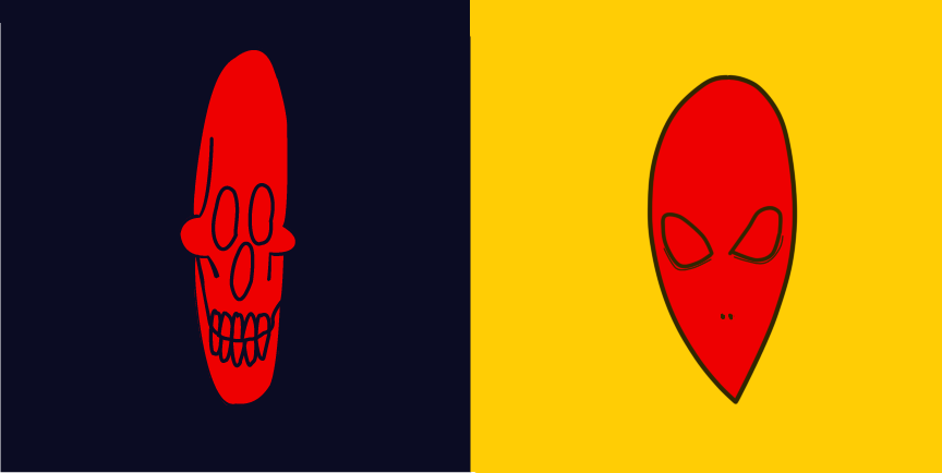
I learned the important lesson that Illusions worked best with opposites or complementary colors. The reason our shared color(green) appears different is due to the fact that green complements red and yellow is a very different shade from tree. Its also important to recognize that colors appear different based on background color.

This part of the phase took approximately2 hours to complete.