
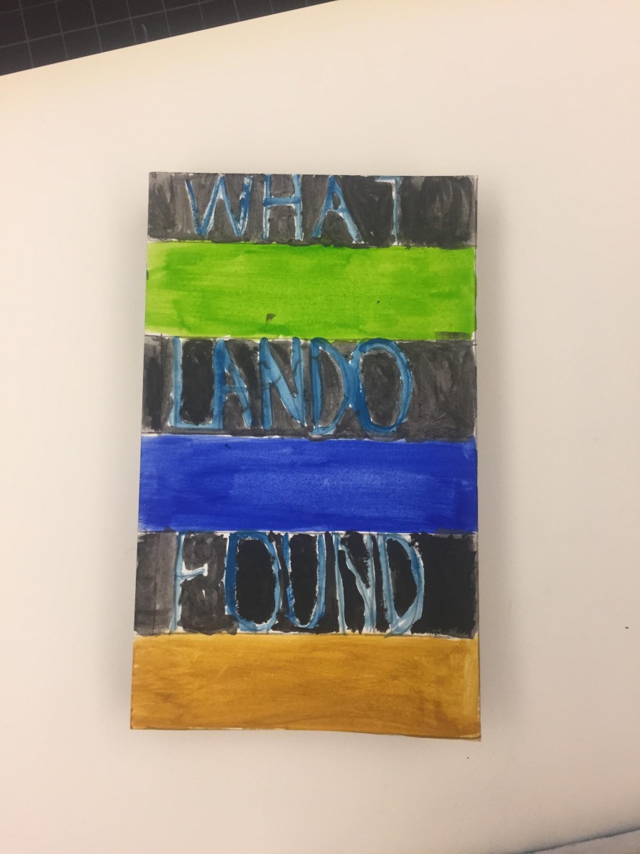
I based my book cover on the picture I had uploaded on phase 3’s color proportions and shades. Since my book had to do with the theme of opposition and dullness I had to put colors that seemed like opposites and I tried doing a formal book cover based on stripes. I think the creation of my book got my point across to the following audience.
This part of the project took me 2 hours to compete since I had to try to paint carefully and in between the lines.

