Saturation Studies: Phase 3

The temperature of my group was cool and we also got the poster named “Ween”. My group decided to have the word soft echo. The sense relating to Soft was the sense of touch and the sense relating to echo was the sense of sound. For a cool temperature some would usually think of blue of green but I thought of the color white and orange. The color white is known to reflect heat is that was the reasoning behind picking white. The color orange may seem like its the color that relates to heat but I look at it as a cool breeze while the sunset is coming closer toward the ocean breeze. I wanted to use a Helvetica font but for some reason my computers fonts were not changing my word into the font I wanted. But al in all this is the poster we thought of.

Time: This part of the phase took me about 2 hours because there was a lot of thought put into deception and alignment.

Saturation Studies: Phase 3

Time: 2 hrs

The temperature my group was cool, and we got the swiss poster called Pavement. My group decided to have the bitter whistle as our main word, and as our “featured bands” the names icy shriek, and sharp snarle. For a cool temperature you instantly think of blue, and especially of our words we wanted to have a blue poster. This particular poster didn’t use the font of “Universalis”, like how Professor Spevack’s was. Instead the other swiss font it had was called “Switzera”. The only thing i struggled with was that because it was the Switzera font for some reason I had to adjust the point size to what I thought was exact as the poster because it wasn’t exactly the same. Especially, since the word bitter whistle is longer than pavement.

Saturation Studies Phase 3: Develop

The two words that describes warm is “Spicy/ Hiss”. I think it might sound catchy and have a strange taste besides the theme color I chosed in this poster. The word “Spicy” has this 3D feature and I think it has a strong sense of describing warm and the word “Hiss” is placed at the background of the poster, repeating itself vertically with less opacity on the texture. When I think about the word “Hiss”, I would imagine it less visible and directly spread out.

Valued- Added Portraits: Phase 3

So here you see the 4 images i worked on for this project. The painting is based off of the broad value range image that i had to glue on paper. while the narrow value range is digital made on photoshop and is based off of the narrow value range i also had to glue on paper. The easiest i have to say was the painting since I had some knowledge on doing shadowing  to contrast and adding highlights to certain spots to bring out the features. This was the most complicated project to do because i didnt’t get it at first and didn’t understand until a little later. The narrow value range is the revision i did with the help of my fellow classmates and teacher and their feedback to how improve my work more. I spent a whole day if you count all the hours invested to each image you see.

Sound Visualization: Phase 3

Mashup

This animation is 10 seconds long and I decided not to have both my audio for staccato and legato overlapping each other. I wanted the two songs to have their own impact and, the drawings I did for each song to move with the audio meant for it. The song for staccato is called Black Sheep by Metric, and the legato song is called when the party is over by Billie Eilish.

Overall Hours: 6 hrs

Sound Visualization Mashup: Phase 3

My Mashup Animation:

Description: My animation includes a whole bunch of swirls and triangles. I also put two songs called “Stargazing” by travis Scott and “Zeze” By Kodak Black. I did more of a freelance moving with my animations. I included a little bit of opacity but the movement makes up for that.

Hours: I spent about 4 days working on this project.


Sound Visualization Mashup: Phase 3

My Animation Link

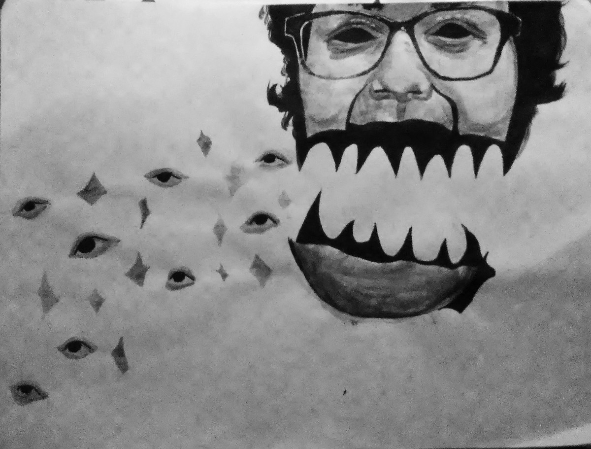
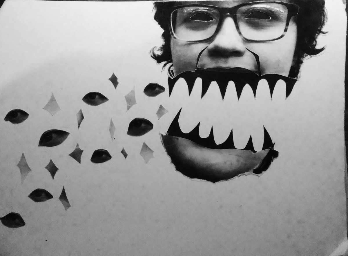
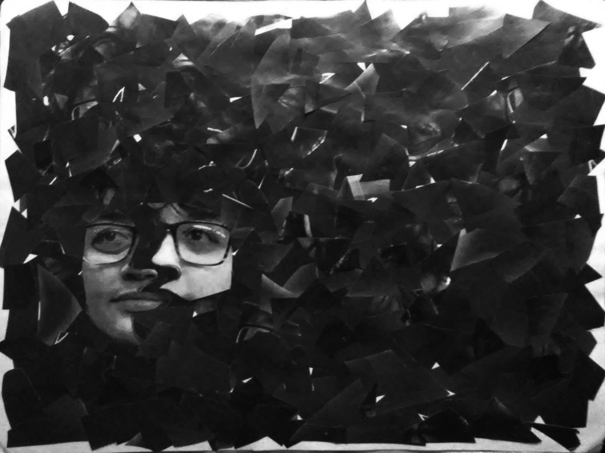
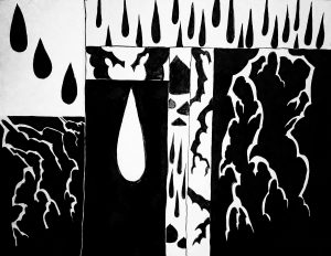
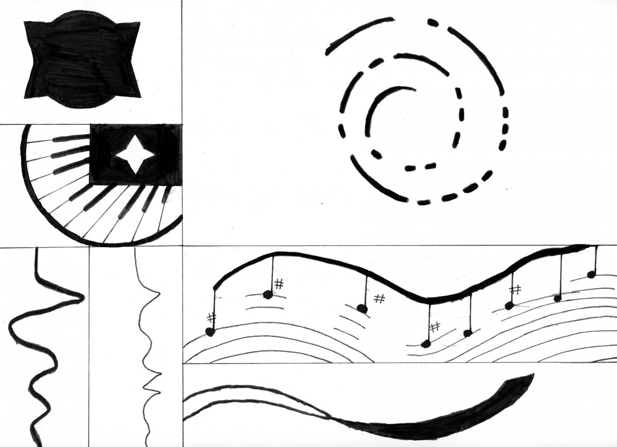
So this link on the top is a minimum of 10 seconds animation that I’ve been working on for the last few days or so and with the element that I especially created for this song, it all turn out great. Before when I started doing the animations, Professor Spevack introduced us some short animation clips of students work from last year and honestly I don’t know why I’m impressed so I though in mind that instead of using the previous figure that I did in phase 2, I can actually redesign the image that for every image will represent all parts of the instrument playing and my challenge was to take these images and try to sync them in the music so the figure can get the feel of the rhythm.

It had taken me more than 2-3  days (around 5 hrs per day) to actually get all the parts set up and sync however with another 1-2 days, when I thought that I’ve finally finish my project, the moment I render the video and click the play button, all parts of the image were slightly un-sync and I had to check it again to see what was the problem. The good side is that all the transformation of every image follows up the rhythm of the song and I only had to move the transformation one sec before or more, add some transformation parts for some images and it took me two tries to get it right.  And finally I’ve completed my project and I was so relief. Unfortunately, this video only plays one song and according to the project, I had to mix two songs and I decided to ignore that part because I’ve made it this far and it would be very stressful for me to go through the whole process again. The name of this song is “Ninelie” by Aimer feat. Chelly, and the genre is J-pop (Japanese pop). It has this very relaxing and smooth rhythm with the amazing breathy vocals.

Song:

Ninelie

Artist:

Aimer