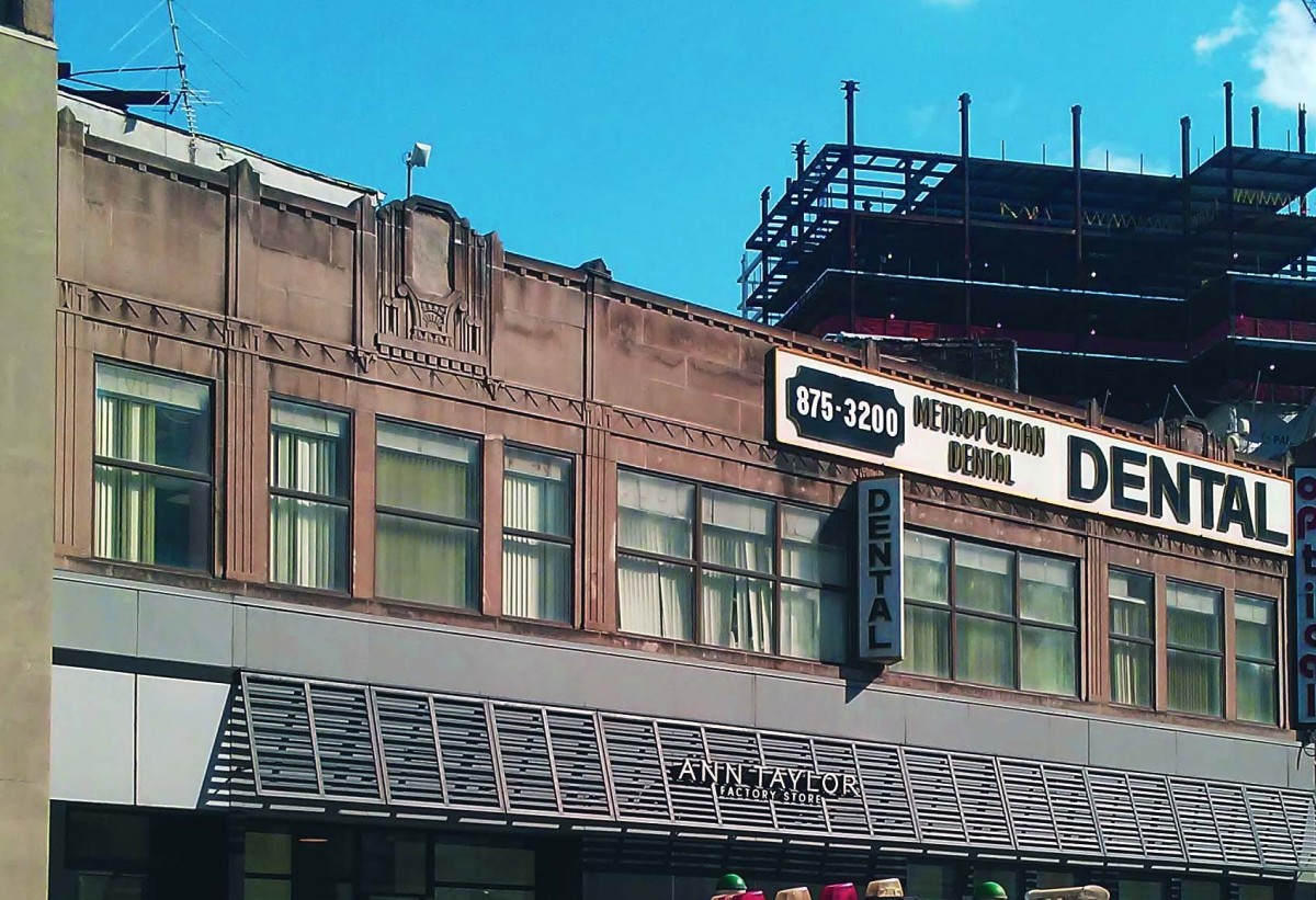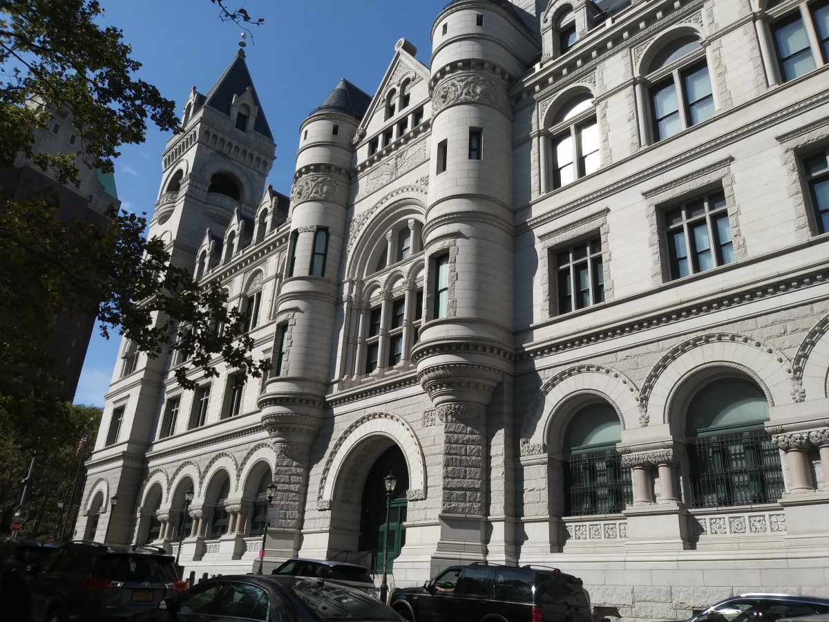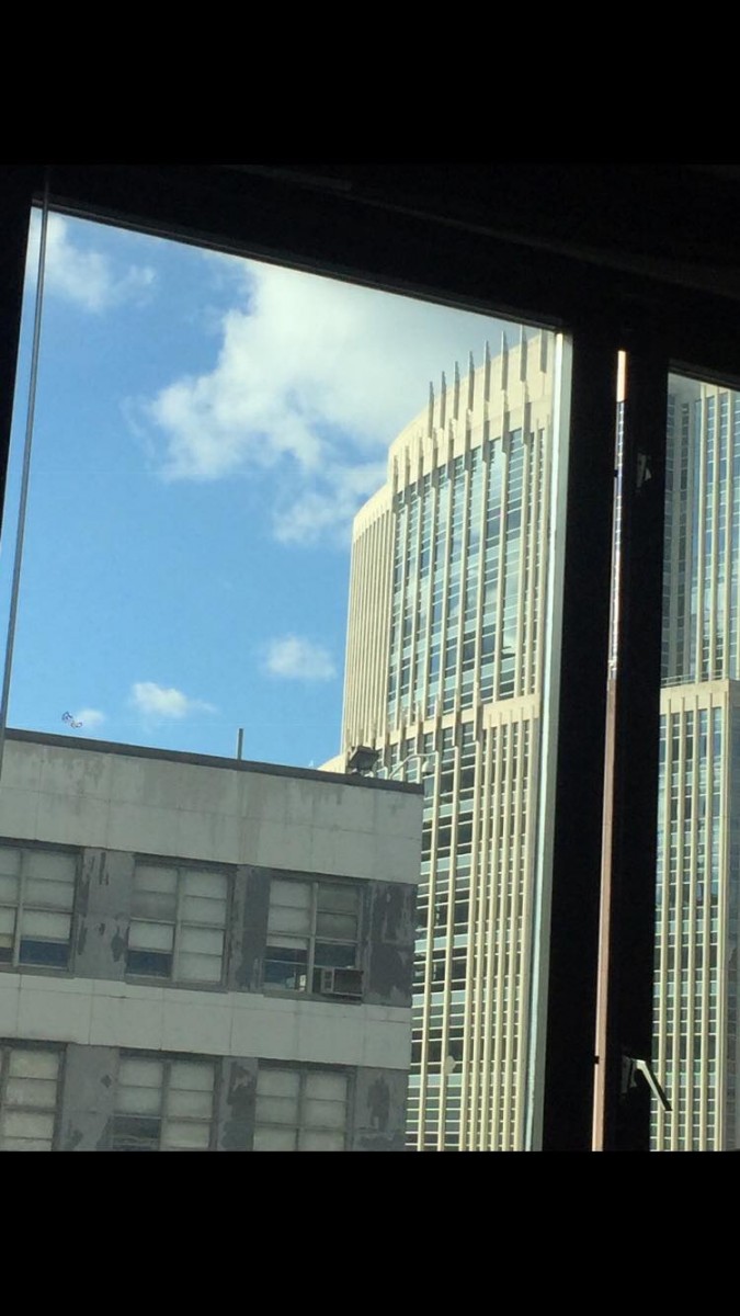
For my juxtaposition project, I chose to be more meaningful and try to take a photo of something more casual. I just so happened to have taken a picture of two buildings that happen to intersect between each other. One building was roughly rigid, eroded, and looked very old. On the other hand, the other building was more like a common style skyscraper in New York City. The juxtaposition in this picture was the view and perception of what’s considered new and old or ancient and advanced. It’s crazy to think that in a civilization/economy as advanced as New York city is so ancient but also advanced at the same time in the exact same space as each other.
Although my juxtaposition photograph may look like two regular buildings that happen to intersect, it is way more than what appears to the naked eye. They have similarities such as that they both have adjusted windows which happened to be organized in the same way. The adjusted windows imply patterns and uniformity within the two. The other similarity is that they both just happen to be in the same proximity, going back to my first point which supports juxtapositions being in a mutual area. Another correlation that these two buildings have in common is that they share the same background. The background is the clouds and the blue sky that alternates between the two. Although the sky and clouds seem to have less importance towards similarities it shows how two different occupying spaces can share a common background that has the power to put them within the same frame. One last similarity that they share is that they both happen to be within the same district or zip code area. Usually, different zip codes come with different house styles and areas. In this zip code area of Brooklyn is more like a Manhattan look alike with all the tall buildings and skyscrapers that usually happen to be big businesses.
On the other hand, the juxtaposition photo that I took has many differences. One major difference is the height difference. Nowadays, New York City is known to be the major city that has a whole bunch of skyscrapers. The difference in height explains the age of the buildings; usually in New York city if a building is smaller it is perceived to be old by the pedestrians unless it’s some kind of store. Also the taller the building, in reference to skyscrapers, the more innovative and new it is perceived to be. Also in the new building, the outside layer of the walls looks very new and clean. It also looks as if the building was made for some kind of professional business. On the other hand, the shorter building is more old and eroded. Signs of erosion on walls usually mean one of two things. Either the building is old or its sanitary condition isn’t up to par like it should or was meant to be. These differences prove my point on how much juxtapositions can be two different concepts but similar things all at once.
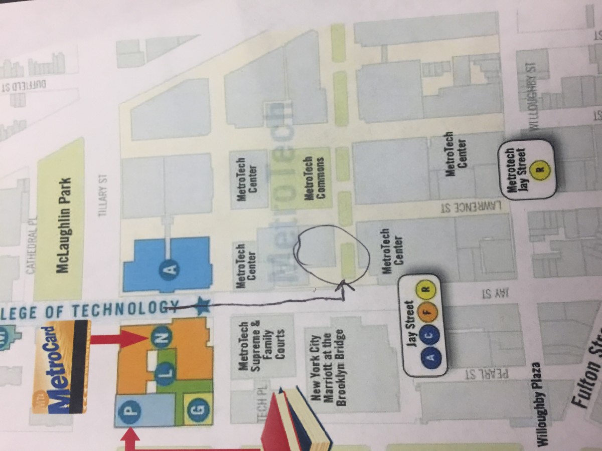
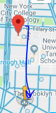
Although my juxtapositions have many differences and similarities, the environment that they are in matters also. When I took the photo, the surroundings around me were very urban. First and foremost in order to travel to where my juxtapositions were, you would have had to walk around the block from City Tech until you got towards the bookstore and you would see the two buildings. In terms of sensory experience while I was taking this picture I smelled halal food from the halal cart that just so happened to be on the same sidewalk I was standing on. I imagined a whole herd of people walking in to get some food after a long day’s hard work. In relations to sound, there was a whole bunch of noise coming from the cars that were in traffic and all around me I heard phone calls. Additionally, the middle school kids just so happened to be going home from school and perhaps they were on their way to get lunch. Another thing about my juxtaposition photo is that they both bring the theme of togetherness into play. They bring the theme of togetherness and unity by showing how people with different purposes and careers can all be in one building working towards a common goal or at least a put their efforts together in order to help each other. New York is known to be a bustling and lively city but truth be told it’s only busy due to the fact people have places to be and people to meet, such an advanced city deserves effort, appreciations, and innovations.
In short, juxtapositions just so happens to be around us without us even noticing or really thinking about them. Just like the picture that I happened to take can ensure so many meanings, it brings all things into a new perspective. Many aspects such as locations, sensories, sensations, touch, and many other things happen to be in place. Similarities and differences are what makes my juxtaposition photo meaningful and also inspiring at the same time. The time frame also plays a huge aspect on my points and opinions within the photo, all in all, juxtapositions are all around us and if we were more aware of them then we would learn to appreciate the world a bit more than it actually appears to us as New Yorkers and future visiting tourists.