Color Harmony: Phase 2

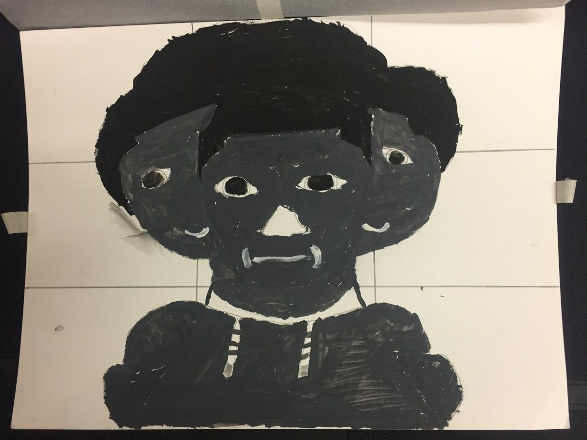
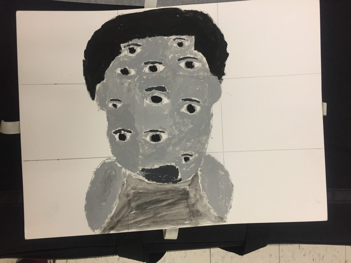
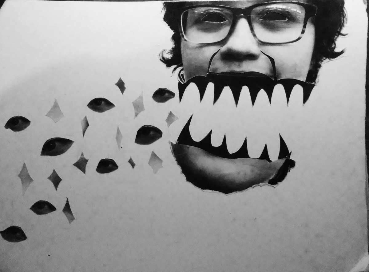
So, this artwork was taken from a mobile game I play, then photoshop it for some essential editing and Ai (illustrator) to place every color proportion in the image which is on the bottom of the image. I decided to choose this image is for being an analogous, I think it would be interesting to see all the color on the proportion bar blend in together that will converted into a monochromatic transition, for some parts. This charcter was design and own by Blustone, VisualShowers.

Duration: 10-15 minutes.

Color Harmony: Phase 2

This image is an image taken by Victor Gladkov. My theme for my glossument is opposites and fabrication. So for that I chose the colors like brown, white, and different shades of blue. I feel like the color blue has many opposites and I also feel like brown Is an opposite of blue because light brown is a shade of orange. I also learned that colors can harmonize to create compatibility.

I spent about an hour an a half on this phase of the project.

Color Harmony: Phase 2

This image shows different kinds of analogous colors because the blues have different shades and so do the oranges. The colors also dragged me in because these are kind if opposite colors.

Value-Added Portraits: Phase 2


The first picture was meant to be mysterious and more of an expiriment. The second piece was more of an artistic style. I tried to convey the theme of illusion and humor at the same time.

This part o the project took me about 5 hours of cutting out and putting glue to Mae these posters work.

Color Interaction Parings: Phase 2

These four images were recolored in photoshop and the objective was to create a illusion that the middle box inside the two giant boxes are the same exact color value, the outer boxes having a differennt color, value but in our perspective we thinking that one mid box seems to lighter and the other darkern but it’s just an illusion the fact that the mid boxes are still the same exact color and value.


Duration: 1 1/2 hour in total.

Color interactions: Phase 2

This part of the phase took me two hours to get done. It was a bit challenging initially because I had to find out how to adjust different colors together. I also had to find how to make different colors compliment each other and to make them into an illusions.


Saturation Studies: Phase 2

These are guide colors that explains the mixture between two color and relationships.  There are three sets and each set has two rows, the  top is the original color and the bottom is for light colors that white color is added as well. This project is used with a Bristol paper and gouache paint. It took some time to get the function of mixing for a color and to be considerate of the proportion of paint used. To be honest, it was quite stressful but I did quite enjoy mixting and discovering colors.

Duration : 1-2 days (first day- 3-4 hours).

Color Interaction Parings: Phase 2

Shifting Value
Shifting value with color
Shifting hue
Shifting Hue and Value


This part of the phase took me a good two hours and a half to get done. It was a bit hard at first because I had to find out how to adjust different colors together and to make colors seem compatible. The last two was kind of hard for me too in a way because I didn’t understand the difference between the last two.

Saturation Studies: Phase 2

This is my painting chart. The whole of this phase was to understand the mixing of colors and how saturation affects primary colors to create new colors. As you could tell I had a hard time with this. At first I had gotten the hang of the first two boxes on each side of the chart but towards the middle i kind of gave up partly because I ran out of paint. All in all, I watched a youtube video after and I had gotten the hang of it.

Hours: I spent about 3-5 hours on this phase of the project.

Value-Added Portraits: Phase 2

Broad range design, followed by Narrow (low key).

This first image was meant to be campy and more artistic, while the second piece is more grounded in reality.

hours spent, roughly 8