
Time: 35 mins
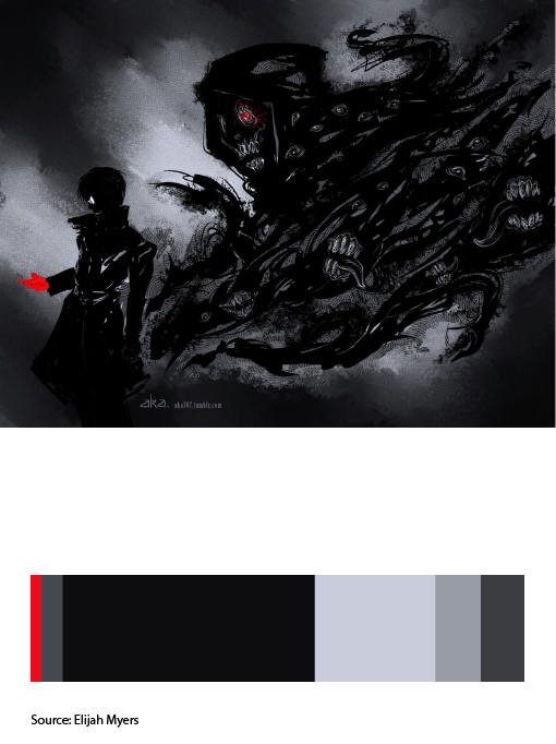
The art work I used as a reference when creating my proportional color inventory was an artwork called ” Black Reaper” created by an artist named Elijah Myers. The artwork was based on an anime character from the anime Tokyo Ghoul. This image had a theme similar to mine and it contained colors used to convey a really dark theme. Color reference can be used in your future design work for when you are trying to convey a certain tone or theme. You could look at other references that convey a similar theme/tone to our work and see the types of color used t achieve this. You than apply the same colors to your as well so that you can achieve the tone or theme as well.


I’m interested in what you’re planning to do with the red. Red can be used to attract the viewer’s attention quickly especially in a primarily gray scale proportional color inventory. At the same time you’re limited to the amount of red you use if you want to match the color inventory.