Arbitrary

Adjective

Existing or coming about seemingly at random or by chance or as a capricious and unreasonable act of will” -Merriam-Webster

The word was use in the article “Why Collaborate?” by Ellen Lupton in the sentence “In my own experiences as a student, I have enjoyed voluntary, informal collaborations with my friends, but I have resent being forces into arbitrary, mismatched teams in the name of social correctness.”

The author uses the word in order to further emphasis how despite collaboration can be fun with the right people and some you have known well enough to work with, there will be times where that won’t be the case and will against your own, force to collaborate with someone who you may not see eye to eye but will seem to come with a beneficial result.

Formal Cover Letter

New York City College of Technology
300 Jay Street
Brooklyn, New York 11201

December 17, 2018

Hello and good day to you Mrs. Thalia

I am writing to you to in regards about your gallery space and to propose an installation based on the work my classmates and I  have done. I am a Communication Design student at New York City College of Technology studying Communication Design interested in Illustration. Together with my classmates, we have developed an installation entitled A Glossument. Inspired by Tom Phillip’s  A humument, this project has centered around the idea of using words we have placed into our glossary and portray them in different ways through out our books. That being said if two students were to use the same word it would ok to do so because each of student will portray a specific word differently and/ or use a different meaning of the word if it had more than one definition. Our project consist of working in vary and creative ways to be able to do so, where each book is different, each with its own unique style by each student and to show something about ourselves that even we may have not seen.

Our installations include a variety of creativity and usage of different materials. My work, in particular, can vary from different tools, but mainly using paint, drawing markers, paper and washi tape. With the color blue shown within the pages. Each piece to be displayed has already been prepared with an appropriate didactic panels, Culminate, Treacherous, Dwell and Demarcation,” as well as a catalogue entry for myself and each student about their work and contribution.  Within the books each of us have our own theme or an idea repeated through out the pages to give in a meaning. For my book in particular the theme is blue, but it ranges with different blues. The blues can be a color when your sad or a color when your relax, or maybe even cold. It’s a one color with different ranges and different emotions that it can show to someone.

My classmates and I hope that this project is interesting to you and be able to become part of your gallery. If there are any additional question to our projects you may reach me at the address above. I look forward to your response and may you have a lovely day.

Sincerely,

R Cortes

Cover Letter

New York City College of Technology
300 Jay Street
Brooklyn, New York 11201

December 12, 2018

Micheal Smith, DFA
Curator
Art Gallery
123 Ink Street
Brooklyn, New York 11201

Dear Mr.Smith,

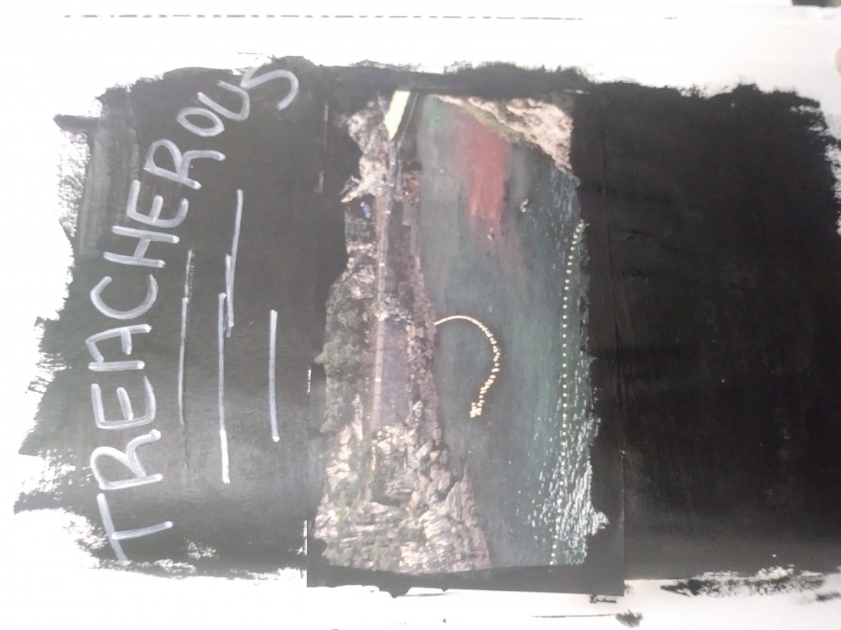
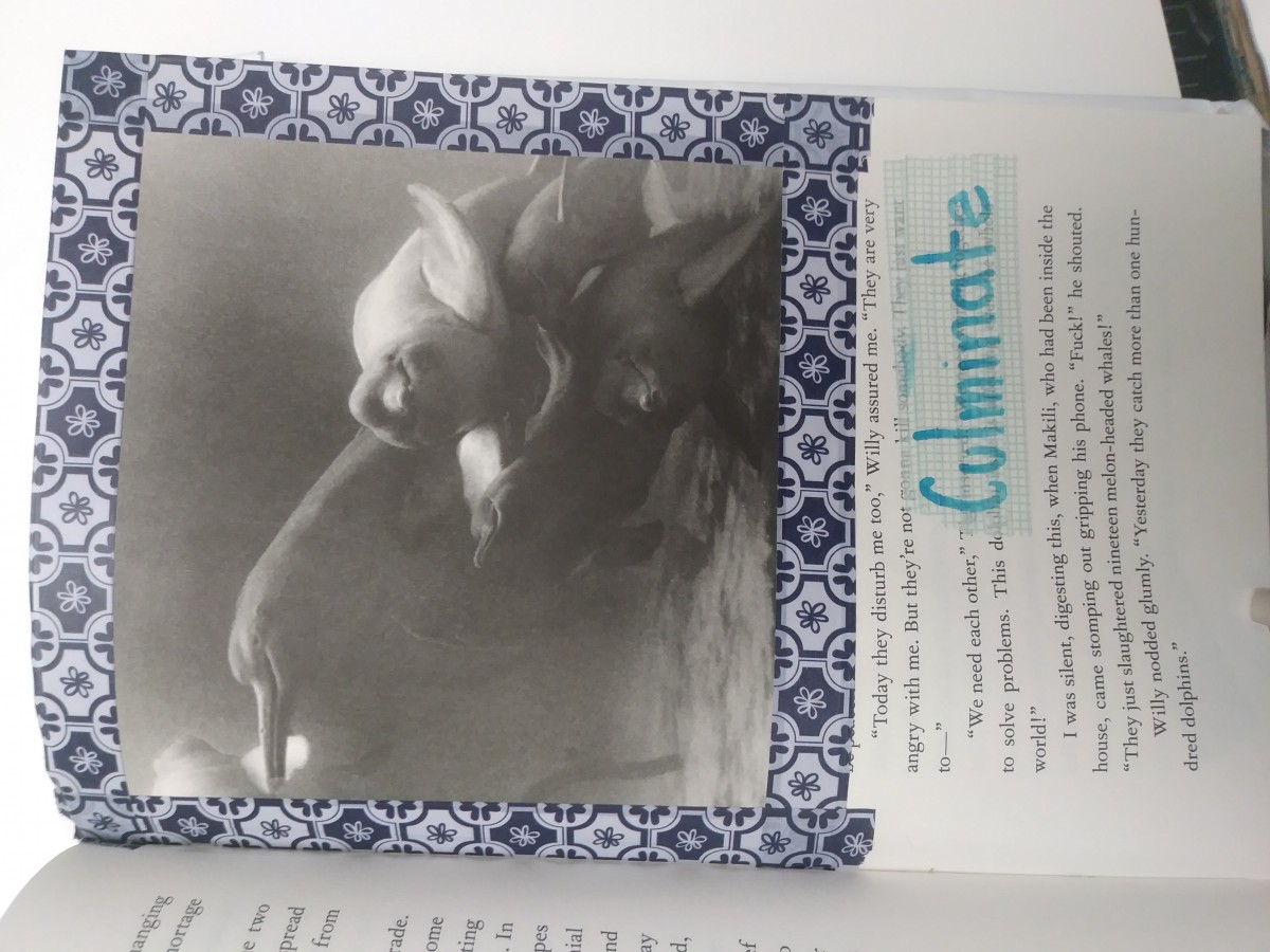
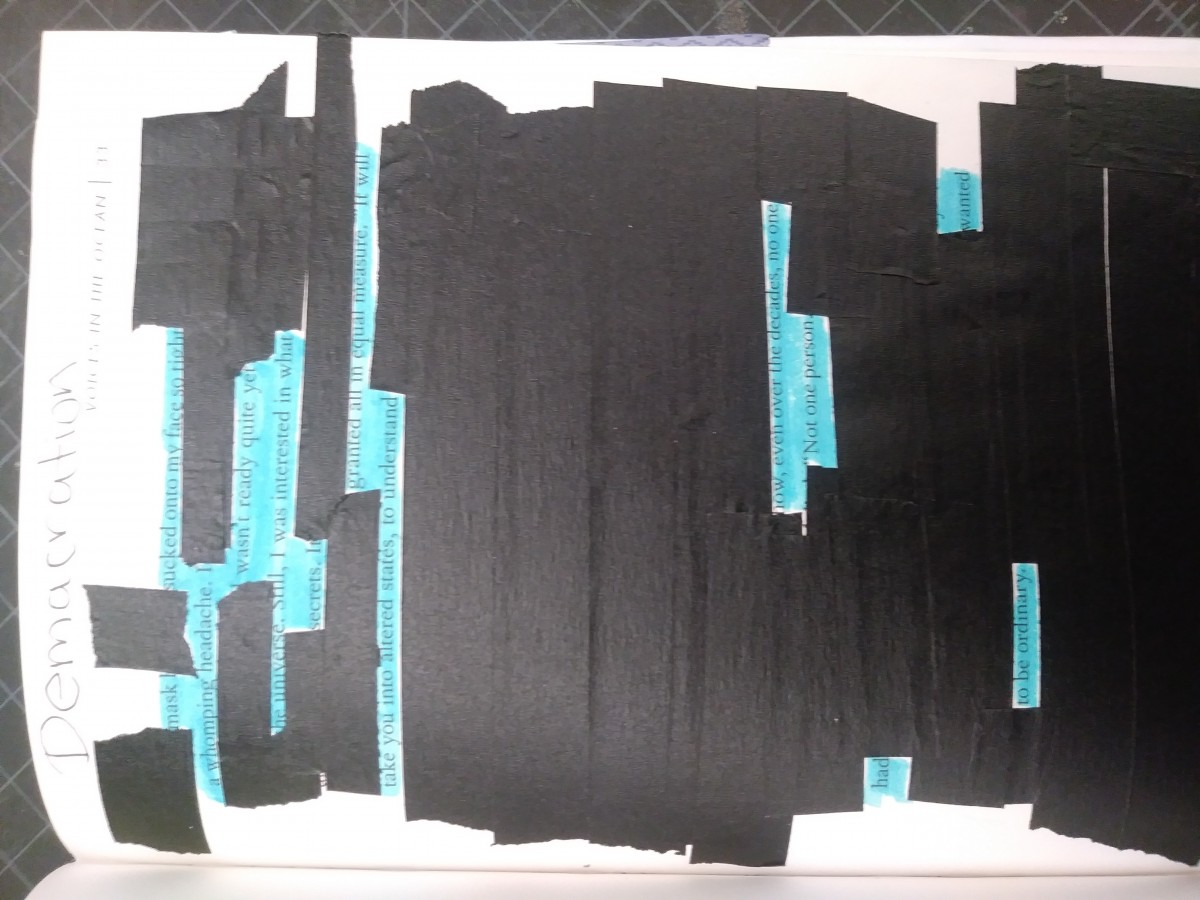
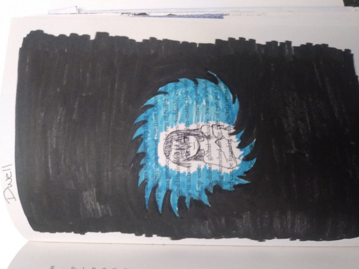
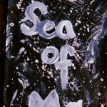
I am writing to you to inquire about your art gallery space and propose an installation based on the work my classmates and I have compiled. I am a Communication Design student at New York City College of Technology currently studying Graphic Design and raster and vector graphics. I take interest in digital art, motion graphics, illustration, and street art. Together with my classmates, we have developed an installation entitled ” a Glossument”. Inspired by Tom Phillips ” A Humument,” this project focuses on taking a book, painting, create a collage and/or using cutting or carving techniques, all to create or transform the book into something new, different, and original.

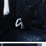
Our installations include a series of altered books filled with representations of words chosen from our class glossument =. These words are represented through image or text. Each book created follows the author or artist theme of choice. M work, in particular, has a dark, horror theme. It is filled with visual representations of words that follow this particular theme in some way.

My classmates and I hope that this installation is of interest to you and your gallery. If you feel like asking me any questions, please feel free to contact me, my address is written above, in the top right corner of this letter. I look forward to your reply and any questions you want to ask.

Sincerely yours,

Garence

Project 3 : Juxtaposition

The image I have chosen is a picture of a tree branch stuck in a fence. The image raises various questions. These are questions such as how did the fence get intertwined with the branch. There is also the thought if it was done intentionally. If it was intentionally done then the thought that follows is why.
I chose this image because I felt that it was very out of the ordinary. It almost seemed as though a tree was cut and the remains of it are stuck in the fence. However, it may be likely that the branch was placed there into the fence. This is likely because that is an area where people do a lot of things for art purposes. For example in that same area there is a wall spray painted with an interesting looking design. This leads me to believe that the branch may have been placed there intentionally.
The branch appears to be significant because of the fence. The pattern on the fence serves as a background that makes the tree branch stand out. The tree branch stands out more in the fence than it would in most other places.

Didactic : Treacherous

The word for this page is treacherous and compared to the other words in the book, the word was display in a more darker sense. Another image from the book was used this time in a location of an ocean but within the waters red is shown, the book originally is about dolphins so one can imagine whose blood it belongs to in the image. By painting the rest of the page black it gives in the idea of a treacherous scene of the killing of who knows how many dolphins.


Diadatic: Culminate

For this part of the book the word is culminate. In order to present the word an image that originally came in the book was used along with washi tape and a blue marker. The image of the dolphins shows them on top of each other which can also be seen as them going into a higher point by going on top of each other, which can represent the word Culminate. In order to add the blue theme as well blue washi tape was used to tape the image to the page as a frame and on the bottom right corner another style of washi tape was used and the word was written. This is to display this image as an art work would be In a museum, framed with the title of the book next to it.

Didactic: Demarcation

Within this page of the book the next word is Demarcation. Black poetry was used in order to demonstrate the word. However instead of using a black marker to cover up the words black tape was used and the words left uncovered was colored in with a blue marker to add on to another page having blue in it, while still showing the word in a form of poem.

Didactic: Dwell

This part of the book the word used is Dwell, in order to portray the word black and blue marker was used on the page. The black marker covering the majority of the page going into the middle in a form of a vortex. Next the blue marker is used to color the inside but not completely as it allows an outline for the image of a girl who looks like she is dwelling over something that she can’t help it, and thus representing the word Dwell.

Color Harmony: Phase 4

For this last project I worked on, I really enjoy it with finding some inspiration for my cover, looking at pictures that has monochromatic, analogous, and complementary. I can apply this for any future projects I have so I can look back on what I did. I could have done different is the pages for my book. I would have use a different design and maybe add some color to it.

Phase 1

Phase 2

Phase 3

Color Harmony: Phase 3

So for my book cover, I decided to use the sub-dominant color as the dominant while the main color is sub, but kept the colors in there. The painting was a good inspiration for my book cover because the theme I have was dark so I wanted to find a painting that help express it and the mood. The hours I spent on this was a good hour.