Cover letter

New York City College of Technology
300 Jay Street
Brooklyn, New York 11201

Dear Gallery Owner,

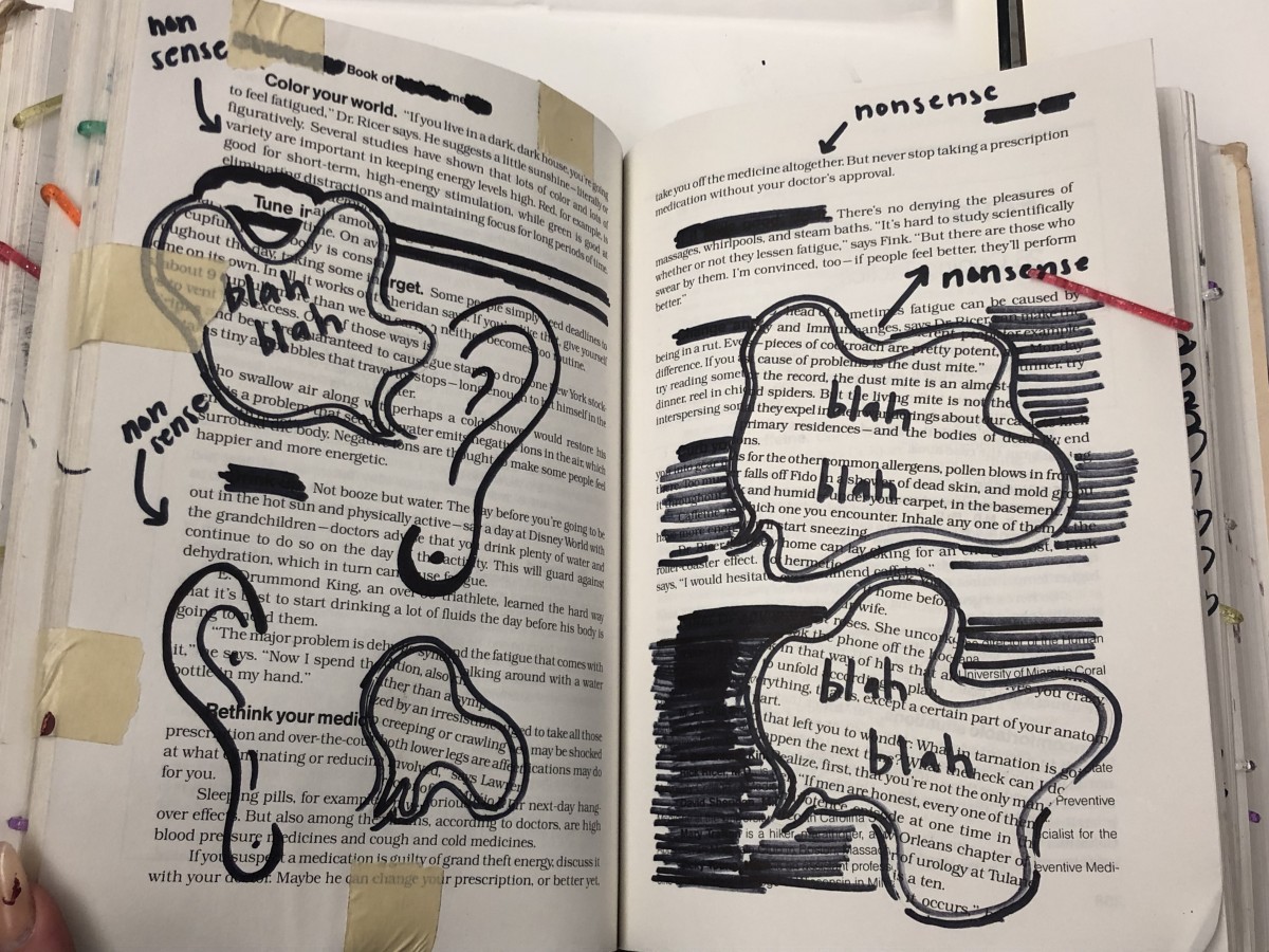
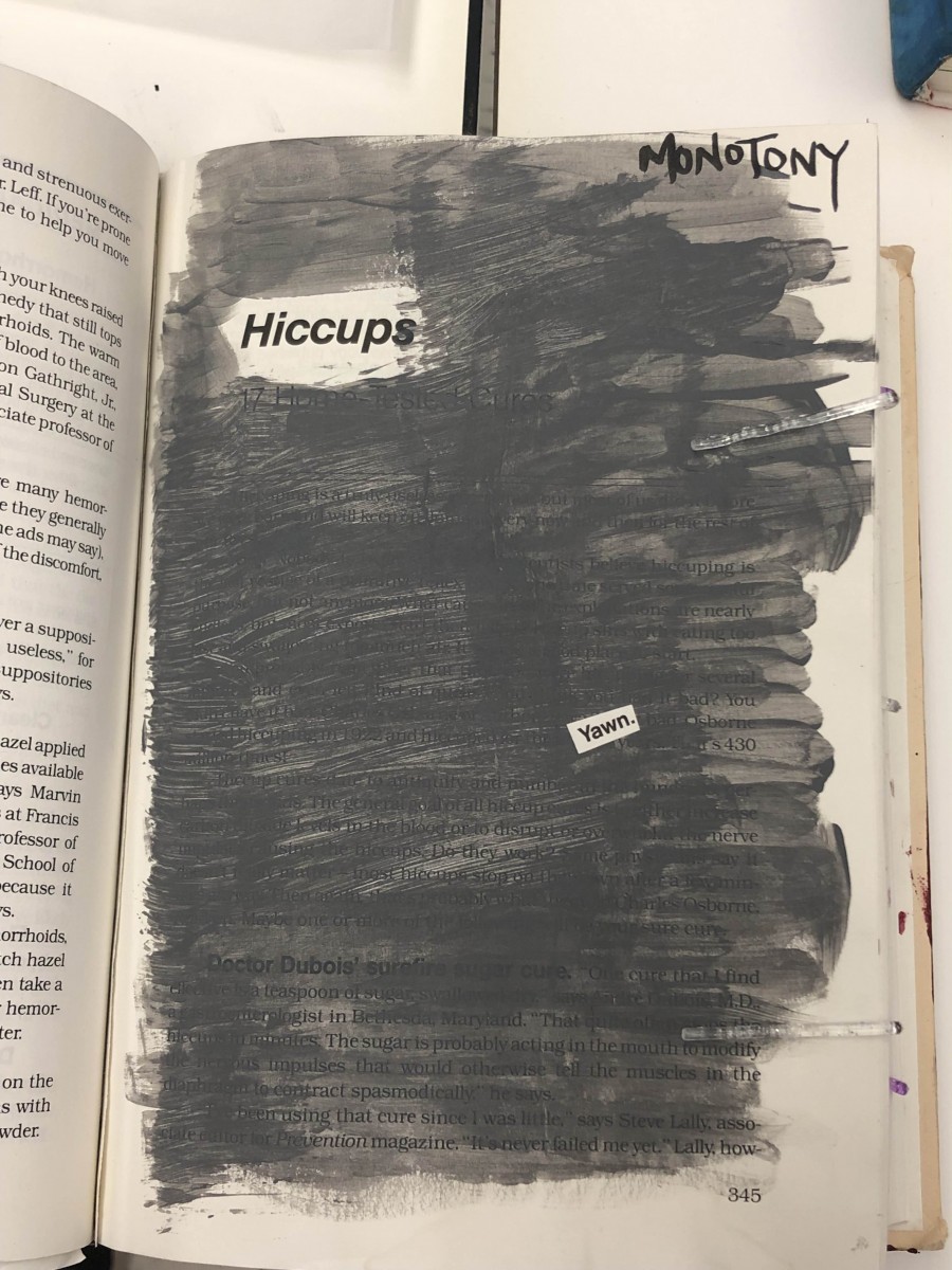
I am Elliot Vidalon, a communication design student in city tech, writing this letter to you because me and my colleagues are interested to be part of your gallery. We have created a glossument book inspired by Tom Phillips work, “A Humument. My interests are illustration design and graphic designs. During the first semester of college, I was given a project by my colleagues to create a glossument. I am very certain that this project of my glossument would be a good fit to your gallery.

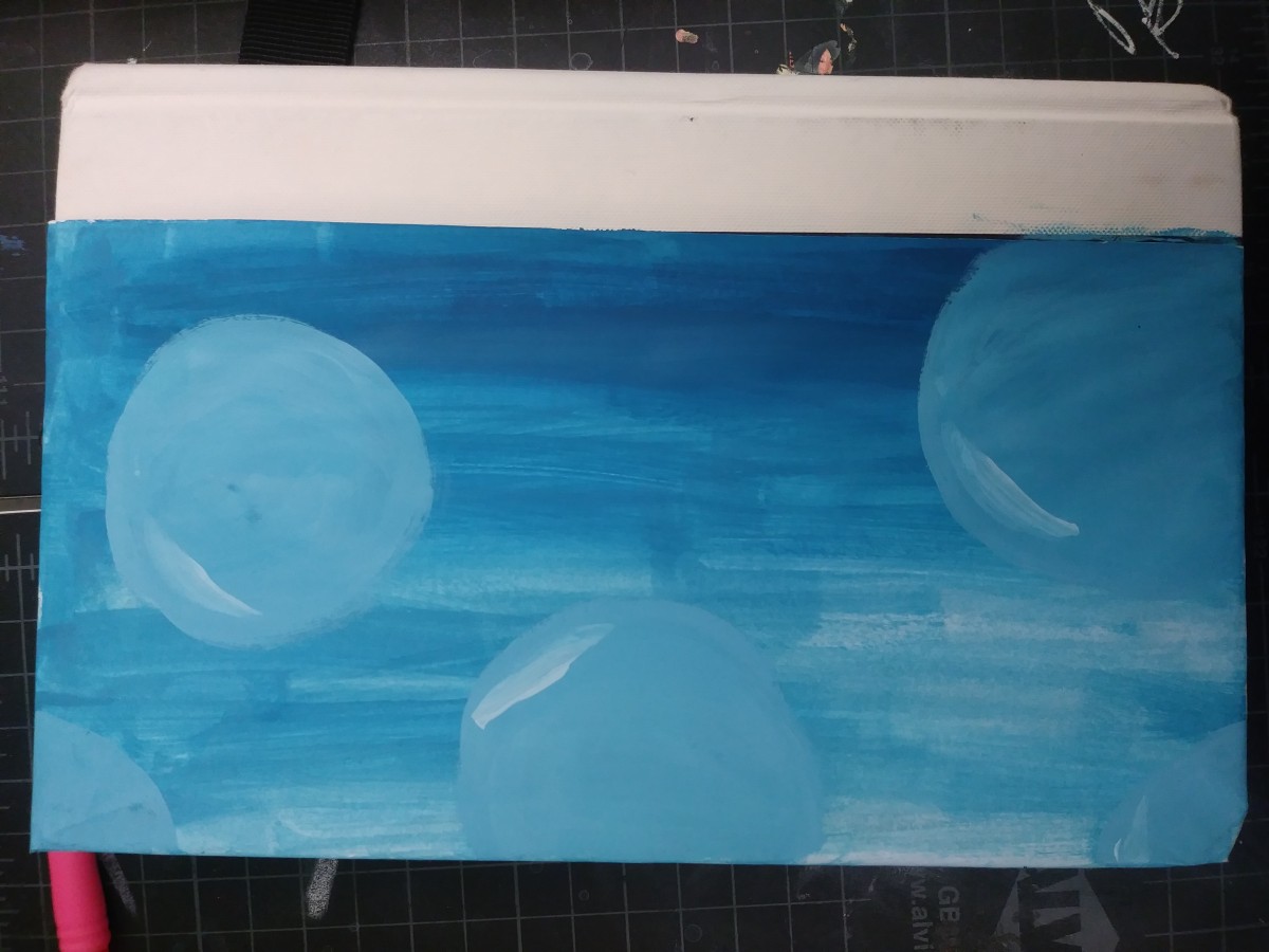
All my colleagues had to write up 15 glossary words and use it for our glossument. In my glossument book, it contains words that I learned about throughout the first semester of my English class. Using these words, I create a customized book called “Cold fate.” Some of the words I used for my glossary book was Futile, Serene and Shun . Each words have their own picture and definition in the book. Please consider the art towards your gallery.

I’m very interested and looking forward to see our work in your gallery and hoping you would be interested and giving me or my colleagues. I look forward to what you think about it. Thank you for your time and have a great day.

Sincerely,

Elliot 


Didactic 2: Hokum

This panel is using two pages because i wanted to really visualize like people hearing hokum. I wanted to have like ears and dialogue bubbles like as if people hear non sense and ears. And pointing at words in the book because to other people that dont know what the book was before all those words are nonsense or hokum. I used permanent marker, tape, and cut out of dialogue bubbles.

Didactic 1: Monotomy

This panel is the second to last panel and it says the word Monotomy which means the same thing, or boring, same tone. I used the color grey for the background because its known for being a boring color and i kept it at the same tone. I used the word hiccup as like the title because its the same tone over and over again. I used acrylic paint and cut up one word that says “yawn”

Color Harmony: Phase 4

This is the project I liked the most because I liked looking into color theories and finding out what I think would go nicely with my Glossument. I enjoyed it because i had to really think what would go with my title, and the theme of my book and I think I picked the right one.

I think something I could’ve done better was not rushing it because that what ended up happening with Phase 3, and tried to make it more creative like make it really look like the photo i chose.

Phase 1

Phase 2

Phase 3

Color Harmony: Phase 3

My book cover was heavily based on the colors that I used for phase 2 of the vintage photograph of my mother. I wanted it to look used but have the same bold typography I was using throughout my whole book. The orange colors were hard to make with the paint but I’m happy with how it came out.

This process took me an hour and half. I used acrylic paint and tape.

Color Harmony: Phase 4

My thoughts on the project are that it was a fun and challenging way to test out our creativity mainly seeing how we can present a specific word whether it’d be specific to its meaning or writing it out in certain ways etc. I enjoyed being able to come up with different ways to define a word even when in most cases it was repeated. I also had fun being able to use the photos my books had and used them to represent different words chosen from the glossary.

What I could’ve done better was probably give more time to it or try to have a more open mind. In some cases, it was really difficult to imagine how to express the word, so most of the techniques are repeated as a result. This can help me in a future project by trying to expand ways of representing images without limiting what I know I can do and test out new techniques for it.

Phase 1

Phase 2 

Phase 3

Color Harmony: Phase 1

Monochromatic

By Wahleyah Black

For this first Image, I decided to go with a monochromatic blue. The image itself is an example of it, having from a very light blue using it as highlights within the image and then a navy blue for within the shadows.

complementary

By Toni Grote

The second image represents the complementary colors with purple on the bottom part of the image and turning into orange to yellow. Seeing as complementary colors are those opposite of each other such as Blue and orange, and red with green. The same would go for purple and yellow, therefore, becoming a nice example of it.

Analogous

By Supreme James

The third and final image is an example of Analogous, this is because of the colors it contains, which would blue purple and pink/orange in which the colors follow one after the other in the color wheel, which is what an analogous color is and why the colors present would be an example of analogous color.


Worked 1 hour

Color Harmony: Phase 3

SAMPLE-colorinventory

The glossument cover was influenced by the proportional color inventory due to the colors it had. My glossument already has a theme of blue which the image already has a different range of, along with it the title of the glossument is “voice in the ocean” so even the context of the ocean relates. The dominant color in the image was white however when working into the cover it turned out that the dominant color wasn’t white but rather between the tint ranges of blue, and I also used more orange for the words than what I had expected. I wanted my cover to have an image ranging with blue and relating to the ocean so the image I selected helped, and while it isn’t the same I did use forms of waves for the front and then paint the back part with ranges of blues and then adding bubbles.  Although the final result did take a while to think of since at first painting the ocean didn’t come to mind at all until I found the image.


Worked on for 1 hour 30 minutes.

Glossary Write Up

Afflatus

Detour

Exasperate

Expenditure

Liabilities

Matriarch

Multihyphenate

Notion

Perilous

Pharmaceutical

Plough

Prevalence

Psychiatric 

Treacherous

Underfed

During the semester i learnt these list of words. I found the words mostly in readings we had and article from the practice final. The whole point of this glossary is to find words we don’t know and look it up and write out the definition and sources out so classmates that may not know the word can also see it. This glossary has helped me through the semester because i got to know 15 new words that i may have heard but never know the actual meaning. This glossary was also used for my glossument book which was also another fun project.

Cover Letter

New York City College of Technology
300 Jay Street
Brooklyn, New York 11201

Hello Gallery Owner,

I am writing this letter to you because my classmate and I would like our art to be apart of your gallery. We have created a glossument book together with my classmates inspired by Tom Phillips work, “A Humument”. My name is Giraffe and i am a communication design major student attending City Tech. My interests are digital art and graphic designs. During the first semester of college, I was given a project by my classes to create a glossument. I believe this project of my glossument would be a good fit to your gallery.

Everyone in my class had to write up 15 glossary words and use it for their glossument. In my glossument book, it contains words that i learnt about throughout the first semester of my English class. Using these words I create a customized book called “The Book That Called My Name.” Some examples of the words i used was Expenditure, AfflatusExasperate, and Matriarch. Each of these words have their own picture and definition in the book. Please also check out my Catalogue Entry, it will explain who the artist is and how the work was created to my glossument. Please consider the art towards your gallery.

I really enjoy the work you have in your gallery and hope you would be interested and giving me or my classmates, hopefully everyone a chance in adding our art towards that collection. I look forward to what you think about it. Thank you for your time and have a great day.

Sincerely,

Giraffe