
For this last project I worked on, I really enjoy it with finding some inspiration for my cover, looking at pictures that has monochromatic, analogous, and complementary. I can apply this for any future projects I have so I can look back on what I did. I could have done different is the pages for my book. I would have use a different design and maybe add some color to it.
Color Harmony: Phase 3
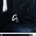
So for my book cover, I decided to use the sub-dominant color as the dominant while the main color is sub, but kept the colors in there. The painting was a good inspiration for my book cover because the theme I have was dark so I wanted to find a painting that help express it and the mood. The hours I spent on this was a good hour.
Color Harmony: Phase 4
This is the project I liked the most because I liked looking into color theories and finding out what I think would go nicely with my Glossument. I enjoyed it because i had to really think what would go with my title, and the theme of my book and I think I picked the right one.
I think something I could’ve done better was not rushing it because that what ended up happening with Phase 3, and tried to make it more creative like make it really look like the photo i chose.
Color Harmony: Phase 3

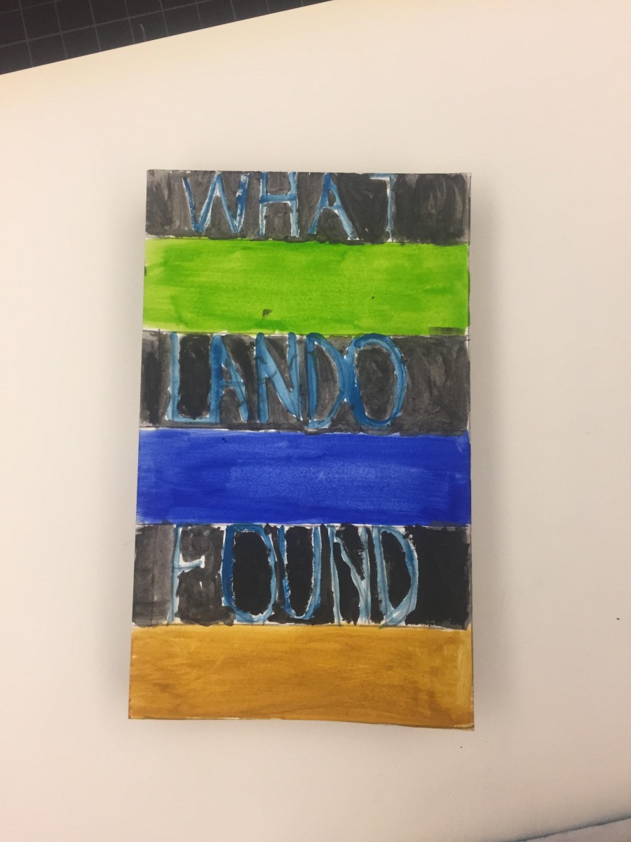
My book cover was heavily based on the colors that I used for phase 2 of the vintage photograph of my mother. I wanted it to look used but have the same bold typography I was using throughout my whole book. The orange colors were hard to make with the paint but I’m happy with how it came out.
This process took me an hour and half. I used acrylic paint and tape.
Color Harmony: Phase 4
My thoughts on the project are that it was a fun and challenging way to test out our creativity mainly seeing how we can present a specific word whether it’d be specific to its meaning or writing it out in certain ways etc. I enjoyed being able to come up with different ways to define a word even when in most cases it was repeated. I also had fun being able to use the photos my books had and used them to represent different words chosen from the glossary.
What I could’ve done better was probably give more time to it or try to have a more open mind. In some cases, it was really difficult to imagine how to express the word, so most of the techniques are repeated as a result. This can help me in a future project by trying to expand ways of representing images without limiting what I know I can do and test out new techniques for it.
Color Harmony: Phase 1

For this first Image, I decided to go with a monochromatic blue. The image itself is an example of it, having from a very light blue using it as highlights within the image and then a navy blue for within the shadows.
By Toni Grote
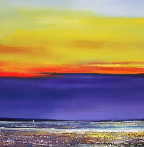
The second image represents the complementary colors with purple on the bottom part of the image and turning into orange to yellow. Seeing as complementary colors are those opposite of each other such as Blue and orange, and red with green. The same would go for purple and yellow, therefore, becoming a nice example of it.
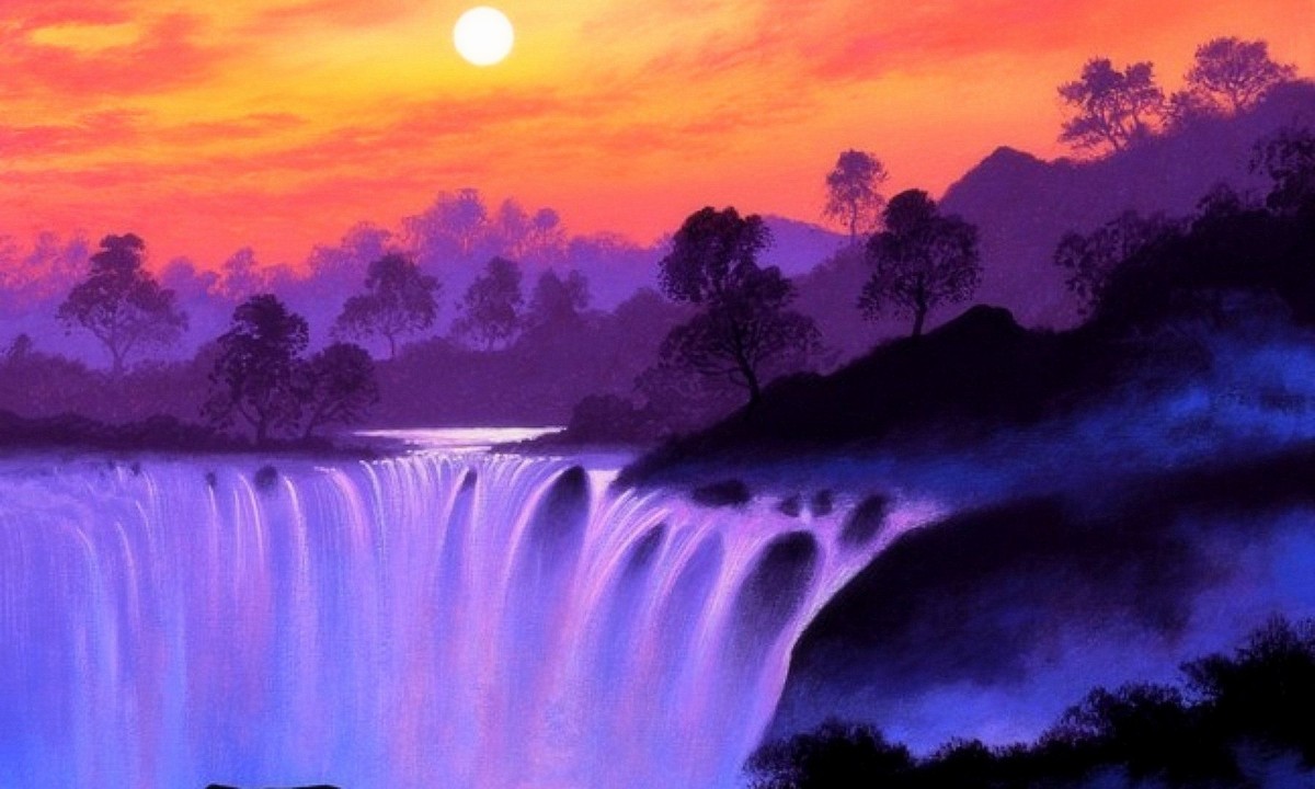
The third and final image is an example of Analogous, this is because of the colors it contains, which would blue purple and pink/orange in which the colors follow one after the other in the color wheel, which is what an analogous color is and why the colors present would be an example of analogous color.
Worked 1 hour
Color Harmony: Phase 3

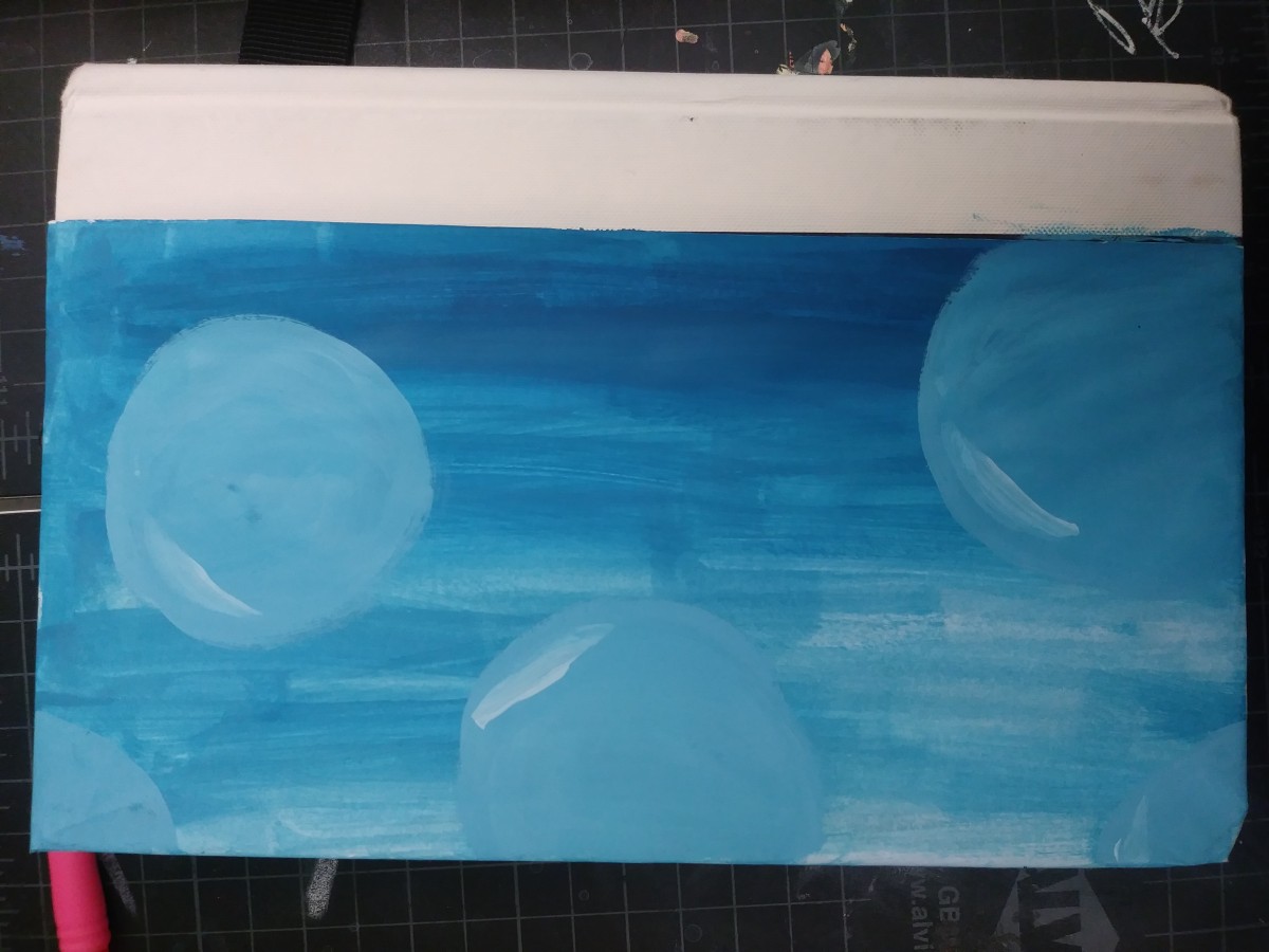
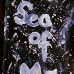
The glossument cover was influenced by the proportional color inventory due to the colors it had. My glossument already has a theme of blue which the image already has a different range of, along with it the title of the glossument is “voice in the ocean” so even the context of the ocean relates. The dominant color in the image was white however when working into the cover it turned out that the dominant color wasn’t white but rather between the tint ranges of blue, and I also used more orange for the words than what I had expected. I wanted my cover to have an image ranging with blue and relating to the ocean so the image I selected helped, and while it isn’t the same I did use forms of waves for the front and then paint the back part with ranges of blues and then adding bubbles. Although the final result did take a while to think of since at first painting the ocean didn’t come to mind at all until I found the image.
Worked on for 1 hour 30 minutes.
Color Harmony: Phase 4
All in all, this whole semester was very new and also a bit challenging to me. I learned many new terms in relation to graphic design and other things. For this project, I think I could’ve been a better creative thinker when it comes to words and all other things. I felt as if I could’ve done more in regards to the painting for my book. I left out one color and I did the green a bit too light in terms of the shade. In short, this was a good semester.
This whole project took me more than 6 hours.
Color harmony: Phase 3
Hours spent- 2
The picture that I based my book cover off of was a painting of a sunset with trees. I can’t really draw so I mad a abstract like cover that represents all colors that I used to make the color proportions.
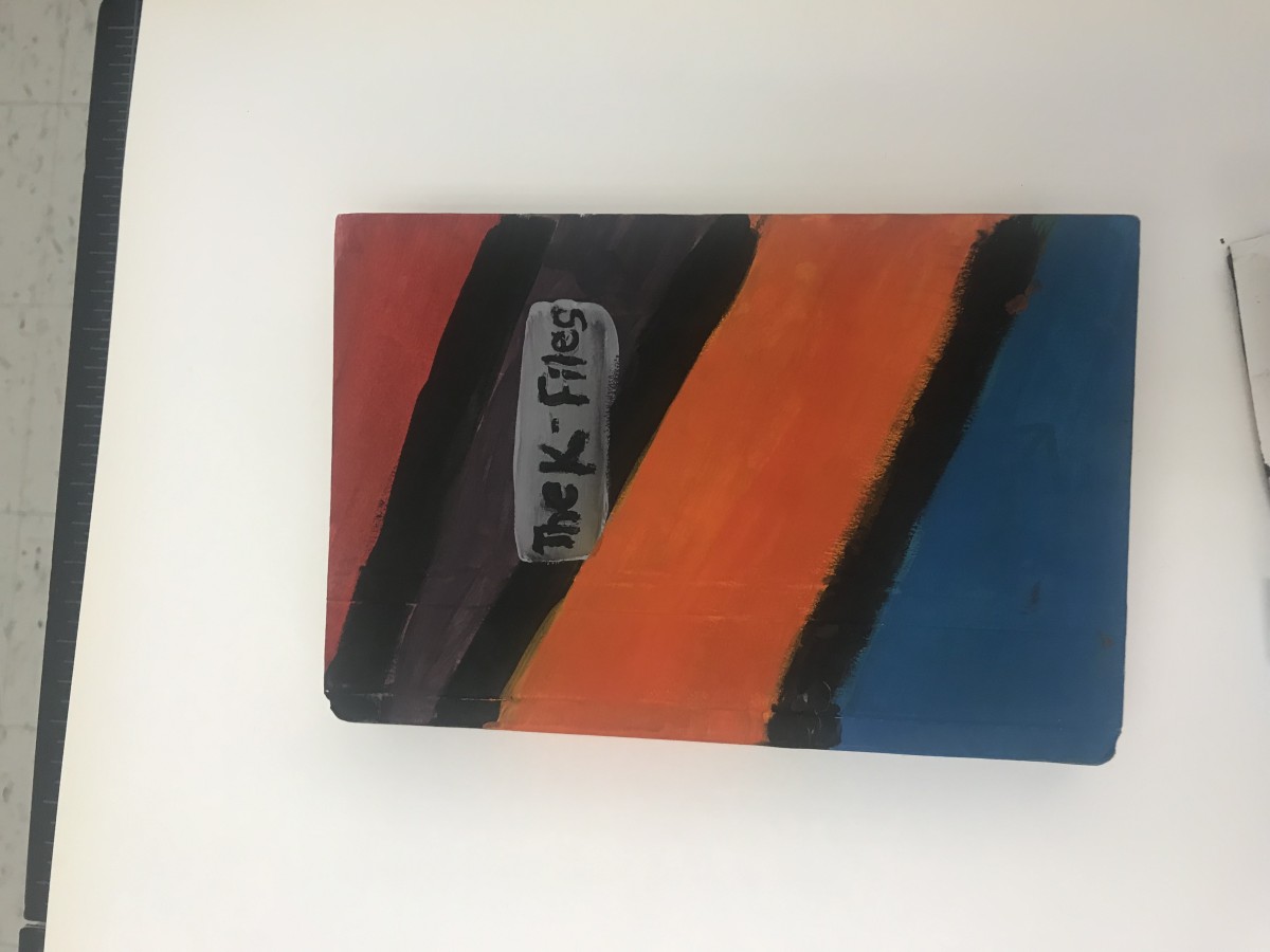
Color Harmony: Phase 3
I based my book cover on the picture I had uploaded on phase 3’s color proportions and shades. Since my book had to do with the theme of opposition and dullness I had to put colors that seemed like opposites and I tried doing a formal book cover based on stripes. I think the creation of my book got my point across to the following audience.
This part of the project took me 2 hours to compete since I had to try to paint carefully and in between the lines.

