post altogether took maybe 15 minutes?



Ways of Seeing – FYLC Fall 2018
First Year Learning Community

post altogether took maybe 15 minutes?


This entire project, i would say, took me around an hour, it was fun to do designs for each color
For my partner in this project , Gary, I went with a deep dark blue. While getting to know him, he said his favorite color was black, but his personal interests were vibrant and held a lot of emotion in them. A music style he said he liked was jazz, which Immediately associated with the song ‘ rhapsody in blue’. so I chose this particular shade of blue because when you first glance at it, it’ll look black, but looking at it more you’ll see that it’s blue, which I hope can visually express how when you first meet Gary he might appear as g o t h but he’s actually really cultured and talented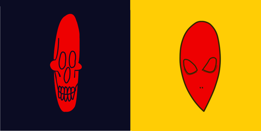
Based on the articles presented, it seems that color, which was once thought of as a constant, is in fact, relative. According to Josef Albers in The Magic and Logic of Color;
“In visual perception a color is almost never seen as it really is”
So color is subjective, meaning in one way or another we all see color a little bit differently than the person next to us. from what I was able to gather based on my very small knowledge of color theory, it appears that having your color, lets say a green, beside or surrounded by a darker color, preferably one very different from it, such as a black, can make the color look darker, than if it had a white background, and comparing them, it almost tricks your brain into seeing one darker or lighter than the other.
This project taught me that i need to get better with painting and using brushes. And also that i hate dealing with glue. There are many things i did during this project i wish i could have done differently, such as my planning and documentation. I also wish that i didn’t have to see 15 cut out photos of myself. I think what’ll take away from this is that composition is just as important as the drawing aspect of it.